
A tiny flower crown tattoo can still look crisp after years when the linework, placement, and aftercare agree. I’ve worn mine through sun, sweat, and ordinary life, and it hasn’t lost its delicate shape. The design is small, but the decision wasn’t. Here’s what I learned.
Here’s what it looked like before
Before I chose the design, I had a clear patch of skin saved for something personal. It wasn’t covered in old ink, scars, or competing symbols. I kept checking that spot in different light because I wanted the tattoo to look minimal black ink, not like a mark I had rushed into.
I also had too many saved references. Some were ornate, some were fierce, and some had petals so dense they looked muddy at a small scale. I’d already decided against a large bouquet.
I wanted one flowing stem, layered petals, and enough open skin for every line to breathe.
The first references felt stylish, but not all of them felt meaningful. A few were polished and elegant, yet they could have belonged to anyone. I wanted something personal enough to keep surprising me.
Before You Choose the Crown
Start with the feeling you want the tattoo to carry. Mine needed to feel meaningful, feminine, and quietly empowering without announcing a complete story to everyone who saw it. If you’re still collecting references, these small flower crown tattoo ideas helped me notice which shapes felt personal instead of merely stylish.
A strong reference should show the silhouette clearly. I looked for botanical crown references with open spacing, readable petals, and a graceful curve. That made the final choice worth it because I could imagine how it might age, not only how it might photograph on appointment day.
I also asked myself whether I loved the flower itself or merely loved the way it looked on someone else. That distinction matters. Your skin tone, movement, and personal associations will change the way the same delicate design feels.
If you’re drawn to symbolic flowers, write down what each bloom means before you choose. I didn’t need a complicated explanation, but I did want the crown to feel expressive when nobody else knew its story.
- I Sketched My Tiny Flower Crown Tattoo
- I Chose Three Delicate Wildflowers
- I Tested Fine Linework On Paper
- I Matched The Crown To My Wrist
- The Birth Flower I Kept
- I Compared Tiny Flower Crown Tattoo Ideas
- An Ankle Placement Worth Considering
- I Prepared For The Needle’s Sharp Sting
- I Checked The Ink’s Crisp Symmetry
- Aftercare Notes I Actually Followed
- I Watched My Flower Crown Tattoo Heal
1I Sketched My Tiny Flower Crown Tattoo

I began with a pencil sketch instead of handing my artist a crowded reference board. The first version had five flowers, curling stems, and tiny dots between every petal. It looked striking on paper, but the details collapsed when I reduced it to a three-inch paper sketch.
So I removed two flowers. That was the hard part.
The final drawing kept one stemmed bloom, layered petals, and two small leaves that curved like a crown around the center. I wanted the design to feel delicate without becoming timid, and my artist agreed that negative space would protect the shape.
I tested the sketch near my collarbone, where the fair cool-pink skin made the black lines easy to see. I’d expected the placement to feel dramatic, but it looked more personal than loud. If you’re considering a similar placement, compare it with these small flower crown tattoo ideas before you commit.
The winning version was the least crowded one. I didn’t need a ring of petals around the whole flower.
The single stem gave it a graceful direction, while the leaves kept it from looking like a plain botanical symbol. That balance is why it’s still readable years later.
I kept the drawing deliberately imperfect. One petal sat slightly higher than its neighbor, and the stem curved instead of dropping in a stiff line. That tiny decision made the crown feel raw and expressive.
What the First Sketch Taught Me
The first sketch taught me that a tattoo can be intricate without being overloaded. I had to choose between every attractive detail and the few details that actually made the crown recognizable. That was my first surprise!
The final single-stem composition felt more expressive because it left room around each mark. If your reference looks impressive only when enlarged on a screen, print it at the size you might wear. The paper exposes weak spacing quickly.
I also learned that minimal doesn’t mean forgettable. A dainty design can have a sharp silhouette, a meaningful center, and enough contrast to remain iconic without becoming heavy.
When I reduced the sketch again, the strongest feature was the curve, not the number of petals. That became my rule: protect the gesture first, then add only the details that support it.
2I Chose Three Delicate Wildflowers

For the rib design, I tested three flower shapes rather than three identical blooms. One had rounded petals, one had pointed petals, and one had a narrow center with two leaves. The result felt symbolic and personal, but it still fit the fine-line rib placement.
I chose the narrow flower for the center because it followed the natural length of the ribs. The rounded flower sat slightly above it, and the pointed one finished the little crown.
I wanted a playful rhythm, not a repeated stamp. You’ll notice the difference when each bloom has its own silhouette.
The medium warm ivory skin in the reference made the black linework look crisp without harsh contrast. I asked for restrained shading, because heavy gray would have made the tiny petals look older before they had healed. My opinion is firm here: skip dense fill on a small floral tattoo unless your artist has a very specific reason.
I went back and forth for an afternoon, then saved the three-flower version beside a tiny small butterfly tattoo for comparison. The butterfly was charming, but the wildflower crown felt more meaningful to me. You should choose the image you’ll still recognize when the trend has moved on.
Each bloom had a different emotional role. The rounded one felt romantic, the pointed one felt daring, and the narrow center flower felt quietly sacred. Together, they created a graceful tension instead of a flat row of matching shapes.
I didn’t choose the flowers because they were the most realistic. I chose them because their silhouettes stayed readable at a small scale. That is a more useful test than asking whether a reference looks impressive on a large screen.
3I Tested Fine Linework On Paper

Before the needle touched my skin, I asked for a printed stencil at the intended scale. I traced over the petals with a black pen, then held it under a lamp. That little test showed me where the fine-line flower stencil needed more breathing space.
The olive skin in the reference gave the design a grounded look. I wanted the black to stay sharp against it, so we widened a few connecting lines by a fraction instead of adding shading.
I’ve learned that a line can be delicate without being hair-thin. Fragile linework isn’t the same thing as refined linework.
I also checked the flower from a distance of three feet, then from arm’s length. Up close, the leaves looked crisp and intricate. From farther away, the whole shape still read as one flower crown.
Don’t judge a tiny tattoo only with your nose inches from the stencil.
And I kept one small flaw in the sketch, a slight bend in the stem. That made the design feel expressive rather than machine-made. If you’re comparing references, this tiny moth tattoo has the same useful lesson: a little asymmetry can keep a small black design from looking sterile.
The paper test also showed me where the petals began to merge. I opened those gaps before the appointment. It was a tiny edit, but it protected the crisp center that makes the design recognizable.
A strong stencil should survive three questions: Can you identify the flower quickly? Do the lines still separate at normal viewing distance?
Does the shape remain graceful when the skin moves? Mine passed all three.
4I Matched The Crown To My Wrist

My wrist version needed a different scale because the skin moves every time I bend my hand. I placed the flower just above the wrist crease, with the stem running toward the forearm. The golden tan skin made the black wrist linework look polished and clear.
I rejected the idea of wrapping the entire tattoo around the wrist. It sounded bold, but a full band would have turned the petals into a busy ring. One open side gave the crown a sleek, understated shape, and I could still see the flower when my hand rested naturally.
I tested the stencil while flexing my wrist, holding a cup, and turning a door handle. That sounds fussy, but it showed me how much the design shifted.
You’ll want to do the same with any moving placement. A tattoo that looks elegant while your arm is still may look awkward when your hand is working.
The final angle followed the wrist instead of fighting it. I didn’t need a dramatic flourish. For another compact reference, I saved this tiny fine line butterfly tattoo and noticed the same principle: clean open space often ages better than extra decoration.
The wrist made the crown feel visible and confident. I liked that I could glance down and see the stem without twisting my arm. Still, that visibility meant I had to be honest about sun exposure and daily friction.
If you wear a watch or bracelet, place the stencil while wearing it. My first position looked beautiful until I noticed the band would sit directly over one leaf. Moving the design slightly changed everything.
Would I Actually Enjoy Wrist Placement?
Would I actually enjoy seeing the tattoo every day? That question separated the romantic idea from the practical one.
The wrist felt visible and confident, while the ribs felt private and slightly mysterious. Neither was wrong.
I also asked whether the moving wrist placement would make aftercare harder. Friction from sleeves, watches, and repeated bending mattered more than I expected. The answer helped me value a placement that suited my routine, not just one that looked sharp in a photograph.
The wrist is a strong choice if you want a tattoo you can monitor easily. You can notice dryness, irritation, or fading without needing a mirror. That practical benefit made the placement feel empowering.
The ribs offered a different kind of appeal. They made the flower feel like a secret, something meaningful that didn’t need to be visible to validate the choice. I nearly picked them.
5The Birth Flower I Kept

I brought a traditional flash sheet to my appointment, printed on aged off-white paper with several hand-drawn floral options in black.

6I Compared Tiny Flower Crown Tattoo Ideas

I made a quick comparison sheet with collarbone, ribs, upper back, wrist, and ankle placements. The upper-back version looked romantic and elegant on deep ebony skin, especially with the single stem centered below the shoulder line. It was the most private option, but it wasn’t the one I wanted to see every day.
The upper-back flower crown had the strongest silhouette because the skin offered a wide, steady field. Still, I preferred the intimacy of the ribs. The rib placement felt more personal, while the upper back looked more like a visible statement.
Your choice should follow how visible you want the meaning to be.
I also compared a dainty version with a bolder black outline. The dainty one looked ethereal at first, but the stronger outline survived my distance test better. I’ve seen tiny lines spread slightly over time, so I wouldn’t choose the thinnest possible mark simply because it photographs well.
Would you rather have a tattoo that looks impressive for one photograph or one that keeps its identity through ordinary years? I chose the latter. You can browse tiny butterfly tattoo references for placement ideas, but your flower’s line weight should be chosen for your skin and lifestyle.
I considered adding a tiny ornamental border, then removed it. The border made the crown look more ornate, but it weakened the individual flowers. The simpler version felt sharper and more timeless.
My comparison sheet also exposed how much placement changes the mood. The same crown looked romantic near the collarbone, fierce at the ankle, and quietly sacred along the ribs. The drawing wasn’t the only decision.
7An Ankle Placement Worth Considering

The ankle version looked unexpectedly fierce on fair cool-pink skin.
8I Prepared For The Needle’s Sharp Sting
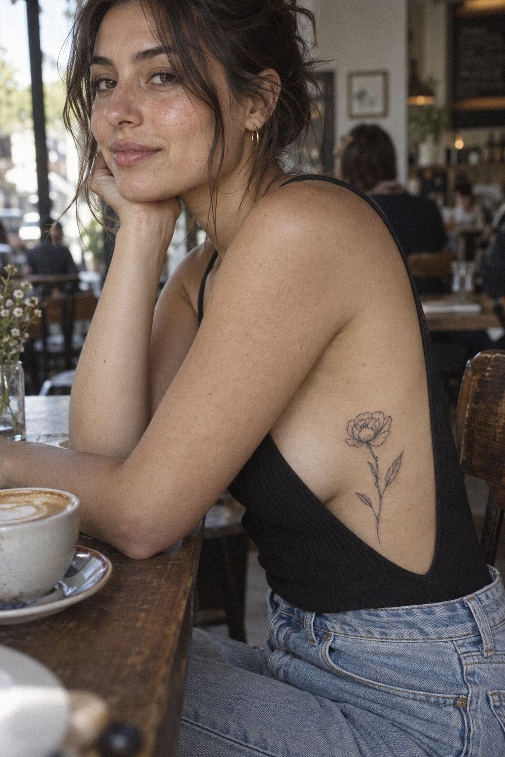
I expected the ribs to feel sharp, and they did. The sensation was brief but intense around the bone, especially when the needle crossed the thinner skin near the lower edge. I chose the ribs anyway because the placement gave the black rib tattoo a graceful vertical line.
Pain depends on your body, your artist, and the exact spot. Ribs, feet, hands, and sternum are commonly more painful, while the forearm, thigh, and shoulder are often more tolerable. I won’t pretend the ribs felt gentle, but the session was manageable because the design stayed small.
I ate beforehand, brought water, and wore clothing that didn’t press against the stencil. Those choices made the appointment feel calmer. You don’t need a dramatic ritual.
You need a clear reference, a rested body, and an artist who explains what they’re doing.
And I asked for a pause when my breathing got shallow. That wasn’t failure.
It was practical. A small tattoo can still feel raw and demanding, especially near bone. If you’re unsure about your tolerance, compare the ribs with tiny butterfly tattoo stencil placements and ask your artist what they see most often.
The sharpest moment came near the lower rib, where the skin felt especially sensitive. It passed quickly. I found that steady breathing helped more than trying to act fearless.
My artist also explained each transition before making it. That made the appointment feel controlled and professional. A calm conversation won’t remove the sensation, but it can make the experience feel less intimidating.
9I Checked The Ink’s Crisp Symmetry

When the stencil went on my inner forearm, I checked the centerline before looking at the petals. The flower sat on medium olive skin, and the design needed a clean relationship between the stem, two leaves, and the layered crown. I wanted crisp black symmetry, but not a stiff mirror image.
My artist adjusted one leaf so it followed the natural curve of my forearm. That small change made the tattoo more organic and personal.
The petals remained balanced, but the stem no longer looked copied from a grid. A perfectly even design can look less graceful when it ignores the body underneath.
I inspected the stencil while my arm hung naturally, then again with my palm turned upward. Don’t approve a tattoo only while you’re holding your arm in an unnatural pose. You’ll live with the movement, not the appointment photograph.
The ink looked sharp on the first day, almost too dark. I knew the healed version would soften slightly, so I didn’t ask for extra saturation just to chase that fresh look. You can compare tiny fine line butterfly tattoo references, but remember that fresh and healed ink never look identical.
Symmetry mattered most at the center. I wanted the crown to feel balanced, but I didn’t want every petal to look mechanically duplicated. The slight variation gave it a more human and expressive finish.
Before the first line, I checked the stencil from both sides of my body. That took less than a minute and gave me confidence. A striking tattoo begins with a stencil you can approve without hesitation.
10Aftercare Notes I Actually Followed

The split image helped me understand the difference between a stencil and healed ink.
11I Watched My Flower Crown Tattoo Heal

The inner-forearm version looked bold on deep brown skin with a warm undertone, especially during the first few days. As it healed, the black settled into a more understated finish. The petals stayed legible, and the two leaves still framed the stem without merging into one dark shape.
I photographed it at one week, three weeks, and several months. That gave me a better view than comparing it only with fresh studio photos. The healed black flower crown still had a clear center and open gaps between petals, which mattered more to me than having razor-thin lines.
Very fine lines can widen over time. Strong black placement, sensible spacing, and sun protection give a small tattoo a better chance of staying readable. You’ll still see natural change, because skin isn’t paper, but thoughtful linework gives the design room to age.
I’ve had mine for years now, and the original idea still reads immediately. It feels personal, expressive, and quietly iconic. If you want one more reference before booking, look through tiny butterfly tattoo designs and study the healed examples, not only the fresh ones.
The first month was when I noticed whether the crown had enough separation. It did. The pointed flower stayed distinct from the rounded one, and the center remained visible without extra shading.
Years later, the lines are softer but not lost. The tattoo no longer has the fierce darkness of fresh ink, yet the overall silhouette feels more graceful. That settled quality is what I hoped for.
When the Flower Crown Finally Settled
The settled tattoo isn’t as dramatic as the first-day version, and that’s exactly what I wanted. The mature tattoo lines look softer, but the crown remains sharp enough to read from a normal distance.
One small touch-up could improve a faint section near the lower leaf, but it isn’t urgent. I wouldn’t chase absolute perfection if the overall silhouette still feels graceful and meaningful. A little age can make a tattoo feel more lived-in, not less valuable.
The crown has also become part of how I recognize myself. I don’t notice it every hour, but when I do, it still feels intentional. That matters more than preserving a completely fresh appearance.
A tattoo that settles well doesn’t need to look frozen. It needs structure, spacing, and a silhouette strong enough to remain recognizable as the skin changes.
How Much It Cost
My artist priced the tattoo according to the studio minimum and the time required, rather than treating the flower as a fixed universal price. In the US, a small tattoo commonly meets a shop minimum of about $50 to $100, while hourly rates often fall around $100 to $250. Your artist, city, placement, and appointment length can shift the final number.
I asked for the quote before the appointment and confirmed whether the minimum covered the stencil, design adjustments, and touch-up policy. That conversation saved me from guessing. You should ask the same questions, because a tiny tattoo isn’t always a tiny appointment when the artist is building custom linework.
I chose a custom flower instead of a flash design, so the drawing time mattered. It was worth paying for a thoughtful stencil, but I wouldn’t pay extra for needless detail. A delicate tattoo needs precision more than ornament.
The cost felt reasonable because I was buying judgment, not just minutes under a needle. If you’re comparing options, use the range as a guide and ask for your artist’s real quote. Don’t treat a random online number as a promise.
The best value wasn’t the lowest quote. It was the artist who could explain spacing, placement, healed results, and touch-up policy clearly. For me, the custom work was worth it because the tattoo still feels polished years later.
I also asked whether a future touch-up would have a separate minimum. That detail was easy to overlook, but it made the quote more useful. Clear pricing felt professional and reassuring.
What I Learned About Keeping Tiny Tattoos Personal
I used to think the meaning had to be obvious for a tattoo to feel meaningful. I wanted every petal to carry a story, every leaf to represent someone, and every line to explain itself.
Years later, I think that pressure makes small tattoos worse. A personal tattoo can hold meaning without displaying its entire biography.
The strongest choice I made was leaving space. I didn’t fill the crown with extra dots, initials, dates, or shading just because the skin looked open. That restraint kept the single-stem composition readable, and it gave the flower a timeless quality that still feels like me.
I also learned that placement is emotional, not only practical. The ribs felt private.
The wrist felt visible. The ankle felt playful and slightly daring.
The upper back felt elegant but less intimate. Your body changes how the symbol speaks, even when the drawing stays the same.
And I stopped chasing the freshest photograph. Fresh ink is dramatic, dark, and sometimes a little swollen.
Healed ink is quieter. I prefer the healed version because it shows whether the linework, spacing, and silhouette were good decisions.
A tiny flower crown tattoo won’t stay frozen. Sun exposure can fade black, and fine lines can widen.
Still, you can protect the design with sunscreen after healing, choose a sensible scale, and work with an artist whose healed portfolio is as strong as their fresh work. That’s the part I trust now.
The most personal detail isn’t always the most visible one. For me, it was the birth flower hidden among the three blooms. That small choice gave the design an emotional center without making it literal.
I also stopped comparing my tattoo to every new floral trend. The crown feels classic because it belongs to my history, not because it follows a particular moment. That makes it more empowering each year.
Fresh Ink vs. Healed Ink
Fresh ink can look bold, sharp, and almost too saturated. Healed ink reveals the real personality of the design. If the crown only works while the black is at its darkest, I wouldn’t call it a strong investment.
The healed version is what makes the tattoo worth it for me. The petals don’t need to look frozen or flawless. They need enough spacing and structure to remain recognizable through ordinary years.
Fresh photographs can also exaggerate contrast. They make every mark look fierce and polished, while healed skin shows the more delicate truth. I prefer that honest version.
If you’re choosing an artist, ask to see healed work at a normal distance. Look for consistent lines, readable shapes, and graceful aging. Those examples tell you more than a perfect appointment-day photograph.
The Questions I Get Asked Most
How much does a tiny flower crown tattoo usually cost?
A tiny flower crown tattoo commonly falls around $50 to $100 for a shop minimum or about $100 to $250 per hour in the US. Your artist’s region, experience, custom drawing time, and placement can change the quote, so ask before booking. That is the most reliable way to judge the real cost and value.
– Studio minimum – Hourly rate – Custom stencil time
Are tiny flower crown tattoos a good idea for a first tattoo?
Yes, a tiny flower crown tattoo can be a meaningful first tattoo because the design is compact and easy to personalize. Choose a placement you can tolerate and an artist with healed fine-line work. You’ll want clean petal spacing, not the thinnest possible lines.
– Delicate botanical shape – Personal birth-flower detail – Manageable scale
How do I choose a tattoo artist for a tiny flower crown tattoo?
Choose an artist who shows healed fine-line tattoos, not only fresh studio photographs. Check line consistency, spacing, black saturation, hygiene, and whether their portfolio includes botanical work. You should feel comfortable asking about their needle choices and aftercare process.
– Healed portfolio – Botanical experience – Clean studio practices
How much do tiny flower crown tattoos hurt?
Pain varies by placement, but ribs, feet, hands, and sternum are often sharper than the forearm, thigh, or shoulder. My ribs felt intense but manageable. You’ll have an easier session if you eat, hydrate, and wear clothing that won’t rub the area.
– Rib sensitivity – Forearm tolerance – Short appointment breaks
How long does a tiny flower crown tattoo take to heal?
The surface usually heals in about 2 to 3 weeks, while complete healing can take about 2 to 3 months. Wash gently, moisturize lightly, avoid swimming during early healing, and protect the healed tattoo from strong sun.
– Gentle washing – Light moisturizer – No early pool time
What’s the best placement for a tiny flower crown tattoo?
The forearm is often easier to tolerate and lets you monitor healing, while the ribs feel more private and follow a graceful vertical line. You should also consider friction, sun exposure, visibility, and how the skin moves before choosing.
– Inner forearm visibility – Rib privacy – Ankle friction
Where I’d Start First
If I had to pick one, I’d start with the inner forearm. You can watch the linework heal, protect it from friction, and see whether the spacing stays crisp before choosing another placement.
Save your favorite reference and ask for healed examples first. That decision matters more than chasing the smallest line.
Would I do it again? Absolutely!
I’d keep the three-flower structure, the open spacing, and the personal birth-flower detail. I might ask for one slightly stronger connecting line, but I wouldn’t make the crown larger just to add more drama.
If you’re working with a tight budget, ask about the studio minimum, the design time, and the likely touch-up policy before you book. A thoughtful, meaningful tattoo can still be small, and the best value is the one you’ll be glad to see years from now.
I still love it! The crown feels delicate without being timid, symbolic without being obvious, and polished without losing its personal edge. If you choose carefully, a tiny flower tattoo can carry a surprisingly powerful story.

