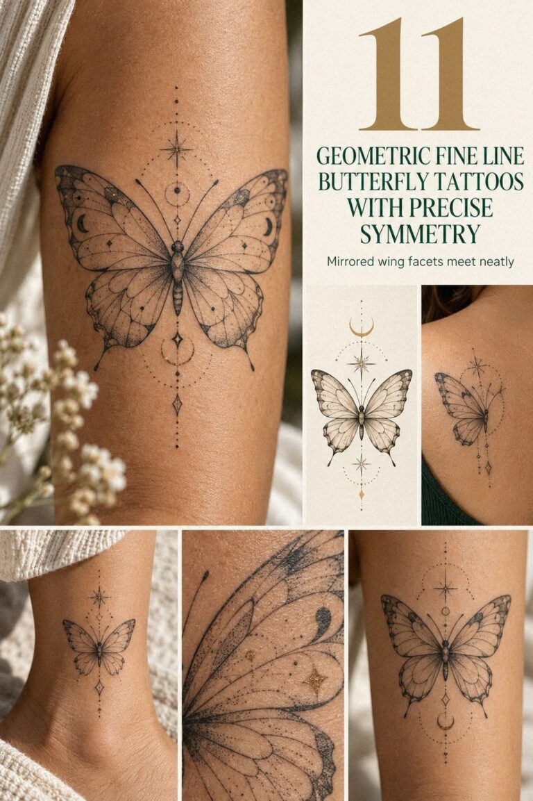
Fine line dragon tattoos were the design I nearly postponed. I wanted something striking but discreet, so I chose curling linework that could hide beneath a sleeve or appear with one movement. The result feels personal, crisp, and surprisingly powerful without taking over my body. Here’s what changed my mind.
Here’s What It Looked Like Before
Before the appointment, I had a clear patch of skin and no design I trusted enough to keep there. The blank space felt intentional, but every idea still seemed temporary. I’d saved dragon references, floral details, and tiny symbols for months, yet none felt personal enough for my final tattoo concept.
I kept comparing small fine line dragon tattoos with larger pieces that had heavier blackwork. The heavy blackwork examples photographed well, but I didn’t want a dragon that would announce itself before I did. I wanted privacy, movement, and enough scale for the claws and scales to stay readable.
The first sketch was too crowded. The wings overlapped the body, the tail disappeared, and the head looked more like a lizard than a dragon. So I started over with a simple black line stencil, leaving breathing space around every curve.
That decision led me to compare the lighter movement of tiny dragon tattoos with the longer shape of a serpentine dragon. You’ll notice the difference immediately: a tiny design whispers, while a longer one can follow the body like a signature. That distinction mattered for my planned tattoo budget.
- Choosing Small Fine Line Dragon Tattoos
- How I Sketched My First Fine Line Dragon
- Match Dragon Linework to My Wrist
- Why a Serpentine Dragon Felt Meaningful
- Testing Fine Line Dragon Tattoo Ideas
- Shoulder Blade Placement: Wings in Motion
- Add Florals Without Losing Dragon Detail
- Delicate Ink or Bold Accents?
- Selecting a Unique Fine Line Dragon
- Before the Tattoo Session: What I Checked
- Protecting My Dragon During Healing
1Choosing Small Fine Line Dragon Tattoos
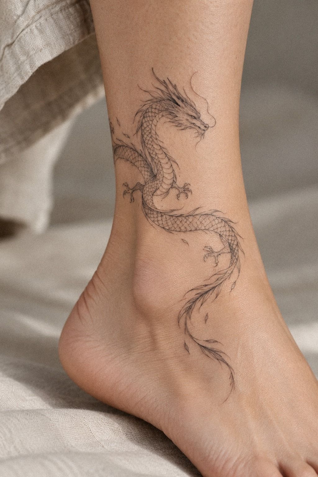
I began with small fine line dragon tattoos because I wanted control over visibility. A curling body could sit beneath a shirt cuff, while the head and wing could appear when I moved my arm.
That balance felt sleek and understated, not timid. I’d rather choose a smaller design with clean structure than force a crowded dragon into a tiny patch of wrist skin.
The reference that helped most was a 2-to-4-inch dragon sketch with a narrow body, open negative space, and only a few scale marks. You’ll want the shape to read from a distance before anyone studies the details. If the silhouette disappears, more decoration won’t save it, no matter how much the piece costs.
I rejected a heavily shaded version because it looked fierce on paper but muddy at small scale. Instead, I chose a delicate contour, one expressive eye, and three claw marks.
I also tested a muted olive accent beside the terracotta notes I liked. And yes, fewer details made the dragon feel more iconic!
For comparison, I looked through fine line snake tattoos because their bodies show how flowing curves can create movement without dense shading. Your dragon doesn’t need every scale drawn to feel intricate, and that restraint can improve its ink placement.
2How I Sketched My First Fine Line Dragon
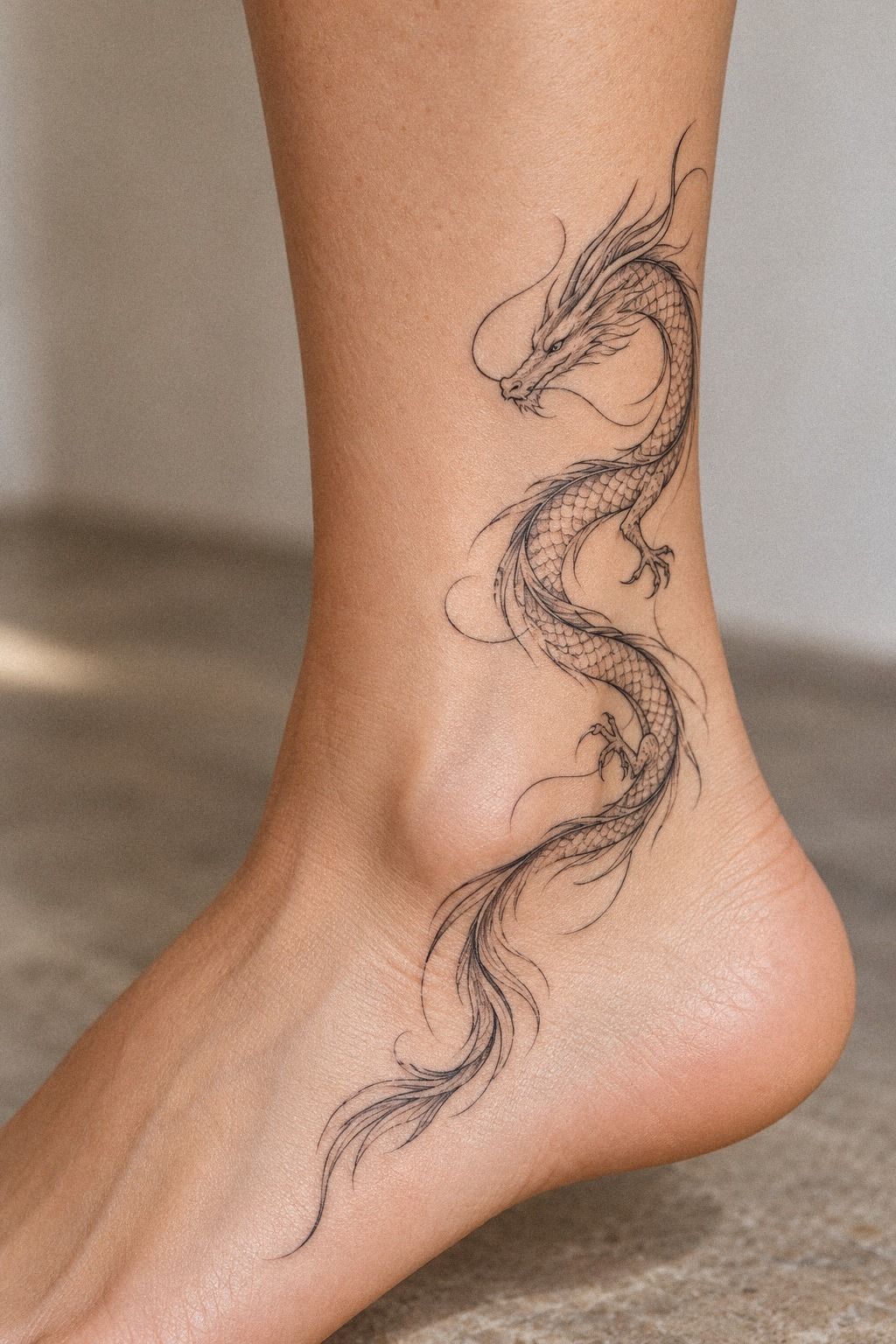
My first fine line dragon started as a pencil sketch on tracing paper. I drew the body in one long S-curve, then tested the wings separately so I could move them without redrawing the whole figure. That small change made the design more graceful and less stiff.
The final reference used a single-needle style drawing with selective black accents around the eye, claws, and wing joints. I wanted the linework to stay crisp, but I didn’t want every feature to compete. You’ll want one focal point, and mine became the dragon’s face.
I’d originally asked for ornate horns. My artist made them smaller, and I’m glad they did.
The first version looked dramatic but distracted from the body. The edited horns feel sharp and meaningful because they’re visible without becoming the entire story.
I kept the surrounding accents clay-toned with a restrained aged-brass detail!
But the sketch still needed to work on skin, not just paper. I compared it with fine line owl tattoos to study how open areas protect delicate details.
Paper forgives clutter. Skin doesn’t, especially when your tattoo design needs to age well.
3Match Dragon Linework to My Wrist
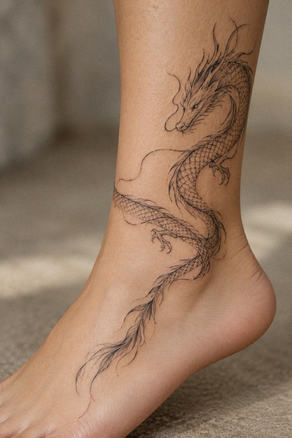
My wrist forced me to think differently. The skin moves constantly, and I didn’t want a dragon that looked perfect only when my hand was held still. I tested the head near the thumb side and let the tail travel toward the forearm, which gave the design a natural direction.
The chosen reference had a black fine line transfer with a clear outer contour and very limited interior shading. You’ll want to rotate your wrist while checking the stencil. If the dragon looks broken when your hand turns, the placement needs work before the needle comes out.
I skipped the tiny wing detail I’d been attached to because it sat directly over a crease. That was the right call.
A more minimal wing stayed readable, and the whole piece looked polished from several angles. A restrained plum-gray accent near the tail gave it a little more character without making the placement loud.
For another placement study, I saved fine line bird tattoos because their wings show how a few sharp marks can suggest motion. Your wrist design should move with you, not fight your joints, and that can be worth the extra planning time.
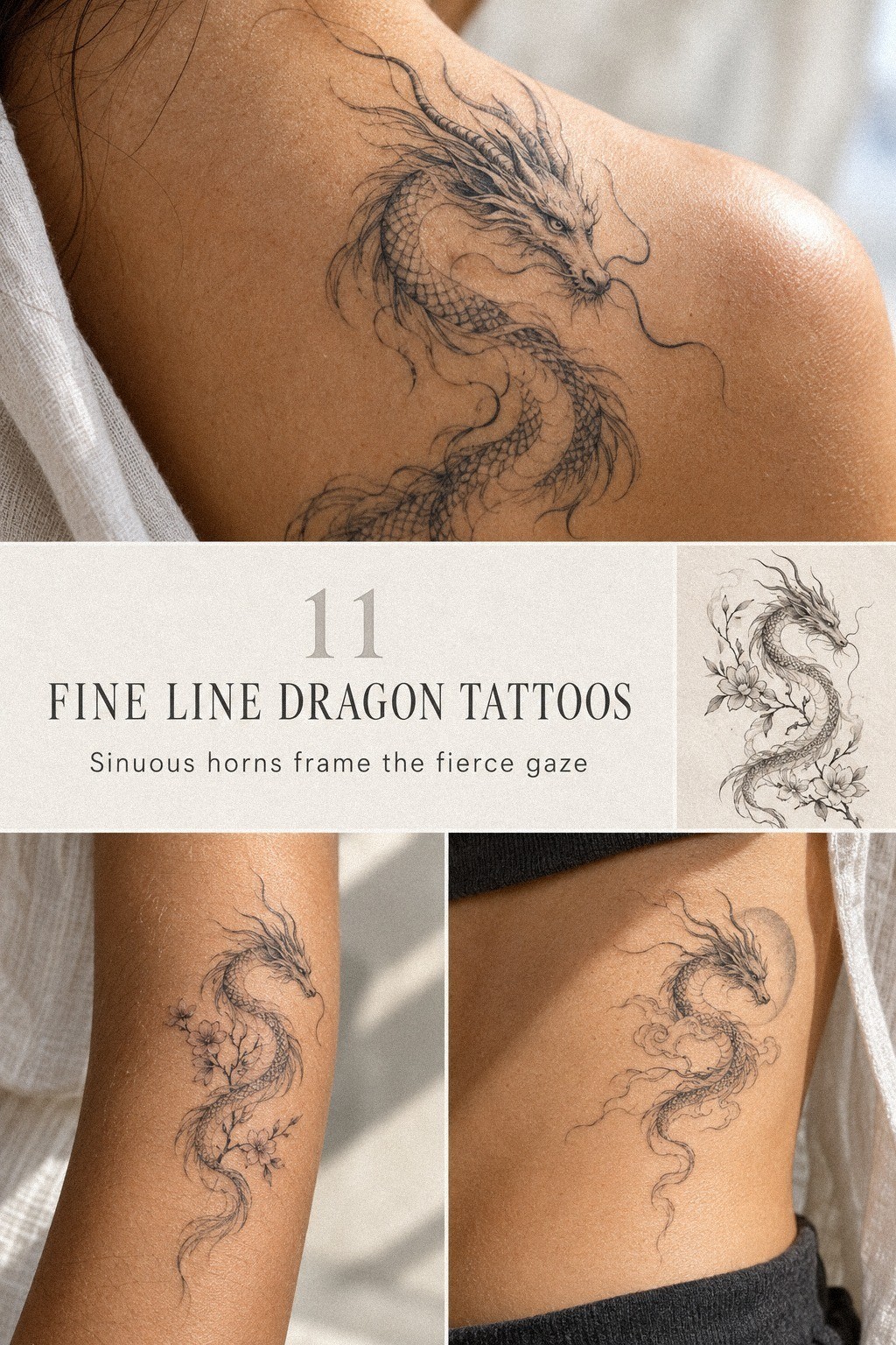
4Why a Serpentine Dragon Felt Meaningful
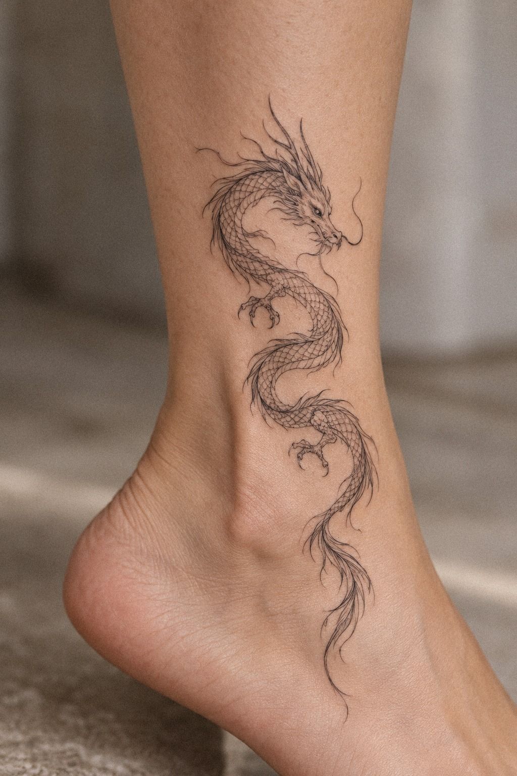
The serpentine shape became meaningful because it represented persistence without looking aggressive. I wanted a dragon that could protect me, but I didn’t want a clenched jaw or exaggerated flames. The long body felt strong, while the soft curve kept it personal and calm.
I chose a fine line blackwork head with a closed mouth, narrow eyes, and two short horns. That expression gave the dragon an almost sacred quality.
You’ll get more emotional range from posture than from adding random symbols. A subtle navy accent along the neck worked better for me than a bright color.
My first idea included a sword, a moon, and several stars. It was too literal. I removed everything except a tiny crescent near the tail, and the design became more timeless.
Sometimes the most meaningful mark is the one you stop trying to explain.
And if you want a softer animal reference, watercolor fine line butterfly tattoo ideas can show how movement and symbolism work without heavy visual weight. Your dragon can be fierce without looking hostile, which made the final choice feel like good value.
5Testing Fine Line Dragon Tattoo Ideas
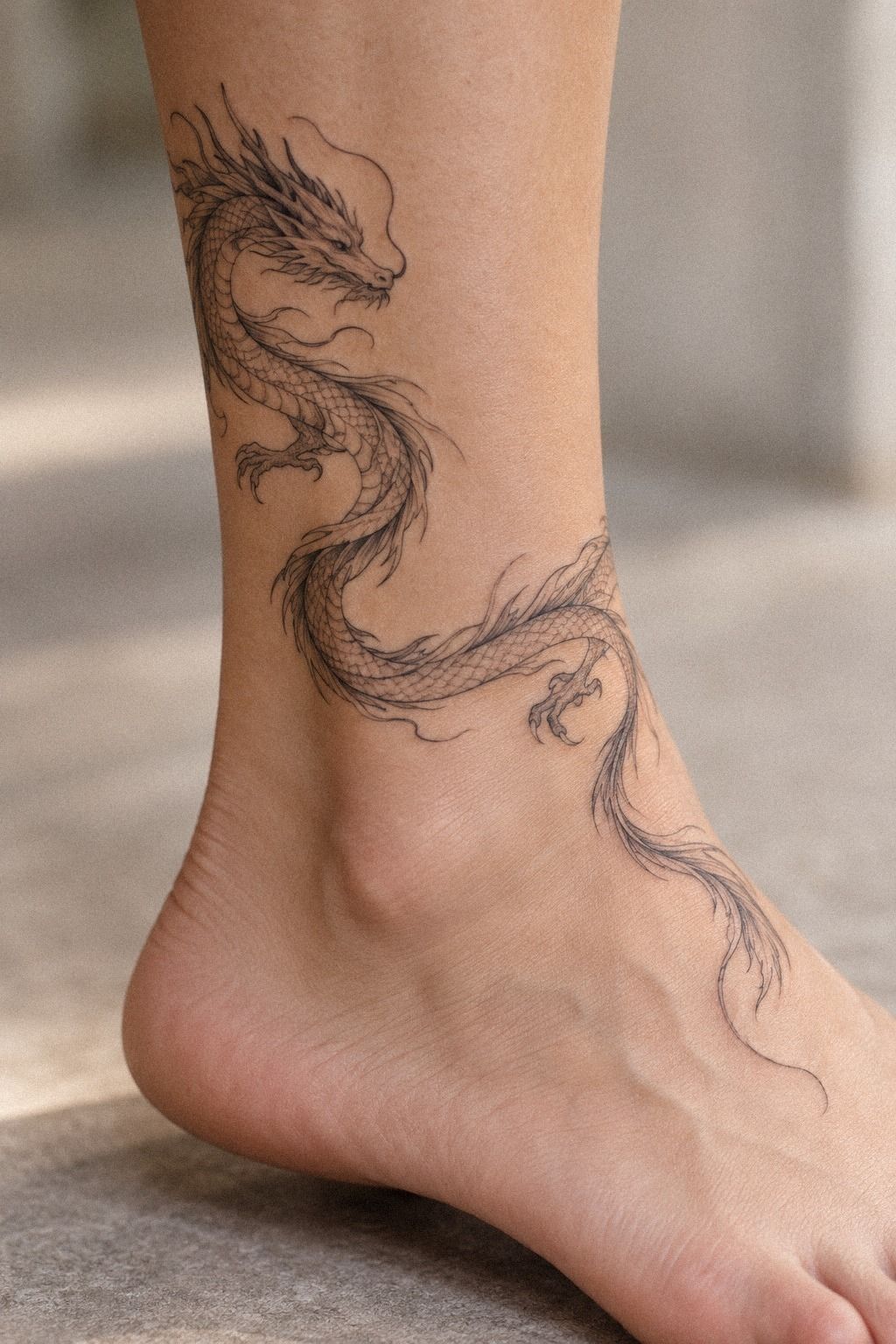
I tested fine line dragon tattoo ideas on a small aged off-white flash sheet before choosing the final version. I drew three body shapes, two head angles, and several tail endings so I could compare the overall rhythm.
The first option was ornate, with extra scales and a longer pair of wings. It looked ornate but crowded once I reduced it to the size I could afford. The second was more dainty, though the face lost its personality.
The third version had a narrow body, one open wing, and a curling tail. It felt expressive without needing more symbols. I tested a tiny emerald-and-gold accent against the cream paper, and that was the option I kept inside my planned tattoo budget!
I also tested the stencil at different distances and under different lighting. A tattoo can feel vibrant up close yet disappear from a few feet away. I wanted the main silhouette to remain readable, because that improves the long-term value of a fine line piece.
The tiny dragon tattoo ideas I compared helped me see where a small dragon needs fewer interior marks. That reference confirmed that scale should serve the dragon silhouette, not overwhelm it.
The Shape I Kept After Comparing Every Draft
The final shape depended on what I removed. I kept the open wing, the curved neck, and the slightly lowered head. Those choices made the dragon feel flowing rather than rigid.
I removed extra stars, dense scales, and a second floral sprig. The negative space became part of the design instead of an accidental gap. That gave the dragon silhouette a cleaner identity.
I’d expected the most detailed draft to feel special. It didn’t. The simpler version felt more personal, more readable, and easier to imagine living on my skin for years.
A look at fine line snake tattoo references also helped me judge how much curve the body could carry. I wanted the tail direction to feel intentional without making the design look crowded.
6Shoulder Blade Placement: Wings in Motion
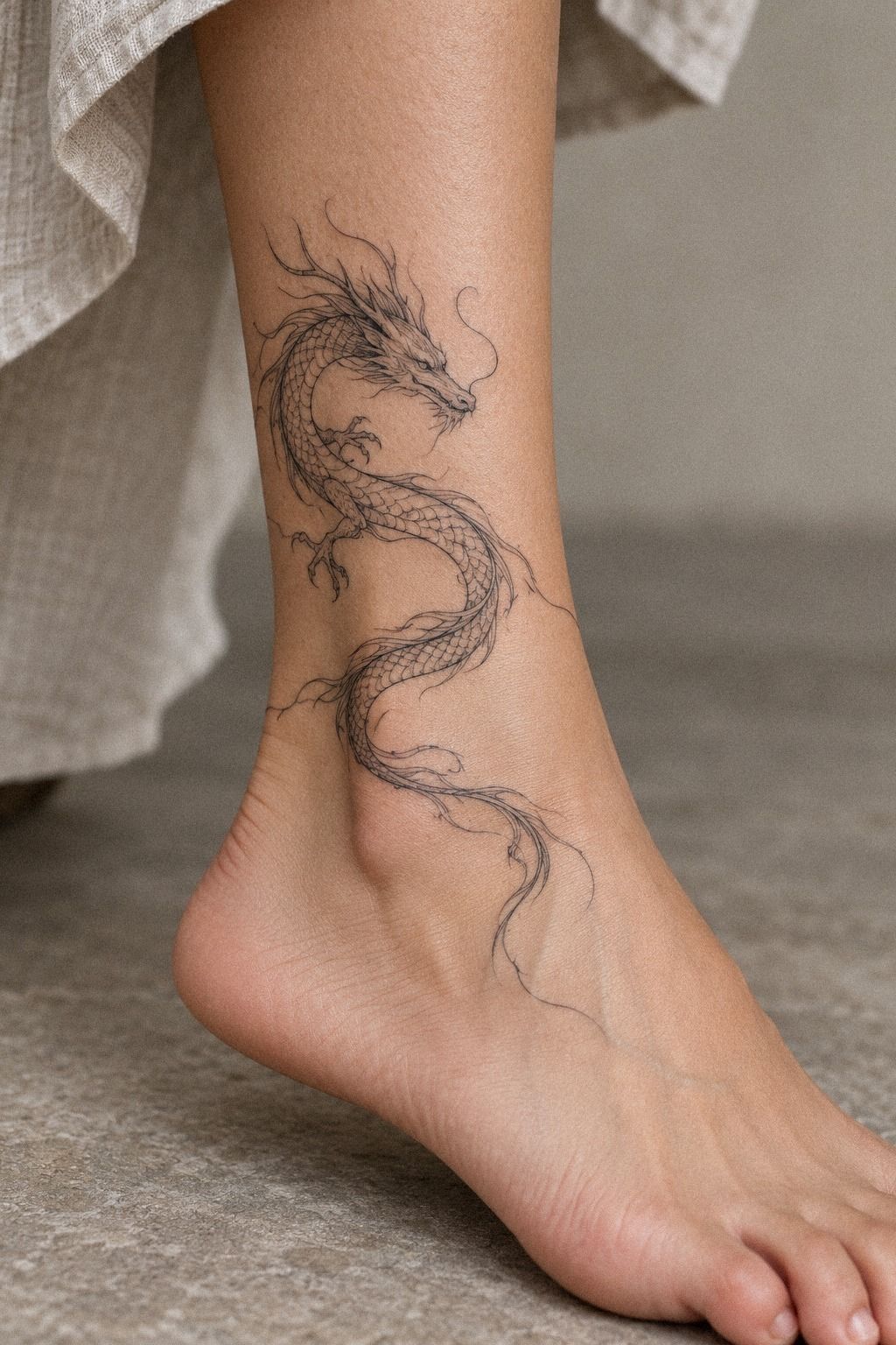
The shoulder blade gave me enough room to make the wings graceful without making them oversized.
I chose a slightly lifted wing with forest-green and rust accents rather than a fully spread design. That posture felt bold but still private, and it followed the shoulder blade without forcing the dragon into a rigid position.
The tail curved toward my upper back, while the head faced inward. That made the composition feel expressive and personal. I wanted movement, not a symmetrical emblem.
7Add Florals Without Losing Dragon Detail
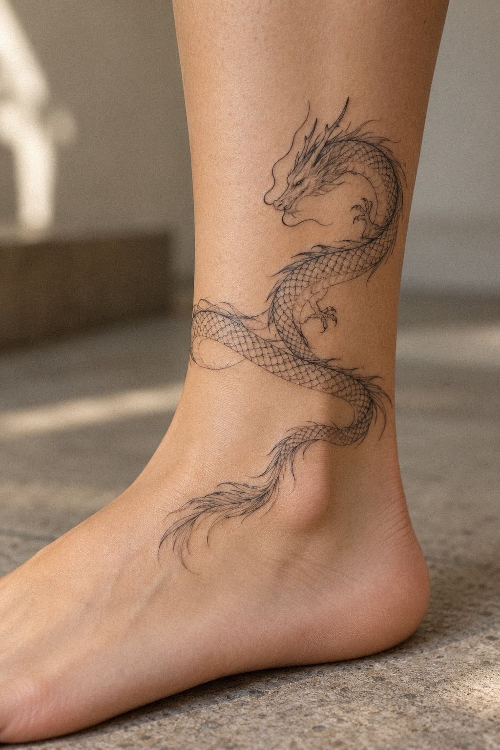
I added a small floral sprig only after the dragon worked on its own. The flowers followed the tail instead of filling the empty spaces around the body. That choice kept the composition delicate and let the dragon remain the subject.
The sprig used fine black botanical linework with three narrow leaves and tiny five-petal flowers. You’ll want the flowers to follow the dragon’s direction, not float beside it. A separate bouquet would have made the design romantic but disconnected.
I considered dusty rose and charcoal accents, but kept the brass-colored detail extremely small.
I tested roses first, then removed them because their layered petals competed with the scales. The final wildflowers feel whimsical and understated. They soften the dragon without making it feminine by default, which mattered to me.
But floral detail has a limit. I kept the stems open and avoided micro-shading between petals. For another light reference, tiny fine line butterfly tattoo designs show how fragile elements can stay legible when the gaps are protected.
8Delicate Ink or Bold Accents?
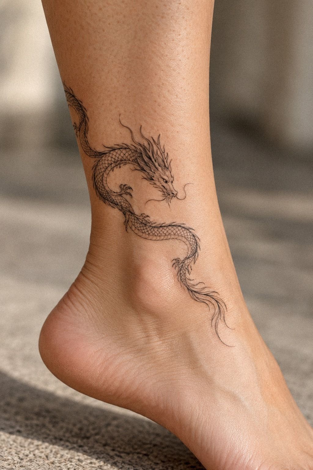
The biggest choice was whether to keep every line delicate or add a few bold black accents. I tested both options around the eye, claws, horns, and wing joints.
The fully delicate version looked elegant, but the face became difficult to read at a distance. The heavier version felt too loud for the private quality I wanted.
I chose a middle ground: a thin outer contour, selective black at the eye, and slightly stronger claws. That contrast gave the dragon a vibrant focal point without changing its personality. It also helped me avoid paying for unnecessary shading!
The answer wasn’t “more ink” or “less ink.” It was deciding where the eye should land. That kind of editing can protect the value of the appointment better than adding another decorative element.
A few fine line bird tattoo examples helped me study how small dark marks can suggest movement. I used that idea around the wing joints, where contrast mattered most.
How Contrast Changed the Dragon’s Personality
The dragon became more edgy when I darkened the eye and wing joints. Before that, the piece looked soft but slightly anonymous. A few sharper accents gave it a point of view.
I didn’t want every line to compete for attention. The selective black accents work because the surrounding lines stay quiet. That creates hierarchy without turning the design into dense blackwork.
My artist also showed me how a small change in line weight could make the head look masculine, feminine, or neutral. I chose a balanced expression because the dragon face needed to feel like mine, not like a preset character.
9Selecting a Unique Fine Line Dragon
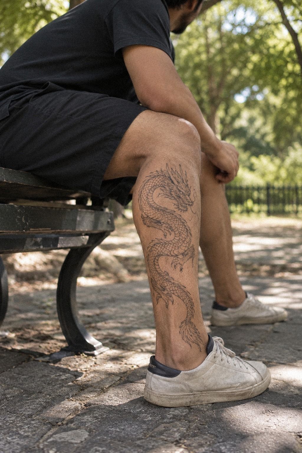
A unique fine line dragon didn’t come from adding more symbols. It came from changing the posture, head angle, and tail finish. I tilted the dragon’s face toward the body instead of looking outward, which made the piece feel private until someone came close.
The final design used a healed black line reference from the artist’s portfolio, not only a fresh appointment photo. You’ll want to ask how similar work looks after the surface settles. Fresh lines can appear darker and sharper than the healed result.
I rejected a popular open-mouth dragon because it felt too aggressive for my intention. The closed-mouth pose is more personal and quietly fierce.
It also gives the design a classic quality that won’t depend on a current trend. I preferred a small midnight-blue accent over a bright colored fill.
And if you’re collecting animal motifs, fine line butterfly tattoo references can help you compare posture and personality. Your dragon should still look like yours when the trend cycle moves on, which is why the right reference sheet is worth the cost.
10Before the Tattoo Session: What I Checked
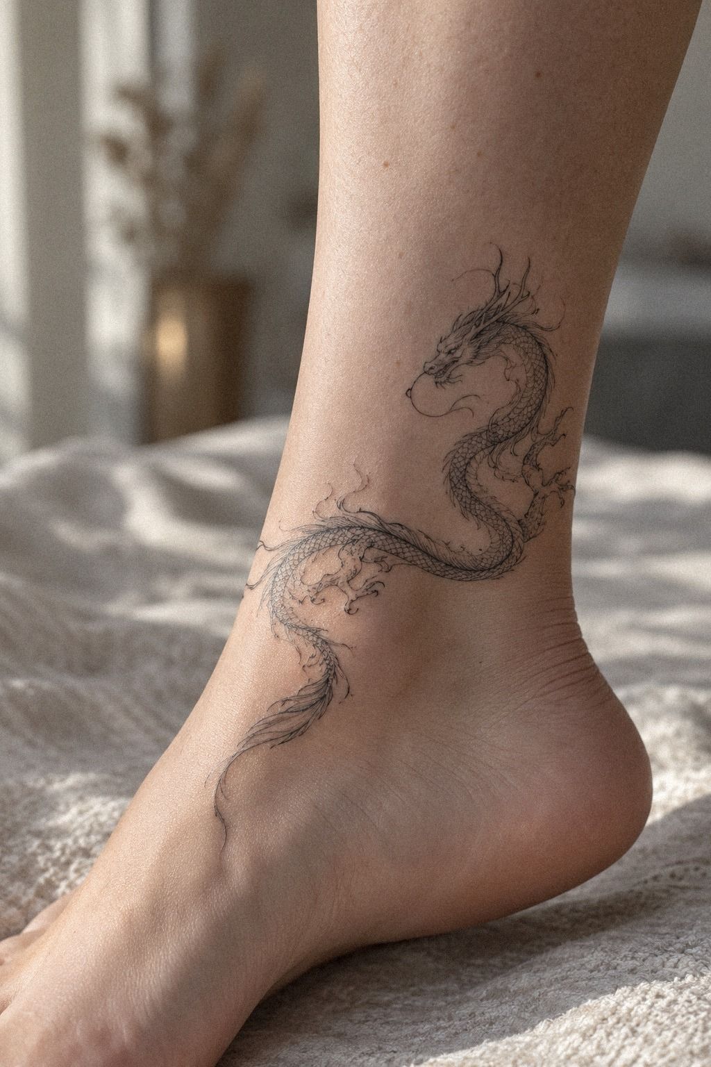
Before the appointment, I placed the white paper stencil beside a healed reference so I could see the difference between promise and reality. The fresh stencil looked crisp, while the healed side showed softer contrast and more natural texture.
I asked about placement, line weight, healing, and how the design might age. You’ll want direct answers before the session begins, especially if your piece includes very fine details. A clean portfolio should include healed work, not only dramatic day-one photographs.
The design took one short appointment, but the preparation took longer than I expected. I arrived with the approved placement, the reference confirmed, and the skin free from irritation. I didn’t want to make a rushed choice because the idea felt exciting that day.
The studio’s single-use needle cartridge and visible hygiene routine mattered as much as the drawing. I also reviewed fine line owl tattoos for healed-line examples before committing. Your artist’s process should make you feel informed, not pressured.
I chose a sage-and-cream accent plan that stayed crisp and restrained!
What I Asked Before Booking
I asked whether the artist had recent examples of fine line dragons, how they approached small scales, and what they recommended for my chosen placement. Those answers told me more than a dramatic social post.
I also asked about the shop minimum, the hourly rate, and whether a small change would alter the quote. A direct conversation makes it easier to compare value without pretending every artist prices work the same way.
The artist explained what could remain crisp and what might soften. I appreciated that honesty. A realistic consultation felt more empowering than being promised a flawless result.
11Protecting My Dragon During Healing
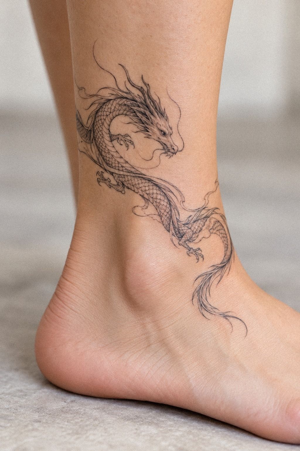
The first surface healing stage took about 2 to 3 weeks, while complete healing took roughly 2 to 3 months.
I followed the artist’s aftercare instructions, kept the area clean, and avoided picking at peeling skin. The terracotta and olive accents looked darker at first, then settled into a quieter tone as the surface healed.
How the Lines Settled After Healing
The healed dragon looks softer than it did on the first day. The settled fine lines still hold the face, wing, and tail, but the contrast is less dramatic.
That change was expected, though I didn’t fully understand it until I saw the tattoo in ordinary daylight. Fresh contrast can make a piece feel vibrant compared with its long-term appearance.
I’m glad I protected the negative space. The open areas give the design room to remain legible as the lines mature. That was one of the best decisions for the tattoo’s long-term readability.
How Much It Cost
I planned around a $300 ceiling because typical US pricing for a small fine line dragon often falls near $100 to $300. That isn’t a promise or a universal quote. Artist experience, region, placement, detail, and shop minimums can shift the final tattoo cost quickly.
I didn’t choose the cheapest option. My priority was a clean portfolio with healed examples, and I’d rather reduce the design than compromise on the artist. You can save money by simplifying the dragon, but you shouldn’t treat hygiene or drawing skill as optional.
For your own estimate, ask whether the shop charges a minimum or an hourly rate. A written appointment estimate helps you compare artists without assuming the lowest number means the best value. I also asked about touch-up policies before booking.
The part worth paying for was the artist’s judgment. My final design didn’t need extra shading, a larger size, or more symbols, and that restraint kept the cost within my planned range. If you’re comparing delicate animal designs, fine line snake tattoos can help you see how line density affects a quote.
Is This Fine Line Dragon Worth the Space?
I think it is, but only if you’re willing to respect the limits of fine line work. The style can look delicate, polished, and incredibly personal, yet it isn’t frozen in time. Lines may soften or widen, and placement affects how that change reads.
My preference is simple: choose a clear silhouette, protect negative space, and use solid black only where the eye needs direction. That approach feels more timeless than copying every detail from a dramatic flash image. You’ll get a more expressive piece when the design has room to breathe.
I’d skip a tiny dragon packed with scales, flames, stars, flowers, and lettering. It sounds meaningful, but the details compete and the body loses its shape. A serpentine curve with one distinctive face feels more powerful because you can recognize it quickly.
The cultural moment helps, too. Dragon imagery is classic, but today’s fine line artists are making it more feminine, masculine, sacred, or edgy depending on posture and placement. I’ve seen the same creature feel romantic on a rib and gritty on a forearm.
And that’s why I wouldn’t chase a viral reference exactly. Your skin, movement, pain tolerance, and reason for choosing the dragon all matter. If your idea needs another animal comparison, fine line eagle tattoos show how posture can carry meaning without extra decoration.
A Few Things Worth Answering
How much does a fine line dragon tattoo usually cost?
A small fine line dragon usually costs about $100 to $300 in the US, with shop minimums around $50 to $100 and hourly rates near $100 to $250. Your final quote depends on size, detail, placement, artist experience, and region, so ask before booking.
Are fine line dragon tattoos a good idea for a first tattoo?
Yes, they can be a good first tattoo if you choose a tolerable placement and a design with enough spacing. Clear linework makes a meaningful first piece easy to understand, while an artistic dragon gives you room to personalize the shape and symbolism.
How do I choose a tattoo artist for fine line dragon tattoos?
Review a portfolio with healed photos, consistent linework, and designs similar to yours. A specialist with strong hygiene practices protects both the result and your skin, so ask about needles, aftercare, touch-ups, and placement before you commit.
How much do fine line dragon tattoos hurt?
Pain varies by placement. Ribs, feet, hands, and sternum tend to feel more intense, while the forearm, thigh, and shoulder are often more tolerable. Your placement may matter more than the dragon itself, especially if the session includes sensitive or bony areas.
How long does a fine line dragon tattoo take to heal?
The surface usually heals in about 2 to 3 weeks, while complete healing takes around 2 to 3 months. Gentle washing and light moisturizing support healing, but your artist’s instructions should guide your routine.
What’s the best placement for fine line dragon tattoos?
The forearm, shoulder, thigh, ribs, and sternum can all work, depending on visibility and sensitivity. Uninterrupted skin helps delicate lines stay readable, while a covered area gives you more privacy when you want it.
Where I’d Start First
If I had to pick one, I’d start with the serpentine dragon on the shoulder blade. The curve follows movement, the wings have breathing room, and clothing can keep it private. Pin the idea for later, then check healed portfolios before you book.