Watercolor dragonfly tattoo ideas can stay delicate without disappearing, especially when placement and line weight work together. I once chose a tiny wrist design before thinking about friction, and it softened faster than expected. You’ll find cleaner ways to plan color, scale, pain, price, and healing here.
Quick answer: Start with a readable body, one dominant color, and a placement that suits your daily life. My strongest recommendation is a small inner-forearm or wrist design with a dark anchor and two transparent wing tones. It can feel personal, vibrant, and striking without becoming visually crowded.
- Shape the Small Wrist Design
- Let Jewel-Tone Wings Lead
- Is Behind the Ear Too Delicate?
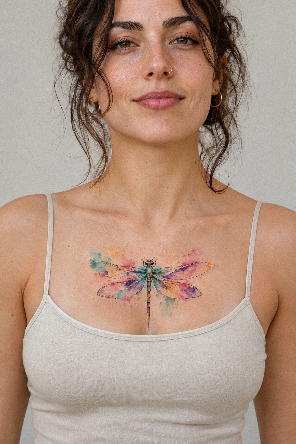
- Frame the Dragonfly With Botanical Accents
- Follow the Collarbone’s Natural Sweep
- Direct Abstract Ink Splashes
- Keep the Ankle Minimal
- Turn Birth Colors Into a Private Symbol
- Build an Ornate Shoulder-Blade Composition
- Preserve Moonlit Wing Details
- Set Realistic Expectations for a Finger Tattoo
1Shape the Small Wrist Design
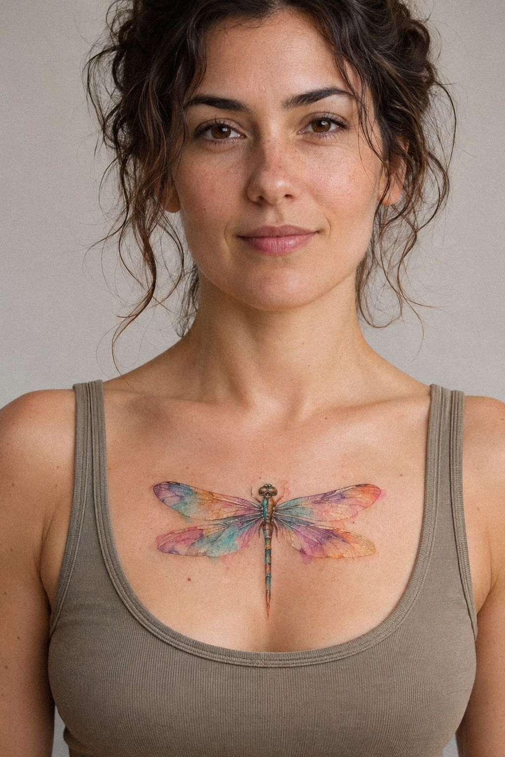
A small watercolor dragonfly tattoo on the wrist works best when the body follows the natural curve of your limb. A terracotta pigment wash with muted olive and stone-toned accents can keep the dragonfly recognizable without making the wings feel heavy. You’ll want the wings open enough to read from a glance, not squeezed into a tiny blur.
I’d keep this design around 1 to 1.5 inches if you’re after a quick session. It’s a delicate choice, but it isn’t fragile by default.
Ask your artist whether the antennae and wing veins can stay slightly thicker than a single whisper of ink. Those lines may soften as your skin ages.
The wrist gets rubbed by cuffs, watchbands, and sleeves, so you’re choosing visibility with a maintenance tradeoff. A vegan stencil paper transfer lets you preview the curve before the needle starts. If you’re comparing petite placements, look at these small dragonfly tattoo ideas for scale and spacing.
I made the mistake of treating every small tattoo as low-effort. It isn’t.
Your session may be short, but your aftercare routine still matters. Wash gently, moisturize lightly, and keep direct sun away while the surface heals over roughly two to three weeks.
The mood is understated and meaningful, with just enough vibrant color to make the wrist feel personal. If you’re nervous about pain, wrist sensitivity can be manageable for many people. Your artist’s pace and your own sensitivity matter more than a promise of zero discomfort.
2Let Jewel-Tone Wings Lead
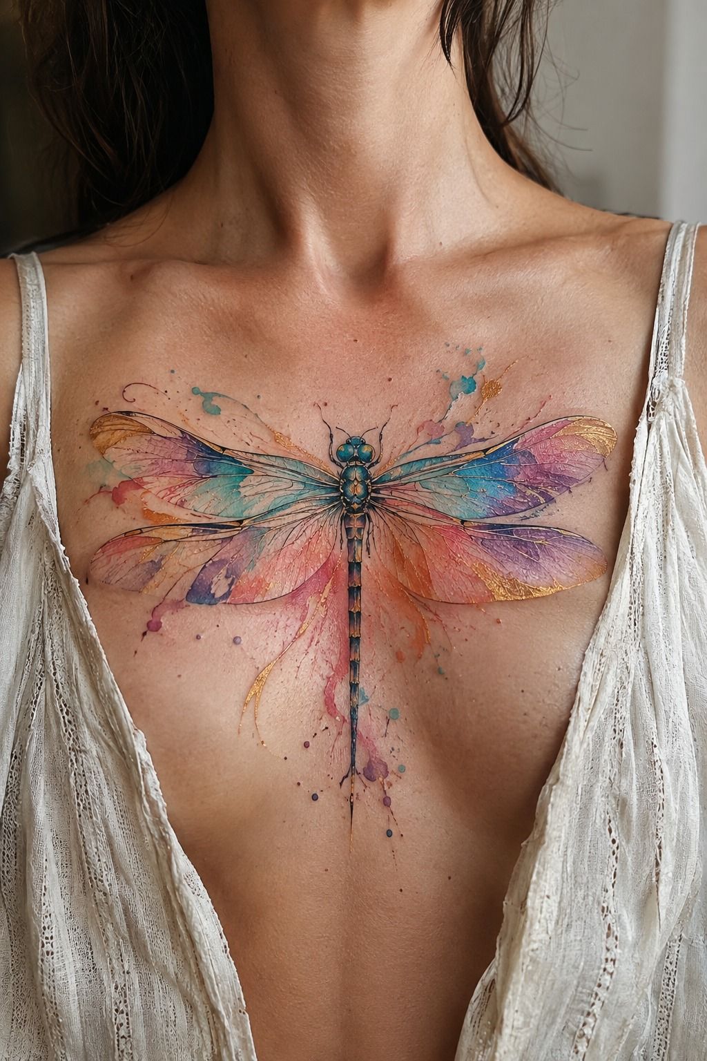
Jewel-tone wings give your watercolor dragonfly tattoo a richer, more striking direction. Clay and aged-gold pigment with soft cream gaps can create contrast without turning the design into a solid block. You’ll get a polished result when the color blooms stay separated across the wings.
I’d ask for a graceful body line and restrained saturation at the wing edges. The ribs can be a more intense placement, so you don’t want a long appointment packed with unnecessary shading. A sleek silhouette, two strong colors, and a few crisp veins can carry the whole idea.
The best version isn’t the one with every possible color. It’s the one where your artist chooses a dominant hue, then uses a second jewel shade as an accent. You could borrow the open spacing from this watercolor butterfly tattoo without copying its shape.
If you’re planning a rib tattoo, breathe normally and tell your artist when you need a pause. That sounds obvious, but people often tense their torso because they’re trying to be tough. You don’t have to prove anything during a session, and the design won’t improve because you stayed silent.
This look is bold but still polished. It’s empowering if the dragonfly represents movement or survival, and you’ll keep it more timeless by avoiding five competing pigments in one small set of wings. The strongest version may use a symbolic color pairing instead.
3Is Behind the Ear Too Delicate?

A fine-line watercolor dragonfly tattoo behind the ear is a sharp option when you want something discreet from the front and expressive from the side. The placement feels edgy and personal, but the available skin is limited, so I wouldn’t force a complicated miniature into it.
I’d choose a compact body, two open wings, and one plum, grey, and rose-gold palette. Behind the ear can be more sensitive than the forearm, and hair, headphones, and frequent washing may complicate the early healing period. Ask your artist how the stencil reads when you turn your head before committing.
This is one of the few placements where minimal usually wins. A dainty design with a strong silhouette can look more intentional than an intricate piece whose smallest marks merge after healing. I’d also ask to see healed work at a similar scale, not only fresh results.
4Frame the Dragonfly With Botanical Accents

Botanical accents make a watercolor dragonfly tattoo feel organic without burying the central subject. On golden tan skin, navy and warm-brown pigment can define the wings while pale accents keep the botanical details from becoming too dense. You’ll want the plants to support the dragonfly, not compete with it.
I’d choose one botanical language and stick to it. A few narrow leaves create a flowing border; a crowded cluster makes the design read like a generic floral tattoo with a dragonfly added later. The most graceful version leaves open skin around the wings and lets the dragonfly’s curve do the visual work.
Ask whether the artist uses a sterile transfer gel and a healed portfolio for botanical watercolor pieces. Fresh results show color, but healed results show whether the leaves stay distinct. You can also compare the lighter movement in these watercolor fine-line butterfly designs before you settle on your plant shapes.
Your placement changes the composition. A wrist version can wrap slightly; an inner forearm version can stretch into a longer stem. If you’re choosing the wrist, keep the lowest leaf away from the crease so repeated bending doesn’t put every detail in a high-friction fold.
This idea is elegant, symbolic, and quietly romantic. I’d skip an oversized botanical frame for a first watercolor session, because it adds time and discomfort without giving the dragonfly more meaning. A restrained sprig will keep the tattoo readable!

5Follow the Collarbone’s Natural Sweep

A unique watercolor dragonfly tattoo along the collarbone starts as a drawing problem before it becomes a placement problem. An emerald-and-gold color sketch lets you compare hand-drawn proportions and cream accents before choosing your final version.
You’ll want the dragonfly to follow the collarbone’s natural sweep, not sit like a sticker across it. A slightly angled body looks more flowing, while perfectly horizontal wings can feel stiff. Ask your artist to stencil the design and let you move your shoulder before anything permanent begins.
I’d choose one concept from the sheet, then remove at least one decorative detail. Flash art is generous with flourishes, but skin needs breathing room. If you like several related sketches, save the rest for another appointment and browse these watercolor moth tattoo references for unusual wing structures.
The collarbone can feel sharp and exposed, particularly near the center. You’re allowed to ask for breaks, and you should avoid tight straps while the surface settles. A thin cotton gauze cover may be recommended by your artist, but follow their aftercare instructions rather than improvising with household materials.
This design feels iconic, vintage, and expressive because it carries the romance of handmade flash art. It’s also more personal than copying a viral design. Pick the drawing that still feels right after you’ve looked at it for a week, not the one that wins in the first five seconds.
6Direct Abstract Ink Splashes
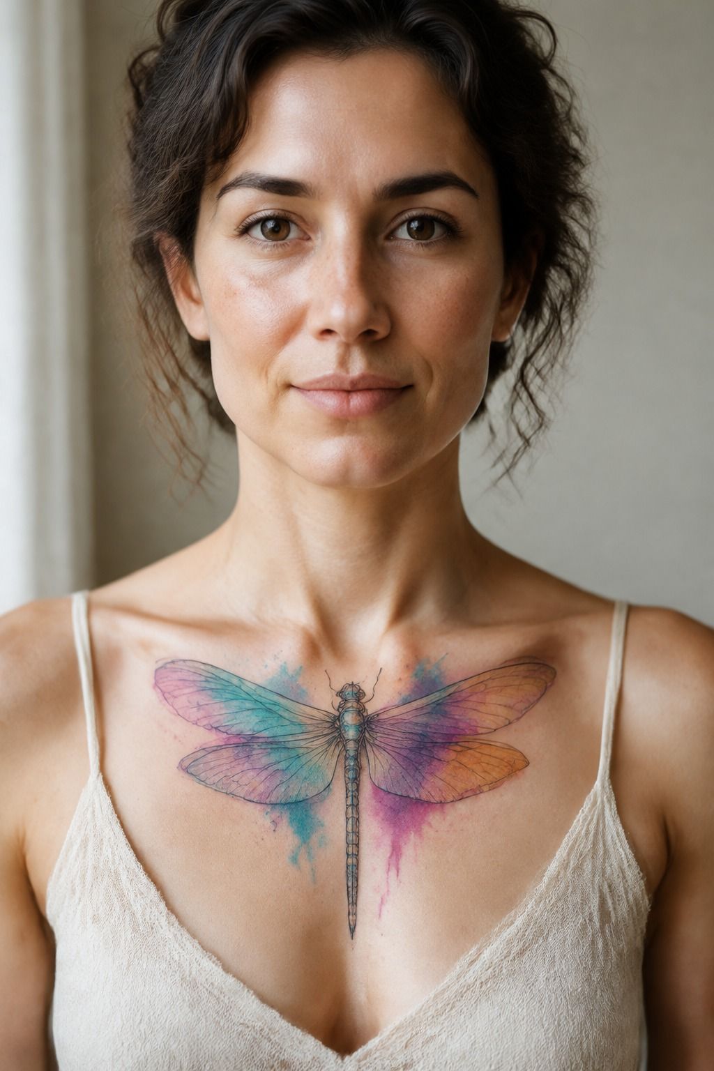
Abstract splashes can make your watercolor dragonfly tattoo feel raw and daring, especially against deep ebony skin. The inner forearm gives the design flexibility, while forest-green and rust pigment can create a clear edge around the dragonfly’s body. You’ll want contrast planned on skin, not guessed from white paper.
I’d ask your artist to keep the splashes directional. A few tapered marks that follow the wings will feel intentional; random dots scattered around the design can look unfinished. The dragonfly should remain the first thing your eye sees, with the abstract color acting like motion behind it.
If you’re concerned about color visibility, choose an artist who shows healed work across a range of skin tones. Fresh saturation can be misleading. You’ll learn more from a healed portfolio than from a flawless new result.
Your artist may use a stronger black or deep green anchor for the body. That isn’t a failure of the watercolor effect. It’s a practical way to preserve structure as softer pigment settles.
I wouldn’t request pale linework alone here, because it can lose definition faster than a firm dark outline.
The finished feeling is gritty, vibrant, and powerful. It’s a good choice if your symbolism involves change, but you’ll want the splash pattern to have a boundary. Controlled irregularity looks expressive; unlimited irregularity just asks your skin to solve the composition later.
7Keep the Ankle Minimal
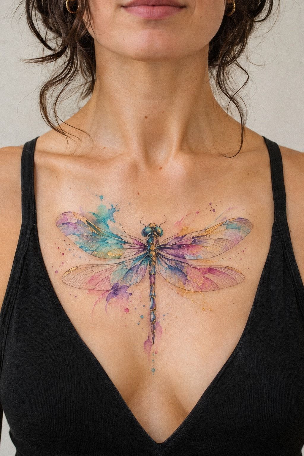
A minimal watercolor dragonfly tattoo on the ankle works when every mark has a job. I’d choose a charcoal body with dusty-rose and brass-toned wings rather than trying to fit a complete botanical scene into a high-friction placement.
Ankle skin meets socks, shoes, and movement every day. That makes this a stylish but demanding choice, especially if you walk or train often. Keep the design slightly above the shoe line when possible, and ask your artist how much space the wings need to remain readable after healing.
The strongest ankle version feels understated rather than unfinished. A tiny, feminine dragonfly can be romantic and meaningful, while a sharper body and darker wings can make the same placement feel more masculine or fierce.
8Turn Birth Colors Into a Private Symbol
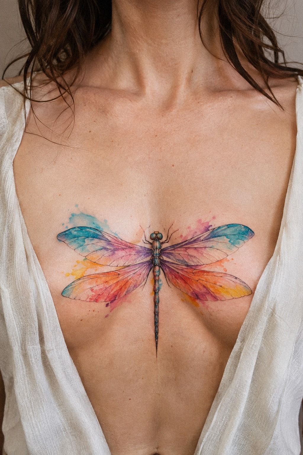
Birth colors can give your watercolor dragonfly tattoo a meaningful starting point without forcing a literal birthstone into the design. Warm-white and camel washes with black accents can sit inside transparent wings while the body remains dark enough to hold the form.
You’ll want to decide whether the colors represent your birth month, a loved one, or a private memory. That choice changes the emotional weight. I’d avoid adding every related hue just because it’s available; two colors with a small neutral gap usually look more intentional than a full spectrum.
Your artist can test the balance with a printed stencil and a small color study. If you’re unsure, ask for the wing pair to mirror each other loosely rather than exactly. Watercolor looks more natural when the pigment has movement, but the overall design still needs a clear center.
I’d also think about how the tattoo will age. Very fine lines can widen over time, and UV exposure can fade color, so you’ll need sunscreen once the tattoo is fully healed. A broad-spectrum SPF 30 or higher is a sensible long-term habit, not a substitute for proper healing.
This version feels personal, sacred, and empowering. It gives you a story that other people won’t automatically understand, which can be a strength. If you’re choosing between a birth-color tattoo and a random palette, I’d pick the one that still means something when the trend changes!
9Build an Ornate Shoulder-Blade Composition
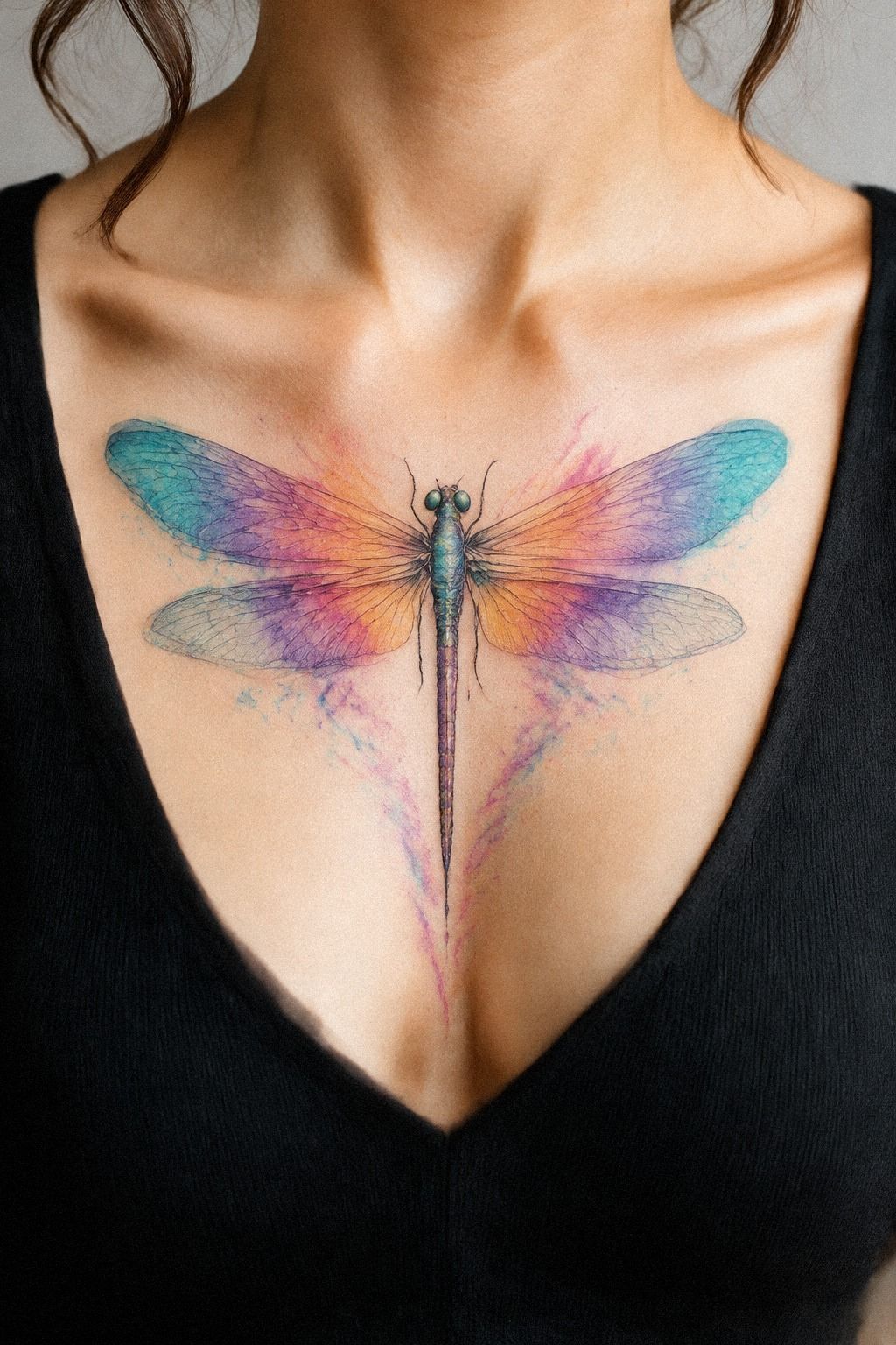
An ornate watercolor dragonfly tattoo across the shoulder blade gives you enough surface for layered wings, a curling body, and a more dramatic composition. On medium olive skin, midnight-blue pigment can anchor the design while copper and ivory areas keep the wings vibrant.
You’ll want to plan this from the shoulder’s movement, not only from a flat sketch. The design can look wider when your arm is relaxed and narrower when you reach forward. Ask for a stencil in several positions, because your shoulder blade changes shape as you move.
This is where a larger tattoo can make sense. A piece around 3 to 5 inches may give the wing veins enough space to stay legible, though your artist should set the final scale. I’d skip packing too many tiny dots into the outer wings; untouched skin will keep the ornate details from becoming noise.
You can also ask whether the session will be split, since a longer appointment can make both your skin and your concentration tired. I’d rather return for a second session than rush a complex composition while trying to appear fearless.
The shoulder blade gives the tattoo a confident, masculine or feminine feel depending on the drawing, not the placement. It can be haunting, classic, and stylish at once. You’ll get the strongest result when the ornament follows the body instead of trying to flatten it.
10Preserve Moonlit Wing Details
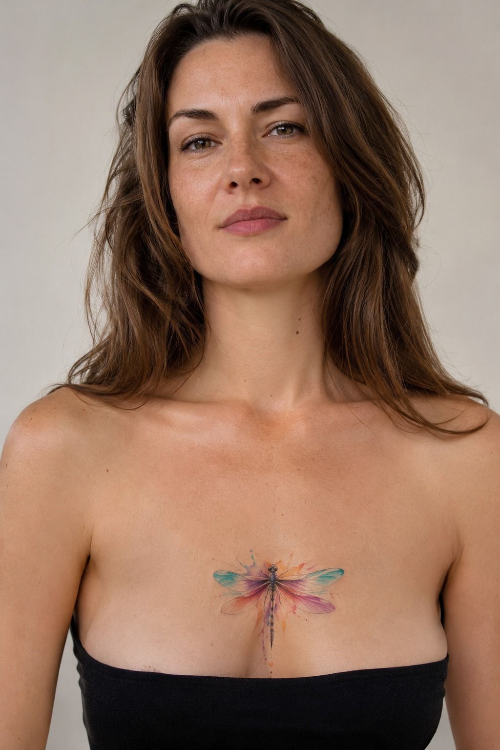
Moonlit wing details give your watercolor dragonfly tattoo a quieter, more ethereal direction. Sage-green and warm-cream pigment needs to be planned before color is added, because pale highlights can disappear when they’re treated as an afterthought.
Your artist should be able to explain which parts will remain skin and which parts will receive pigment. I’d keep the warm highlights crisp rather than filling every wing with pale white ink, since negative space usually stays more natural as the tattoo settles.
This is a smart consultation format if you’re undecided. Bring your reference, then ask for a stencil on your chosen placement. You’ll notice whether the wings feel too wide, whether the body points in the right direction, and whether the design still reads from a normal distance.
The mood is graceful, romantic, and haunting without becoming gloomy. It’s a playful choice for someone who likes symbolism with a little mystery. You’ll keep it polished by limiting the moon details to a few clear accents.
11Set Realistic Expectations for a Finger Tattoo
A tiny watercolor dragonfly tattoo on the finger can look playful and personal, but it needs realistic expectations. Finger skin moves constantly, meets friction, and may hold delicate color less reliably than a more protected placement.
I’d choose a terracotta body with olive and stone-toned wing details here. A dainty, intricate design may look beautiful on the stencil and then soften quickly once daily washing, work, and sunlight enter the picture. Ask your artist whether a future touch-up is likely before you treat the finger as a one-and-done choice.
Pain can also feel sharper on the finger than the size suggests. I wouldn’t book it simply because the tattoo is tiny. The appointment may be brief, but the placement is less forgiving, and a small correction can change the entire silhouette.
The Design Rule I Keep
I’ve come to trust watercolor tattoos that use color as atmosphere and dark structure as an anchor. The most delicate design still needs a readable body, a sensible placement, and enough breathing space around the wings. If I’m choosing between a pale, complicated miniature and a slightly simpler tattoo with a crisp silhouette, I’ll take the second one every time.
My own bad decision was booking a fine-line piece after looking only at fresh results. It looked intricate on day one, but I hadn’t asked how it healed or how much sun the placement received.
That experience changed my consult questions. Now I ask for healed examples, the expected session length, the artist’s preferred aftercare, and a clear explanation of which details may soften.
The best watercolor dragonfly tattoo isn’t automatically the most colorful. Sometimes the strongest choice is one deep body, two transparent wing tones, and a small patch of untouched skin.
That combination can feel expressive without becoming noisy. You’ll also want to think about how the design fits your life, especially if your work, sport, or clothing creates friction at the chosen site.
For proportion ideas, I’d compare the clean silhouettes in these small moth tattoo designs with the compact dragonflies in this small dragonfly tattoo guide. The point is balance, not imitation.
Make the Color Earn Its Place
A striking color plan usually has one dominant hue, one supporting shade, and enough skin left visible to separate them. The dominant pigment should support the dragonfly’s symbolism, not compete with its body.
I’d rather see two meaningful colors than six fashionable ones. A limited palette can feel bold, elegant, and timeless when the contrast is deliberate. The value is clearest after healing, when the tattoo has settled into its real texture.
If you’re unsure whether a color choice is worth it, ask your artist to explain how it behaves on your skin tone. A healed portfolio is more useful than a fresh sample. You can also compare wing movement in these watercolor fine-line butterfly designs before making a final decision.
What Should You Ask Before Booking?
Ask how long the session should take, whether the quoted price includes drawing time, and what happens if the stencil needs changes. The written quote should be clear enough that you understand the expected cost before the appointment.
I’d also ask to see healed work, especially if you want delicate color or fine lines. The artist’s value isn’t limited to a fresh result. It includes judgment about scale, placement, pigment, and aftercare.
Finally, ask what their deposit policy is and whether touch-up guidance is included. That conversation may feel practical, but it protects your budget and helps you choose a studio with a polished, professional process.
Compare Cost With Long-Term Value
Cost matters, but I don’t think the lowest quote should decide this style. A tattoo artist who understands color placement, healed linework, and your skin tone is worth more than a rushed appointment. Before you book, compare the full tattoo budget rather than focusing only on the hourly number.
Here are the planning numbers I’d keep in front of you. They’re useful as a starting point, not a promise of what your artist will charge:
You’re not buying a color palette. You’re choosing a piece that will live through movement, weather, daily life, and ordinary years.
That’s why my favorite designs are meaningful, sharp, and practical at the same time. Paying for sound judgment can be better value than saving a little on the initial price!
The Longevity Rule I Follow for Watercolor Dragonflies
Sun, friction, and skin movement all influence how delicate color settles. Full-spectrum sun protection becomes especially useful after the tattoo has completely healed, while careful aftercare matters during the first several weeks.
I’d avoid judging the final result too early. The surface may look settled after two to three weeks, but complete healing can take around two to three months. Your artist’s instructions should guide washing, moisturizing, and when to resume soaking or swimming.
Finger, ankle, and wrist tattoos may need more maintenance than protected placements. That doesn’t make them a bad idea, but it should factor into your value calculation. A meaningful tattoo can still be a practical choice when you understand the tradeoff.
If you’re comparing a dragonfly with another delicate insect, this watercolor moth tattoo guide offers useful symbolism and scale questions. I’d use it for inspiration, not as a template to copy.
What People Always Want to Know
Where can I buy a watercolor dragonfly tattoo design?
I’d commission a design from a tattoo artist or bring references to a licensed studio rather than buy a generic file. A custom consultation lets the artist adjust scale, placement, and color for your skin and gives you a chance to approve the stencil before the session.
How much does a watercolor dragonfly tattoo usually cost?
I’d budget around $50 to $100 for a shop minimum and roughly $100 to $250 per hour, depending on the artist and region. Your final price may also include drawing time, a deposit, and a planned touch-up review, so ask for those details in writing.
Are watercolor dragonfly tattoos a good idea for a first tattoo?
I think they can be, especially with a readable silhouette and a tolerable placement. A clear silhouette makes the process easier to understand, while the inner forearm, outer arm, or shoulder may feel more manageable than ribs, fingers, feet, or sternum.
How do I choose a tattoo artist for watercolor dragonfly tattoos?
I’d look for healed photographs, clean linework, color work on skin tones similar to yours, and clear communication about deposits and aftercare. A healed portfolio tells me more than a polished fresh result because it shows how the artist’s judgment holds up over time.
How much do watercolor dragonfly tattoos hurt?
Pain varies, but I’d expect ribs, feet, hands, and sternum to feel more intense than the forearm, thigh, or shoulder. Your placement matters more than the word watercolor. Tell your artist when you need a pause, and don’t treat discomfort as a test you have to pass.
How long does a watercolor dragonfly tattoo take to heal?
I’d expect the surface to heal in about two to three weeks, with complete healing taking around two to three months. Gentle washing and light moisturizing support the process, while soaking, swimming, and direct sun should wait until your artist says the surface is ready.
What’s the best placement for a watercolor dragonfly tattoo?
I’d start with the inner forearm or outer shoulder because both offer visibility, workable skin, and generally more tolerance than ribs or fingers. Your best placement balances meaning, friction, sun exposure, and the amount of detail your chosen size can hold.
Where I’d Start First
If I had to pick one, I’d start with a small watercolor dragonfly on the inner forearm rather than the wrist. You still get visibility and a quick conversation, but the skin usually gives the wings more room to breathe and the placement avoids some daily watchband friction.
My concrete recommendation is simple: ask for a dark, readable body, two transparent wing colors, and a stencil you can wear through a few movements before booking. If the dragonfly still feels right after that pause, you’ve probably found the design worth keeping. That small test is my favorite upgrade because it protects both the meaning and the longevity of the tattoo.