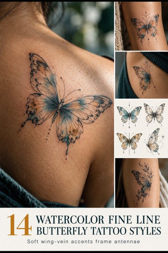
A watercolor fine line butterfly tattoo works best when shape, color, placement, and private meaning develop together. The strongest designs feel personal before anyone else knows the story. Start with the symbol, then let every mark earn its place.
Start With the Meaning, Not the Reference
Write one sentence about what the butterfly represents. Your answer might involve recovery, freedom, grief, transformation, or the version of you who became more self-assured.
A personal symbol does not need to be obvious. It can remain hidden in the wing pattern, a small color choice, or the direction of the butterfly’s body.
Your private sentence gives the artist a meaningful direction instead of a collection of disconnected details. It also helps you decide what to remove when the design starts becoming too ornate.
The most meaningful butterfly is not necessarily the most detailed. Sometimes one open wing, a quiet gap, or a single color carries more emotional weight than an entire symbolic vocabulary.
Set a Realistic Budget Before You Book
Small does not always mean inexpensive. A realistic tattoo budget should account for the studio minimum, consultation, color work, placement, and the artist’s experience.
Some studios charge a minimum even for a tiny design. Experienced artists may also charge more because delicate linework and controlled watercolor require careful judgment, not simply less time.
Ask for a written quote before booking. The best value is not always the lowest price. It is the result you will still feel proud to wear after the initial excitement fades.
A polished portfolio can make a style look effortless, but ask what the artist charges for a design of your size and complexity. Budget conversations are easier before the appointment is scheduled.
Healing and aftercare should also be part of the calculation. You may need fragrance-free lotion, time away from swimming, and a later touch-up if the artist recommends one.
- Begin With a Small Watercolor Butterfly
- Choose Wing Details That Earn Their Place
- Add Watercolor Accents With Intention
- Place the Butterfly Where Its Meaning Can Live
- Keep Fine Line Outlines Clear
- Let Placement Change the Mood
- Match Flowing Wings to Your Anatomy
- Make a Bold Color Choice Without Losing the Line
- Choose a Unique Idea for the Right Reason
- Compare Fine Line and Full Color Carefully
- Prepare for Watercolor Fine Line Healing
- Protect the Color Once Healed
- Keep the Butterfly Readable From a Distance
- Give the Meaning a Clear Center
1Begin With a Small Watercolor Butterfly
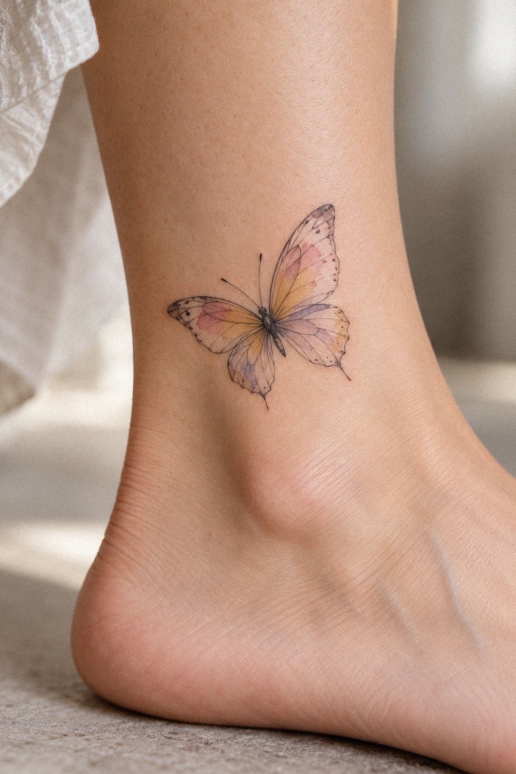
Start with the butterfly’s silhouette, not the pigment. Decide whether you want open wings, a narrow body, and enough negative space for each vein to remain readable.
A small butterfly silhouette can feel delicate on the sternum, wrist, or forearm when the design is allowed to breathe. Shrinking every detail into the smallest possible size usually creates more problems than it solves.
If you are comparing smaller references, browse these tiny fine line butterfly tattoo ideas and note which shapes remain clear at your preferred scale.
I would begin with a single-needle outline only if the artist has healed examples in that style. Fine lines are not automatically better because they are thinner. They must still suit your anatomy, placement, and color plan.
A minimal outline can look crisp and understated, while a slightly stronger contour may help the butterfly remain legible after the watercolor softens.
Your first draft should establish the body, wing span, and main direction. There is no need to force perfect symmetry if a small difference gives the design a more expressive character.
The butterfly can be romantic without looking sentimental. It can be personal without explaining itself.
Ask Better Questions at the Consultation
Bring a short consultation question list so the conversation stays practical. Ask how the artist would simplify the design at your chosen size, which lines they consider essential, and where they expect the color to settle.
Request healed examples of fine line work and watercolor accents. Fresh work can look exceptionally sharp, while healed work reveals how the artist handles spacing, saturation, and softening.
Ask about color longevity, touch-up pricing, placement changes, and whether the design will still read from a normal distance. Those answers tell you more than a follower count.
You should also ask whether the artist would change the wing width, body length, or color balance for your skin. A strong artist can explain each adjustment clearly.
2Choose Wing Details That Earn Their Place
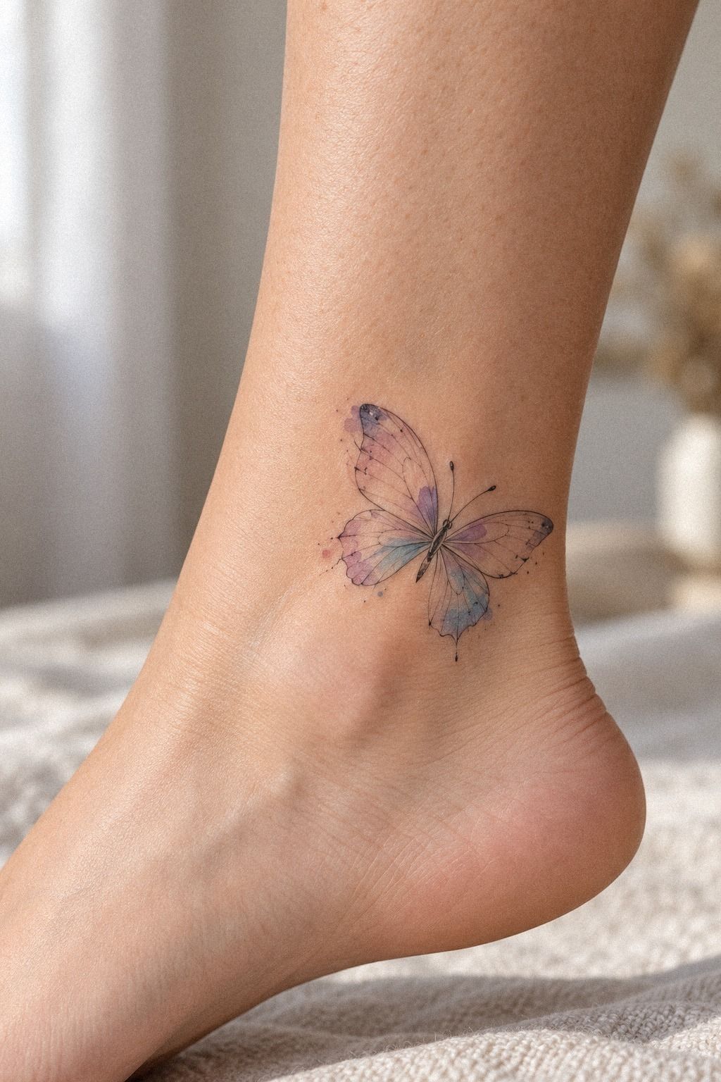
Once the silhouette works, select only the wing details that support it. Intricate wing patterning can be expressive, but every vein competes for attention.
I would keep one dominant structure and let smaller lines become secondary. Compare these fine line butterfly references with your sketch, then ask which details remain readable at arm’s length.
The most delicate wing veins need enough separation to survive normal skin movement and gradual softening. If two marks nearly touch, one may be unnecessary.
You can give each side a slightly different rhythm. One wing might carry more pattern while the other stays minimal. That asymmetry can feel daring without turning the design into visual noise.
A balanced wing structure does not require identical decoration. It requires a clear visual center so the butterfly still reads as one graceful form.
If your private meaning involves change, a slightly uneven pattern may feel more honest than a rigidly mirrored one. The design can be raw without appearing unfinished.
3Add Watercolor Accents With Intention
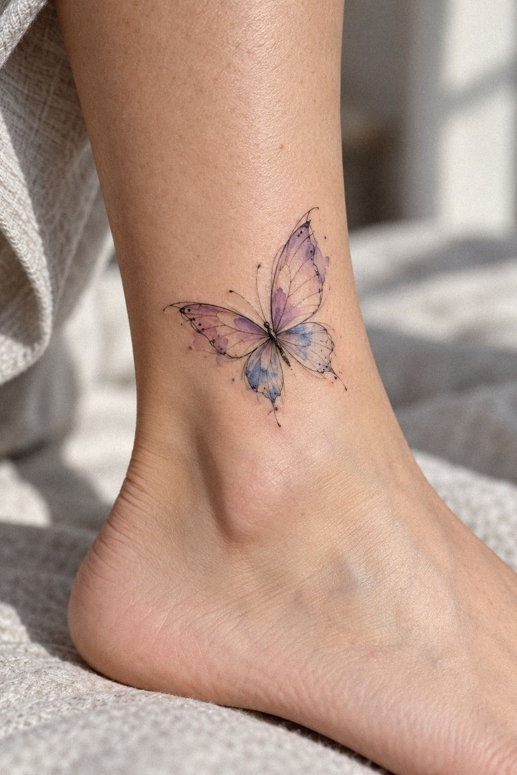
Color should arrive after the linework has earned its place. Vibrant watercolor pigment can look gorgeous, but the artist should consider your undertone before promising a specific result.
A simple palette usually has one dominant shade, one neighboring shade, and one small interruption that carries your meaning. Plum with a grey transition and a small rose-gold accent may feel haunting, while a restrained color shift can feel playful.
Study these watercolor butterfly tattoo examples before making a final choice. I would skip a rainbow palette unless every shade has a reason.
A single-color accent may carry more emotional weight than six competing shades. It can make the tattoo feel sleek, intentional, and easier to read.
Ask whether the color should remain inside the contour or brush slightly past it. The first option looks crisp and graphic. The second feels softer and more ethereal.
Watercolor does not mean the design should look vague. A clear focal point keeps the butterfly recognizable while the pigment adds movement around it.
The color can be bold without overwhelming the symbolism. One vivid interruption may be more powerful than an entire spectrum.
Check Color Against Your Skin
A color plan should be tested against your skin tone, not judged only on a screen. Skin-tone matching matters because a pale wash may look subtle on one person and nearly disappear on another.
Ask to see healed work on an undertone close to yours. The artist should be able to explain how saturation, contrast, and line weight will work together.
Do not treat a darker pigment as automatically better. The right choice is the one that keeps the wing structure visible and still feels personal after the surface softness fades.
A rich blue wash may look elegant on one complexion and muted on another. Your artist’s experience matters more than a saved reference made under different lighting.
4Place the Butterfly Where Its Meaning Can Live
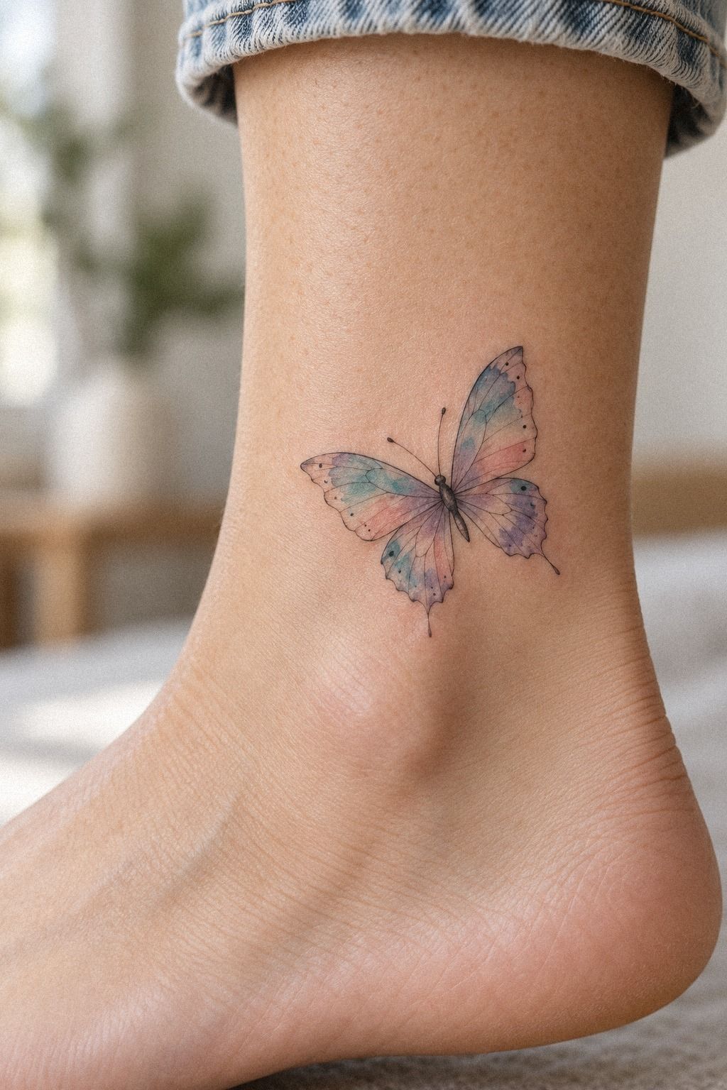
A wrist placement keeps the butterfly visible during ordinary moments. That can give the symbol a steady presence without making it feel like a public announcement.
The wrist placement should follow the natural direction of your arm instead of forcing the butterfly into a perfectly horizontal position.
Bend, turn, and relax your hand before the stencil is applied. A design that looks centered with your arm flat may tilt as soon as you move.
Fine line work in areas exposed to friction needs thoughtful spacing. Compare the wrist with these small fine line butterfly tattoo references and notice how scale changes the amount of detail you can keep.
Your wrist receives more sunlight and daily washing than the sternum. That does not make it a poor choice, but you should be comfortable protecting it once healed.
A dainty wrist tattoo can remain visible without becoming visually fragile. The key is leaving enough room between the body, veins, and outer contour.
If you want a feminine placement, the inner wrist may feel intimate and refined. If you prefer something more direct, the outer forearm gives the butterfly stronger visibility.
Resist shrinking the design until the wings become microscopic. Small and readable can coexist. Tiny and crowded usually cannot!
5Keep Fine Line Outlines Clear
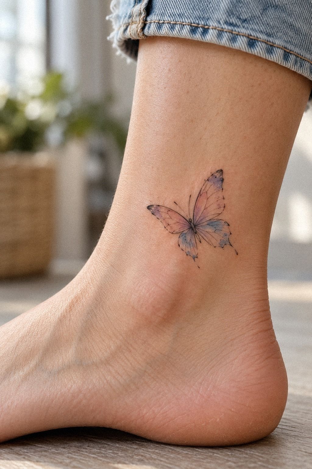
A flash sheet can help you compare line weights before committing. Crisp fine line work depends on spacing, skin movement, technique, and the artist’s judgment.
Ask to see healed outlines rather than relying only on fresh photographs. A line may look sharp on appointment day and soften as the skin settles.
Your best value comes from choosing an artist who knows when to simplify. Spending less on a design that needs correction later is rarely a bargain.
A sharp contour should support the watercolor instead of competing with it. If the outline is too heavy, the color may look trapped. If it is too faint, the butterfly may lose its structure.
This style needs restraint. Fine line watercolor is not a general instruction to make every tattoo thinner. It is a specific relationship between open space, delicate marks, and controlled pigment.
6Let Placement Change the Mood
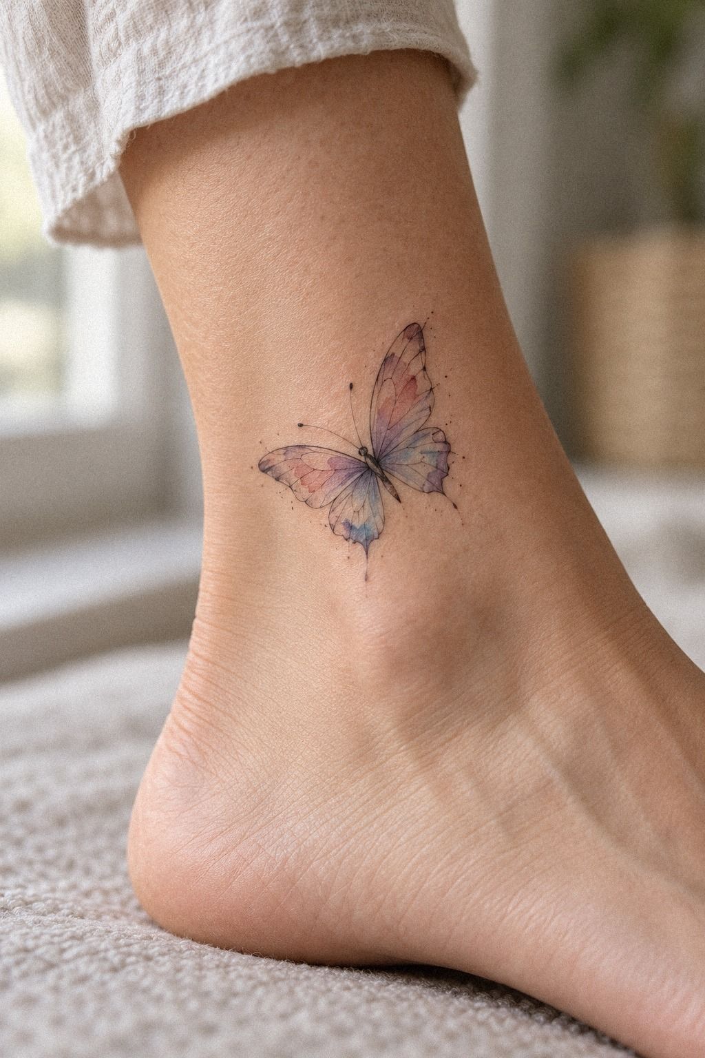
The same butterfly can feel graceful on the forearm, intimate near the sternum, or unexpected at the ankle. Placement mood should match how often you want the symbol visible.
A forearm can make the tattoo feel empowering and direct. A covered location can preserve a quieter, more sacred connection.
The upper arm gives the wings a little more room without demanding constant visibility. The ankle can feel playful and slightly unexpected, though friction from footwear deserves consideration.
A sacred placement does not have to be hidden forever. It simply means the tattoo’s visibility should serve your relationship with its meaning.
Think about how the butterfly will look while you stand, sit, bend, and move. The design should feel intentional in motion, not only when the body is held still.
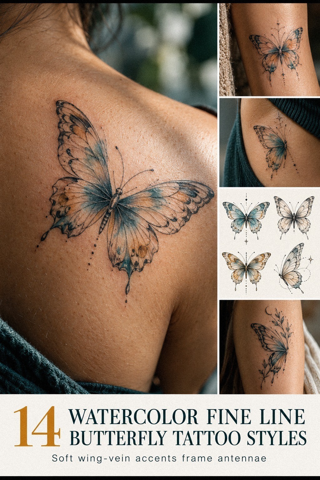
7Match Flowing Wings to Your Anatomy
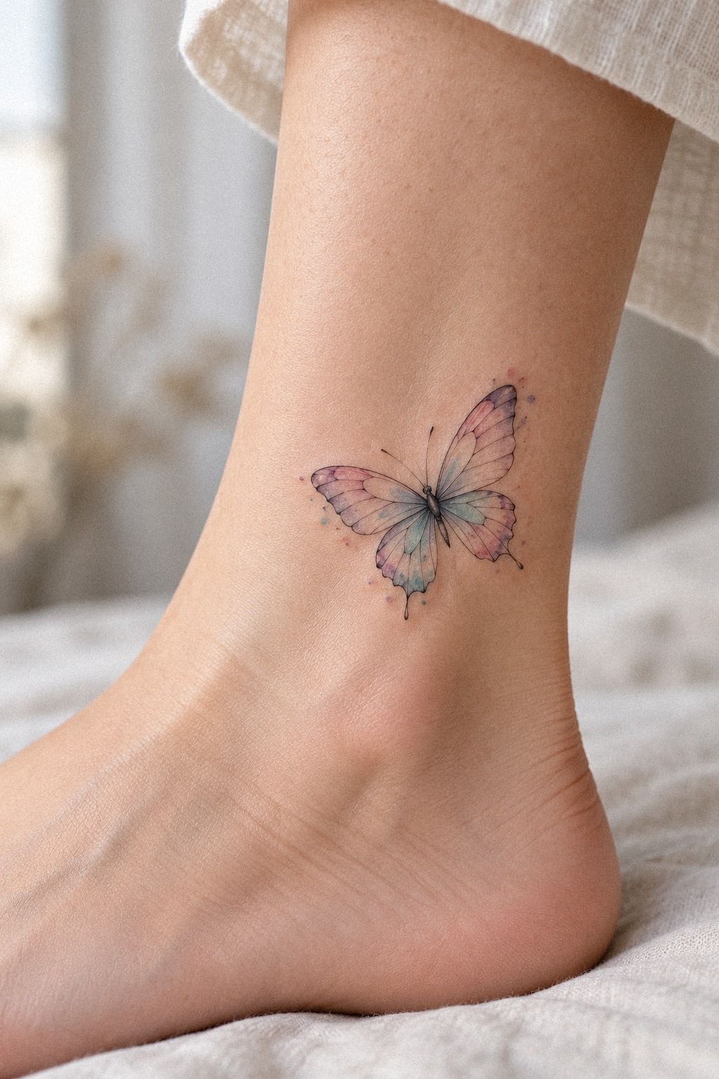
The calf gives a butterfly room to move vertically, especially when the body follows the leg’s natural line. Flowing wing placement should work with the curve of your body rather than fight it.
Ask your artist to check the design while you stand, sit, and relax the muscle. A stencil can look balanced in one position and compressed in another.
Longer body lines may suit the calf or thigh. A compact butterfly may feel more graceful on the wrist, ankle, or upper arm.
The goal is not perfect geometry from every angle. It is a design that feels intentional as your body moves.
A graceful body line can make the butterfly seem as if it is lifting, turning, or resting. That movement is especially useful when watercolor is part of the concept.
The anatomy should guide the design, not erase your idea. A skilled artist can preserve the essential symbol while adjusting the wings to your proportions.
8Make a Bold Color Choice Without Losing the Line
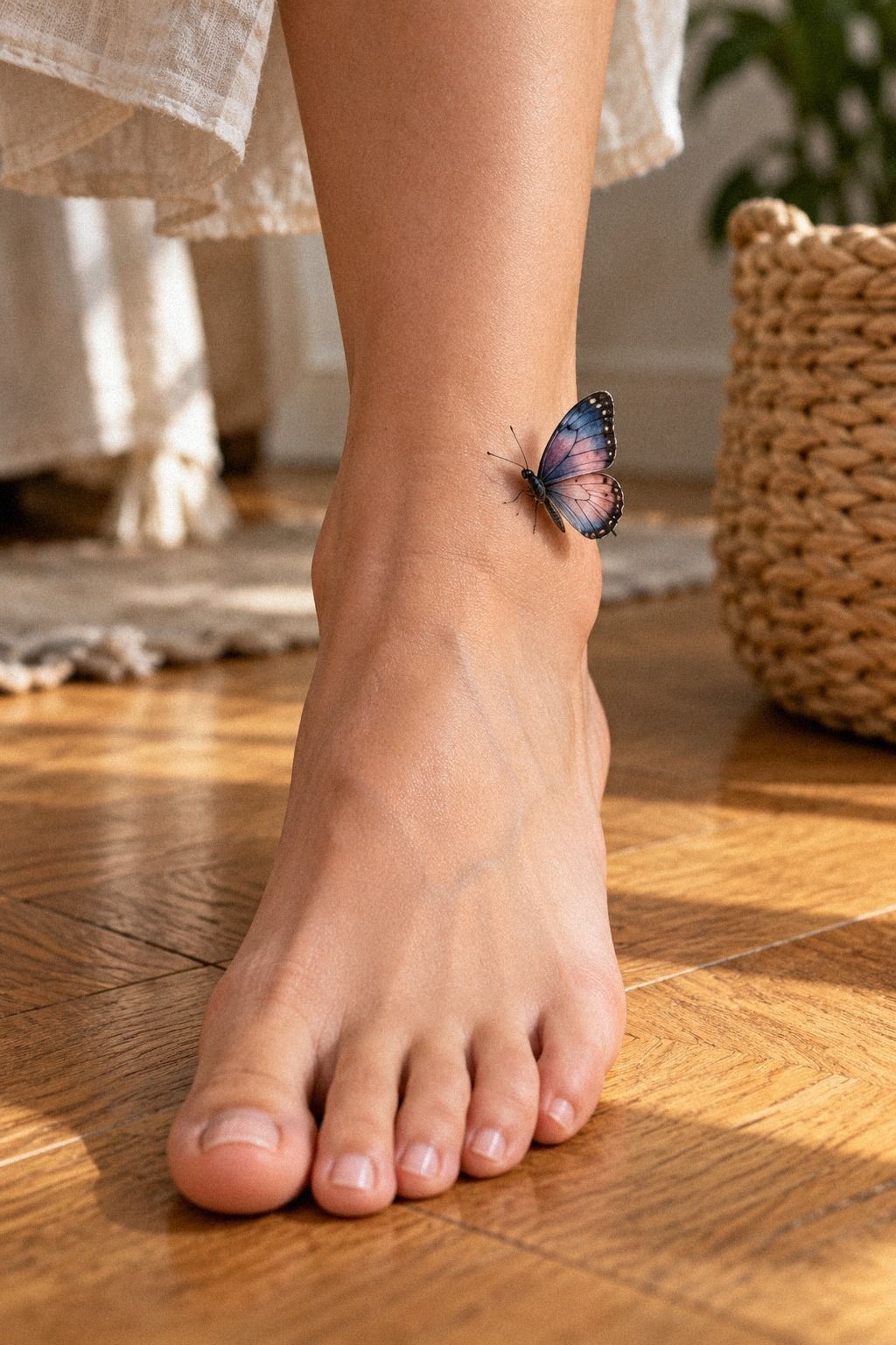
Minimal linework does not mean the tattoo has to look faint. Bold color contrast can give a small butterfly a stronger presence while the open linework keeps it light.
A black pigment accent around one wing edge may create drama without filling every section. A restrained wash can feel more edgy when the surrounding skin remains quiet.
Do not ask watercolor to solve a weak silhouette. Color can amplify a strong design, but it cannot replace spacing, proportion, or a readable body.
A minimal color plan is often easier to live with than a crowded palette. You can always discuss a future touch-up, but removing unnecessary color is not simple.
The best version of this style feels both vibrant and controlled. The eye should notice the butterfly first, then the color movement, then the private detail.
9Choose a Unique Idea for the Right Reason

An ankle placement can make the design feel intimate and slightly unexpected. Unique butterfly placement is valuable when it grows from your meaning rather than a need to appear different.
Look through these small butterfly tattoo references and mark the ideas that still appeal to you after the initial excitement fades.
A good test is simple: would you still choose the concept if nobody saw it online? If yes, it may be worth developing.
An iconic butterfly shape does not need to be copied exactly from a reference. Let the artist change the wing rhythm, body length, or color edge so the final tattoo belongs to you.
You can also hide a small personal detail in the pattern. A date, initial, petal shape, or private color association may matter more than a literal symbol.
The result can be whimsical or fierce, but it should not feel borrowed. Meaning gives originality more staying power than novelty alone.
10Compare Fine Line and Full Color Carefully
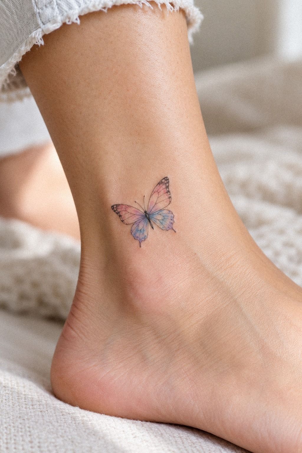
A fine line versus color comparison can clarify where your budget should go. Fine line may emphasize shape and negative space, while watercolor accents add movement and emotional intensity.
You do not have to choose maximum detail in both categories. A smaller budget may be better spent on a polished outline and one carefully chosen color than on a crowded palette.
Ask your artist which element will age most gracefully at your scale. The answer may be a slightly wider gap, a darker accent, or fewer veins.
A refined color balance can make the tattoo feel elegant without becoming overly formal. Watercolor should support the butterfly’s identity, not hide it.
If you prefer a more understated result, keep the pigment close to one wing or the lower body. If you want something more expressive, let the wash move beyond the contour in a controlled way.
11Prepare for Watercolor Fine Line Healing
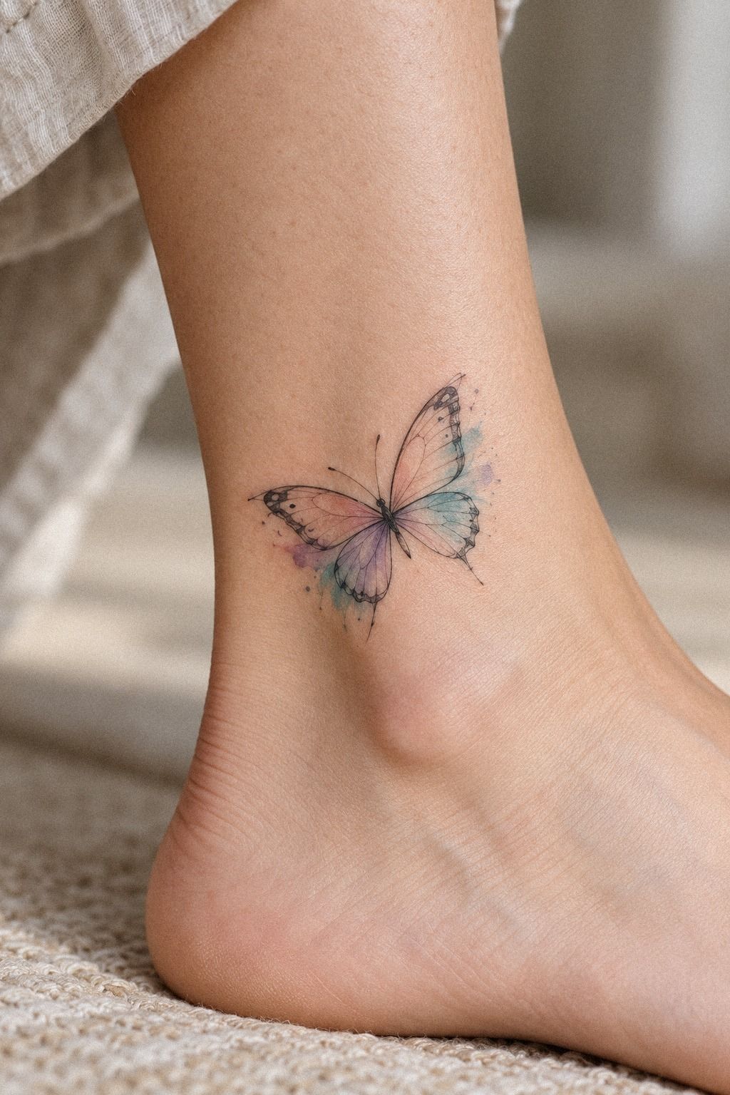
Fresh tattoos can look darker, sharper, and more saturated than the healed result. Graceful healing requires patience rather than constant checking.
The outer layer usually heals in about two to three weeks, while deeper recovery can take about two to three months. Follow your artist’s instructions, wash gently, moisturize as directed, and avoid swimming while the skin recovers.
A fragrance-free lotion is often easier to tolerate than a heavily scented product, but your artist should give guidance for your skin.
You may see flaking, dullness, or temporary unevenness. That can feel alarming when the watercolor appears muted, but picking or applying random products can create more trouble.
Aftercare is part of the tattoo’s value. A beautiful appointment cannot compensate for careless healing.
A careful healing routine protects the fine gaps that make this style readable. It also gives the pigment time to settle before you judge the final result.
12Protect the Color Once Healed
Once healed, sun protection becomes one of the easiest ways to preserve contrast. Use sunscreen on exposed skin and reapply when you spend extended time outdoors.
Do not assume that one touch-up will solve every change. Skin, technique, placement, and exposure all affect how a tattoo settles.
If the artist explains realistic aging before you book, you can make a clearer decision about the long-term cost and care.
A timeless color choice is not necessarily the palest or darkest option. It is the one that still feels connected to your meaning when the initial brightness becomes softer.
Watercolor may lose some intensity over time, especially in exposed areas. That is normal. The goal is to begin with enough structure that the butterfly remains recognizable as the pigment changes.
13Keep the Butterfly Readable From a Distance
A visible forearm butterfly should read clearly at a normal distance while rewarding a closer look. Striking watercolor ink needs a strong focal point, not endless detail.
Keep the main contour clear, protect the color from UV exposure, and choose an artist whose healed work looks as good as their fresh work.
A healed tattoo example tells you more than a bright appointment-day result. Ask when it was taken and whether the artist can show similar skin tones and comparable line weights.
If a touch-up is eventually needed, that does not mean the original tattoo failed. Skin changes, lines soften, and color settles differently from person to person.
Do not overwork the design at the start. A bold focal point, refined outline, and personal color decision can remain expressive without losing its edge. Yes, really!
14Give the Meaning a Clear Center
A sharp tattoo concept has a clear hierarchy. The eye should notice the butterfly first, the color second, and the private detail third.
If every part demands attention, the design loses its emotional center. Leave one area quiet so another can feel more powerful.
That balance is especially important when the tattoo is small. A simple edit can create more impact than another decorative mark.
Your private meaning may be haunting, joyful, protective, or quietly hopeful. The design does not need to announce which one.
A single empty section of wing can carry as much emotional force as a symbol. Negative space gives the viewer somewhere to pause.
The Editor’s Note: What I Would Decide Before the Appointment
I’ve changed my mind about butterfly tattoos more than once. At first, I thought the strongest design needed the most detail, the richest color, and the clearest symbolism. Then I saw a small sternum piece with a clean body, two quiet wing veins, and one blue wash that looked as if it had moved beneath the skin.
That experience changed my idea of understated power. The tattoo felt stronger because it did not explain everything. It left a little mystery, and that made the private meaning feel more protected.
I would choose the artist by healed evidence, not follower count. I would ask to see fine lines after several months, watercolor accents on skin close to my tone, and examples where the artist simplified a reference honestly.
A polished portfolio is useful, but a transparent conversation tells you whether the artist understands your goal. It also helps you decide whether the price reflects genuine skill rather than novelty.
I would leave room for professional judgment. You bring the meaning, but your artist understands how the design behaves on skin. If they recommend widening a gap, shifting the body, or reducing a color, listen to the reason.
The budget conversation would happen before I became attached to a particular concept. I would rather adjust the number of veins or the color range than rush toward an artist whose healed work does not convince me.
Placement would come next. I would hold the stencil in several positions and consider visibility, friction, sunlight, and how often I want the butterfly to enter my day.
Then I would protect the linework with restraint. The most elegant tattoo may contain fewer details than the reference that first caught my attention.
My hard rule is simple: if the design only works when you zoom in, it needs editing. Your tattoo should feel intricate up close, crisp at a glance, and personal even when nobody knows the story.
That combination is rare, but it is worth waiting for!
The Questions Worth Answering First
How much does a watercolor fine line butterfly tattoo usually cost?
A watercolor fine line butterfly tattoo may cost about $100 to $300, depending on the artist, region, size, placement, and color work. Some studios charge a minimum of about $50 to $100, while experienced artists may charge about $100 to $250 per hour. Ask for a written quote before booking.
Are watercolor fine line butterfly tattoos a good choice for a first tattoo?
They can be a manageable first tattoo when you choose a clear design and a tolerable placement such as the forearm, upper arm, or thigh. Review healed work, understand aftercare, and choose symbolism that still feels meaningful beyond the current trend.
How do I choose an artist for this style?
Choose an artist with clean healed linework, watercolor experience, and strong hygiene practices. Ask to see recent and healed examples, then discuss what they would simplify and why. Their explanation should connect directly to your chosen size, skin tone, placement, and color plan.
How painful is a watercolor fine line butterfly tattoo?
Pain depends on your body and placement. The sternum, ribs, feet, and hands are often more sensitive, while the forearm, thigh, and shoulder are usually more tolerable. A smaller design may take less time, but you should still expect some needle sensitivity.
How long does it take to heal?
The outer layer usually heals in about two to three weeks, while deeper healing takes about two to three months. Wash gently, moisturize according to your artist’s instructions, and avoid strong sun, swimming, and picking during the early stage.
What is the best placement for this tattoo?
The forearm offers visibility and easier healing, while the sternum feels more intimate but may be more sensitive. The calf and thigh provide useful space for flowing wings. Compare your preferred placement with this fine line moth tattoo guide to think through how different body curves affect delicate designs.
Where I’d Start First
If I had to pick one step, I’d start with the silhouette. A clean butterfly body and open wings give every color and private detail room to work.
Save your favorite reference, then ask your artist to edit it for your skin and anatomy. You can also revisit these minimalist fine line butterfly tattoo references before the consultation.
The strongest meaning will not need extra clutter. It needs a clear personal anchor, a skilled translation, and enough restraint to remain beautiful as your skin changes.

