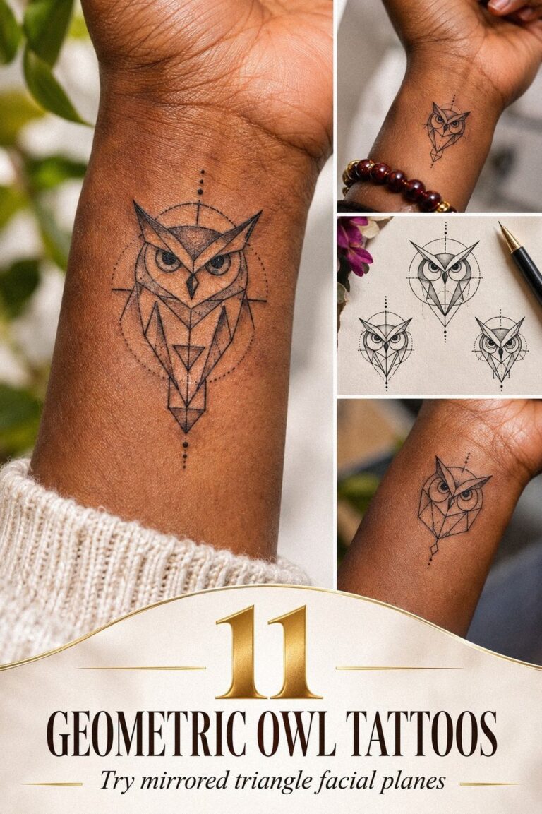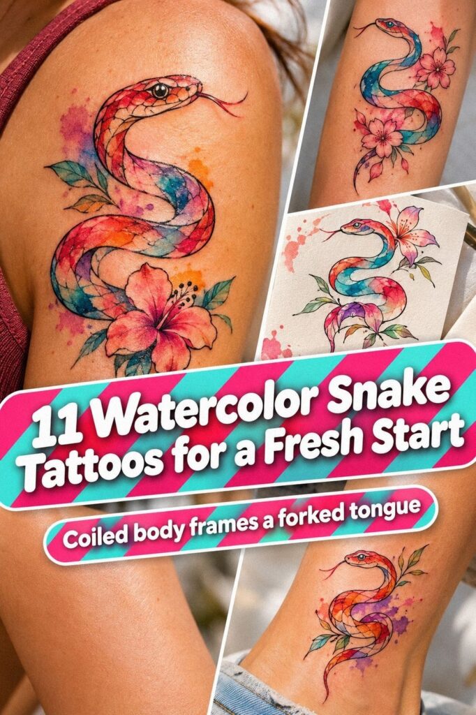
Watercolor snake tattoos can look striking when the design is planned around your skin, placement, and future fading. I booked mine after turning 30, then realized my favorite reference was too detailed for the area I’d chosen. The smaller version looked better, healed cleaner, and felt far more personal!
- I Chose a Small Watercolor Snake
- Why Did I Test Snake Shapes for My Wrist?
- I Saved Unique Watercolor Snake References
- What Matched My Skin Tone and Ink Colors?
- Add Delicate Scales Where They Count
- A Symbolic Snake Meaning Worth Keeping
- My Forearm Test Changed the Placement
- Before the Session, I Cut the Noise
Here’s what it looked like before:
Before my appointment, I had blank calf skin, a folder full of screenshots, and no clear sense of scale. My skin was fair with a cool pink undertone, and I wanted a sleek serpent with fine scales, soft terracotta, stone, and olive color, plus a curling head.
I’d saved dramatic pieces with dense shading, but those weren’t right for me. The linework looked crowded at small sizes, and I didn’t want an ornate design that would lose its crisp shape as the years passed. My small snake tattoo references helped me compare simpler silhouettes.
- I Chose a Small Watercolor Snake
- Why Did I Test Snake Shapes for My Wrist?
- I Saved Unique Watercolor Snake References
- What Matched My Skin Tone and Ink Colors?
- Add Delicate Scales Where They Count
- A Symbolic Snake Meaning Worth Keeping
- My Forearm Test Changed the Placement
- Before the Session, I Cut the Noise
- How Did Fine Linework Feel?
- Aftercare Kept the Watercolor Clear
- What Happened as the Colors Settled?
1I Chose a Small Watercolor Snake

I started with a small watercolor snake because I wanted the design to feel personal rather than performative. A slim serpent could follow my calf without dominating the leg, and the negative skin between the coils kept the silhouette sleek. I chose a fine line serpent with a narrow head, a lifted tail, and only a few scale marks.
The first drawing was about 3 inches tall, but I asked for more margin around the bends. My artist said the smallest details would need clearance if I wanted them to remain readable.
That advice changed the piece. I’d rather have fewer scales that stay crisp than dozens that blur together.
The three-inch sketch also made the cost easier to estimate. A smaller tattoo isn’t automatically the best value if the artist has to compress every detail, so I asked whether the proportions were worth it before approving the stencil.
The watercolor wash wasn’t treated like a solid fill. It moved from muted terracotta near the body to soft olive at the edge, with tiny breaks of stone-toned bare skin. The result was delicate, vibrant, and still recognizable from several feet away.
The terracotta-to-olive wash gave me the expressive shift I wanted without making the snake look heavy. If you’re comparing proportions, my tiny snake tattoos guide explains why a clean outline matters at smaller sizes.
I skipped a wide open mouth and oversized fangs. They looked fierce in larger references, but they made my version feel aggressive instead of graceful. Your snake doesn’t need to look dangerous to carry power, and mine felt more meaningful once the expression became calm.
I also saved another small snake tattoo example that used a narrow body and open coils. It helped me see that a simple silhouette could still feel daring.
2Why Did I Test Snake Shapes for My Wrist?

My wrist placement was the first option I considered because I wanted to see the design often.
3I Saved Unique Watercolor Snake References
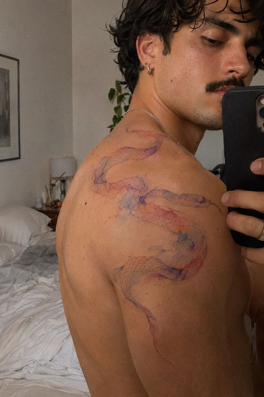
I saved unique watercolor snake tattoos with very different moods, then deleted anything that only looked impressive because of heavy editing. The references that stayed showed real skin, visible pores, and healed color. That mattered more to me than a dramatic presentation.
The healed references were less saturated than fresh work, but they gave me a more honest sense of value. I’d rather approve a design based on its settled appearance than pay for a result I only liked on appointment day.
One shoulder reference used plum pigment that faded into grey around the body. Another had a sharper outline and restrained rose-gold accents. I liked both, but I couldn’t combine every detail without creating a crowded design.
I made a small reference board with three categories: shape, color, and line density. The reference board kept me from collecting random ideas without knowing what I liked about them.
I wanted the coil from one design, the restrained color from another, and the scale spacing from a third. I also saved a tiny snake tattoo reference with a graceful head angle that became part of my final sketch.
The one dominant color rule was surprisingly helpful. My artist recommended choosing one main hue and one supporting shade, which kept the watercolor effect expressive instead of muddy.
I removed references that showed impossibly saturated color on fresh skin only. Fresh ink can look bold and bright, while healed work usually settles into a softer version. That isn’t a flaw.
It’s part of the watercolor character, and your expectations should be realistic before you book.
For another comparison, I used this fine line snake tattoo collection to study how thin contours held up after healing.
4What Matched My Skin Tone and Ink Colors?
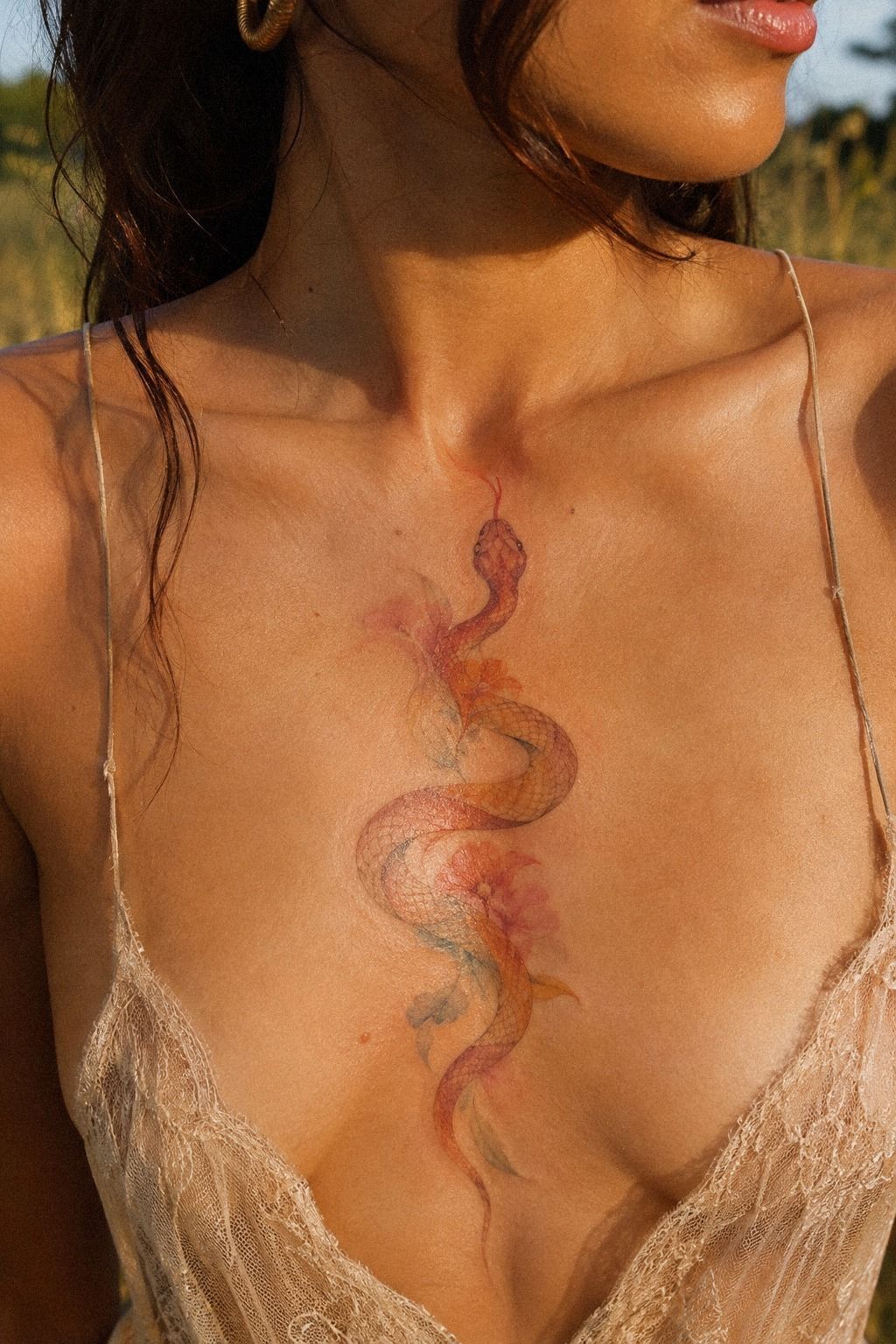
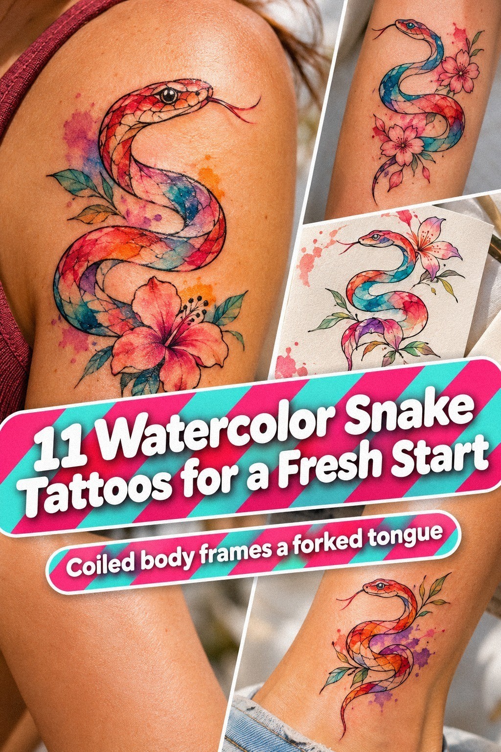
For the sternum version I considered, I tested navy ink with soft white accents against my skin tone instead of trusting a white paper sample.
5Add Delicate Scales Where They Count
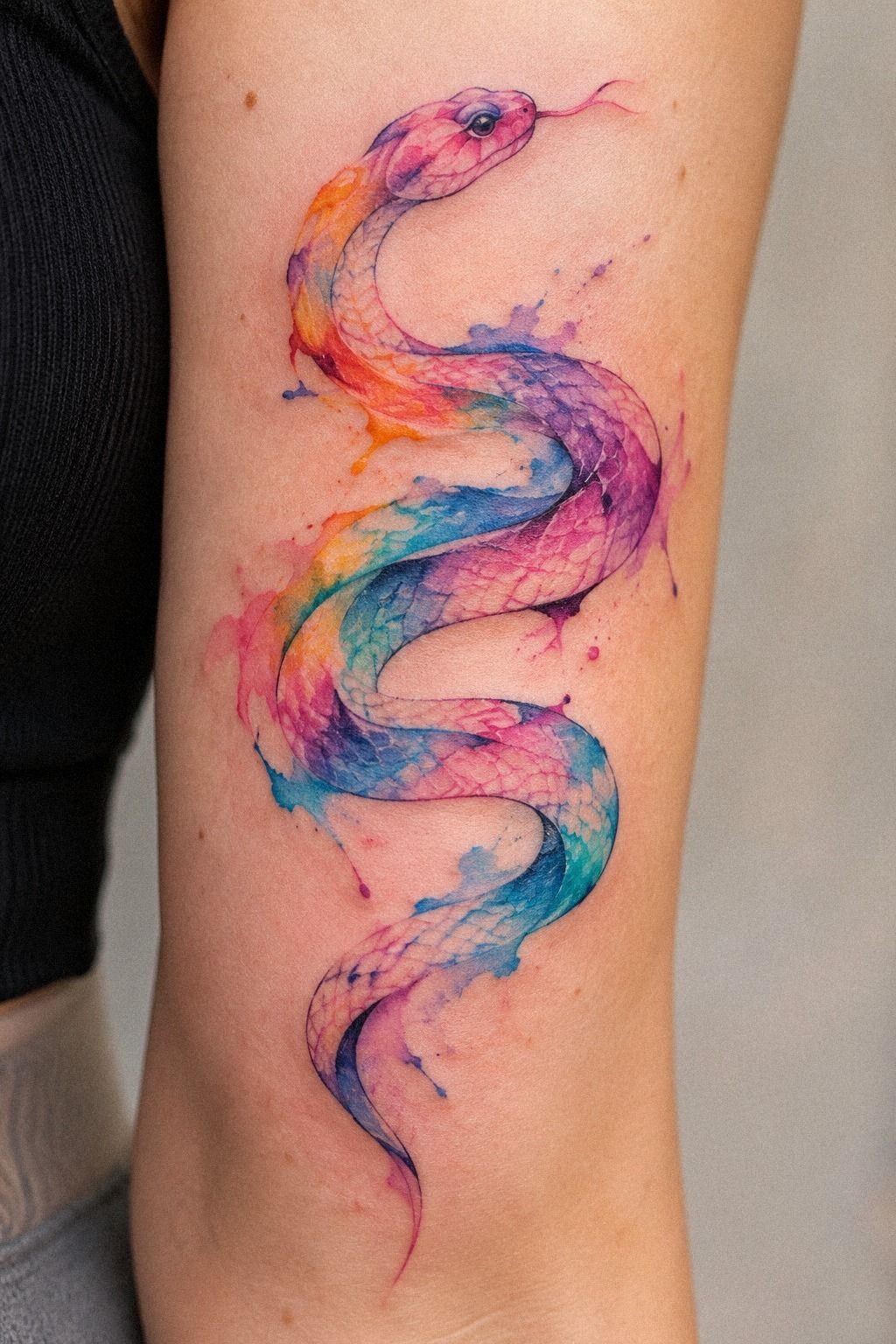
The aged paper flash sheet changed my mind about scale detail. It showed several hand-drawn snakes with different line weights.
One had almost no scales, while another used tiny repeated marks along the spine. I preferred the second option, but only in selected areas.
We chose single needle linework for the face and outer curve, then used slightly stronger emerald marks along the overlapping coils. That contrast made the serpent look dimensional without turning it into a solid dark piece.
The scales weren’t drawn across every inch of the body. They appeared near the neck, inside the main curve, and at the tail. That spacing made the design feel intricate without becoming muddy.
The selected scale marks were worth keeping because each group explained the snake’s movement. My first sketch had too many repeated marks, and I’m glad I let them go.
A watercolor snake needs structure underneath the color. I love the soft wash, but the emerald outline is what keeps the subject readable when the pigment settles. The final design felt sharp, graceful, and understated, with small gold and cream touches.
For more linework comparisons, I saved this fine line snake tattoo collection before my appointment. I also checked another small snake tattoo reference for examples with restrained detail.
6A Symbolic Snake Meaning Worth Keeping
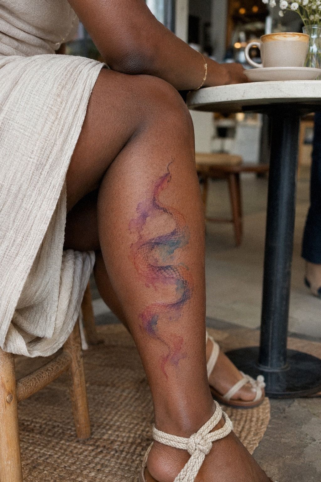
I didn’t want to choose a snake because it was merely edgy. For me, the image represented change after a difficult year, especially the part where I had to stop carrying an old version of myself. That made the design feel sacred without forcing it to look solemn.
The symbolic snake meaning became clearer once I stopped trying to explain it to everyone else. I wasn’t choosing a trend. I was choosing a reminder that felt personal, powerful, and quietly romantic.
The snake’s lifted head became important. I wanted movement, not a closed coil that looked defensive. A curving serpent silhouette gave the tattoo a sense of renewal, while the open section through the body suggested room for change.
You can choose a meaning that’s entirely private. Your tattoo doesn’t need a caption, and you don’t owe strangers an explanation. I told my artist the emotional idea, then let her translate it through posture, spacing, and color rather than adding a literal symbol.
I avoided combining the snake with every popular emblem at once. A moon, flower, eye, and dagger would have made the concept feel crowded. The moon-and-dagger motif was interesting, but it belonged to a different design.
The simpler version became more powerful because the meaning had somewhere to breathe. That restraint gave it a timeless quality I hadn’t expected. If you’re still collecting ideas, this fine line snake tattoo collection includes silhouettes that carry meaning through posture alone.
7My Forearm Test Changed the Placement

I tested the forearm placement after abandoning the wrist.
8Before the Session, I Cut the Noise
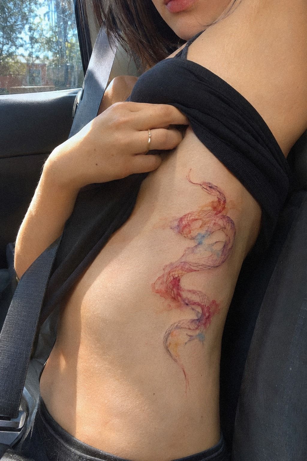
The week before my appointment, I stopped changing the design. That was harder than it sounds. I kept finding new references, but each one pulled me away from the clean, personal piece I’d already approved.
The approved drawing included the final coil direction, color order, and scale placement. Writing those details down stopped me from making a last-minute decision based on someone else’s tattoo.
I brought the approved drawing, identification, water, and a loose shirt that wouldn’t rub against the area. My studio consent form included the placement, approximate size, and color plan.
I also confirmed that the artist’s healed portfolio showed more than fresh work. That mattered because I wanted to know what her delicate lines and watercolor color looked like after the skin had settled.
The session felt calmer because I knew what would happen first. We checked the stencil, adjusted the direction, and discussed which areas would stay skin toned. My consultation questions covered line thickness, color fading, expected timing, and the possibility of a future touch-up.
I’d worried that asking questions would sound indecisive, but clear communication made the appointment smoother. If you’re preparing a tiny snake tattoo, bring your concerns in writing so the consultation stays focused.
I didn’t arrive dehydrated or exhausted. Your body has enough to manage during a tattoo session, especially with fine line work and color layering. I ate beforehand, kept my phone away, and wore a loose shirt that didn’t press against the stencil.
I also set a budget before arriving. Knowing what I was comfortable spending made it easier to discuss changes without chasing the cheapest possible appointment. That small boundary protected my choice!
9How Did Fine Linework Feel?

The calf skin was easier for me than the ribs or sternum would have been, though the sensation still changed across the design. The outline felt like sharp scratching pressure, while the color layering felt warmer and more repetitive.
I’d expected one steady feeling, but it came in waves. The outline was sharp and focused, while the watercolor passes felt broader and more tiring.
My artist used a fine line needle setup for the contour and took short pauses before the color passes. Those breaks helped me relax my leg. If you’re nervous, ask how the session will be paced, especially if your design includes several delicate details.
The most sensitive moment came near the back of the calf, where the sensitive skin felt thinner. I breathed through it and kept my muscles loose. You don’t win anything by pretending you’re comfortable when you’re not.
A short pause can protect the quality of the work. I’d rather add ten minutes than have a tense leg distort the stencil or make the artist rush.
I didn’t use pain as a reason to choose a weaker design. I did, however, remove an unnecessary tiny mark cluster that would have added time without improving the image. The final tattoo took less time because every line had a job.
That was worth it!
10Aftercare Kept the Watercolor Clear

The comparison between stencil, fresh color, and settled color made aftercare feel less abstract. The fresh design looked darker and more saturated at first, while the healed version showed softer edges and calmer color. That contrast helped me stop judging the tattoo too early.
My artist gave me written aftercare instructions for gentle washing, light moisturizing, and sun protection. Surface healing typically takes about 2 to 3 weeks, while complete healing can take about 2 to 3 months. You’ll need patience during that longer window.
I washed the area carefully, patted it dry, and used a thin layer of gentle fragrance-free soap when needed. I avoided soaking it in a pool, skipped direct sun, and wore loose clothing when the skin felt tender.
The peeling looked alarming for a few days, but I didn’t pick at it. The surface healing stage was temporary, and I knew that interfering could create a bigger problem than the peeling itself.
Aftercare isn’t a contest for the thickest layer of lotion. Too much product left the area sticky and uncomfortable, so I used less. The light moisturizer worked better when applied sparingly.
Your artist’s instructions should guide you, especially if their method differs from a general checklist. The calmer you keep the skin, the easier the process feels.
I treated sun protection as part of the tattoo’s long-term value, not an optional extra. After the skin was ready, I kept the area covered or protected when I was outside.
If you’re comparing expectations, this tiny snake tattoo guide is useful for thinking about how small details interact with fading and healing.
11What Happened as the Colors Settled?

The final reference showed a slim serpent in terracotta, stone, and olive tones, and it reminded me that watercolor work should be designed for the person wearing it.
Before You Book: My Shortlist
Before booking, I’d write down the design’s non-negotiables. Mine were a lifted head, open coils, a clear outline, limited scale marks, and a terracotta-to-olive transition.
My personal shortlist kept the consultation from turning into an endless discussion. I brought three references, not thirty, and explained exactly what I wanted from each one.
I’d also save a few small snake tattoo references that show healed work. The best reference isn’t always the most dramatic one. It’s the one that answers your practical questions about scale, color, and readability.
Placement Trade-Offs I’d Price Out
Placement changes more than appearance. It can affect the session length, the level of detail your artist can use, how often the tattoo sees sunlight, and whether the design needs to be adjusted for movement.
The placement trade-off for me was visibility versus proportion. The wrist was easy to see but too compressed. The forearm offered length but felt more public.
The calf gave the serpent enough vertical flow without making the tattoo feel like a performance.
I’d compare those choices with a fine line snake tattoo collection before asking for a quote. That makes the price conversation more useful because you’re pricing a defined design rather than an abstract idea.
What I’d Ask at the Consultation
I’d ask how the design will change for my anatomy, how the smallest marks may heal, which colors will be most visible, and whether the artist has healed work with similar line density.
My consultation checklist also included minimum pricing, deposits, touch-up policies, estimated timing, and aftercare. Those questions aren’t fussy. They help you decide whether the appointment is worth it.
I’d bring one tiny snake tattoo reference that matches the desired scale and one that shows a different option. The contrast makes it easier for your artist to explain what will and won’t work.
The Fading Question I Couldn’t Ignore
Watercolor tattoos can soften over time, and that doesn’t automatically make them a bad choice. The important question is whether the structure will remain readable after the color loses some intensity.
My fading timeline mattered more than the fresh appearance. I chose a defined contour, separated color areas, and fewer scales because I wanted the snake to remain recognizable.
I also reviewed small snake tattoo examples with healed outlines. The boldest fresh colors weren’t always the best long-term value. A restrained, well-planned design can be more satisfying than a saturated one that needs frequent correction.
How Much It Cost
I planned for a small to medium watercolor snake tattoo, but I didn’t treat online prices as a promise. Tattoo costs vary by artist, region, size, detail, and minimum charge. A boutique minimum may sit around $50 to $100, while hourly rates commonly fall around $100 to $250 in the United States.
My written studio quote mattered more than a generic calculator because it included the artist’s time, design preparation, and color choices. I asked whether the deposit applied to the final price and whether a future touch-up had a separate charge.
The boutique minimum was higher than I expected, but the consultation was thorough and the artist’s healed work matched my goals. That made the price feel easier to evaluate.
I also asked how the hourly rate would affect a small design with several colors. Sometimes a lower initial estimate isn’t the best value if the artist needs extra time to revise a compressed stencil.
My artist explained that additional color passes could change the final cost. I’d rather know that before booking than feel pressured during the appointment.
For another planning reference, I reviewed this tiny snake tattoo guide before requesting the final number. It helped me separate the design I wanted from the design I could realistically budget for.
I’d rather pay for a clean portfolio and careful consultation than chase the lowest number. A cheap appointment can become expensive if the design needs correction later. The right value is the artist whose healed work matches the kind of snake you want to keep.
What I Learned Before Choosing Watercolor Snake Tattoos
I thought my biggest decision would be color. It wasn’t. The spacing between scales and coils determined whether the snake would stay readable after healing.
I’ve seen delicate tattoos lose their edge because every inch was filled with tiny marks. That can look intricate on appointment day, but the design may soften into one dark patch later. My opinion is firm here: a watercolor snake needs restraint more than decoration.
The second lesson was to judge references by healed examples. Fresh work can look vibrant, crisp, and almost glossy, while healed work shows the real relationship between line and skin. You’ll learn more from one honest healed example than from ten edited references.
The third lesson was emotional. I didn’t need the most daring snake in the studio.
I needed one that reflected how I wanted to move forward. That made the final piece feel empowering, meaningful, and quietly iconic.
I’d also return to this fine line snake tattoo collection before choosing another design. It reinforces the value of structure, negative skin, and a controlled palette.
The restrained color was the decision I appreciated most after healing. It kept the tattoo polished without making it feel loud.
What People Always Want to Know
How much does a watercolor snake tattoo usually cost?
A watercolor snake tattoo often falls within a $50 to $100 studio minimum or a $100 to $250 hourly range in the United States, depending on the artist, region, size, and color work. I’d ask for a written quote because the detail and placement can change the final cost.
Are watercolor snake tattoos a good idea for a first tattoo?
Yes, watercolor snake tattoos can work well for a first tattoo when the size and placement make sense. I’d choose a clear black outline and a readable silhouette rather than packing in every scale. Calf, forearm, thigh, or shoulder placements may feel easier than ribs, feet, hands, or sternum.
How do I choose a tattoo artist for watercolor snake tattoos?
I’d choose an artist with a healed tattoo portfolio, clean linework, and clear studio hygiene practices. Look for snake designs, fine line work, and color on skin tones similar to yours. You’ll also want someone who explains how the design may soften over time.
How much do watercolor snake tattoos hurt?
Pain varies, but ribs, feet, hands, and sternum are commonly more sensitive than the forearm, thigh, calf, or shoulder. My calf placement felt manageable with short pauses. I’d tell the artist if I needed a break, because staying relaxed made the session easier.
How long does a watercolor tattoo take to heal?
Surface healing usually takes about 2 to 3 weeks, while complete healing can take about 2 to 3 months. Gentle washing and light moisturizing supported my process. I avoided direct sun, swimming, and picking at peeling skin until the area was ready.
What’s the best placement for watercolor snake tattoos?
The forearm, calf, thigh, and shoulder offer useful length for a readable serpent and may feel more tolerable than bony areas. A long vertical placement suits the snake’s shape, while open spacing helps fine lines age more cleanly. Your artist can adjust the design to your anatomy.
Where I’d Start First
If I had to pick one, I’d start with a small calf snake with a strong black outline and restrained color. It gives delicate details enough clearance, and you won’t have to crowd the coils to make them readable.
I’d save my favorite reference, bring healed examples, and ask for a written quote before committing. The best version isn’t necessarily the biggest, boldest, or most ornate. It’s the one whose structure, meaning, and future appearance still feel right to you.
That’s the piece I’d book first!