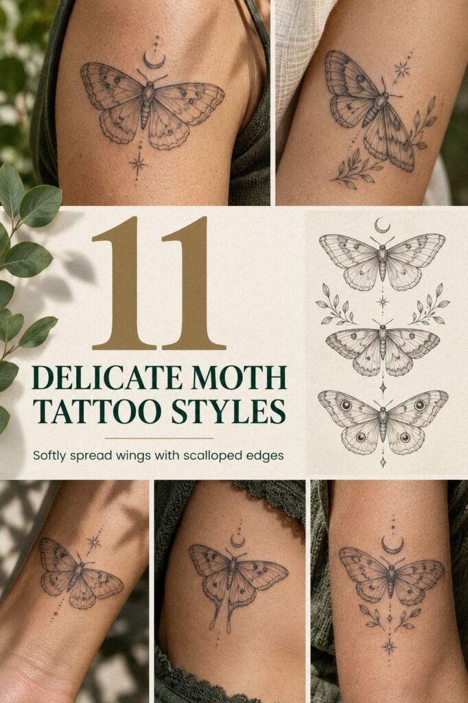
A delicate moth tattoo can look striking in one sitting when you plan the size, placement, and line weight before your appointment. I learned that the hard part isn’t choosing a meaningful moth, it’s keeping the design readable without forcing your artist into cramped details. This guide helps you make a personal, polished choice with a realistic budget. Start small, and you’ll have more control!
- Start With a Small Delicate Moth Tattoo
- Fine Linework: When Fragile Wings Matter
- Where Should You Place the Moth Along Your Collarbone?
- Keep Antennae Crisp and Graceful
- The Moonlit Moth Question: What Does It Mean?
- Choose Botanical Details Around the Wings
- Dotwork or Solid Fill for Intricate Wing Patterns?
- Match the Moth With Meaningful Coordinates
- A Custom Moth Redraw Beats a Generic Reference
- Bold Eyes Versus Dainty Linework
- Protect Your Moth Through Careful Healing
1Start With a Small Delicate Moth Tattoo

Begin with a small delicate moth tattoo that has breathing room between the wings, body, and antennae. On warm olive skin, a fine-line moth with restrained terracotta or muted olive accents can look graceful without feeling crowded.
Ask your artist to show you the stencil at the intended size before anything begins. Your eye should read the moth instantly, even from several feet away.
I wouldn’t squeeze a full wing pattern into a tiny outline just because the reference looks dainty. That usually creates muddy marks later. A fine-line stencil gives you a clear starting point, while an open wing shape keeps the result crisp and timeless.
For your consultation, bring two or three references, not twenty. A tiny moth tattoo collection can help you compare silhouettes, but your artist should redraw the shape for your body. You’ll want the final moth to feel personal rather than copied.
The most useful measurement is the finished width in inches or centimeters, not the size of the reference on your phone. Your artist can tell you whether the smallest details will hold at that scale. I prefer one expressive wing pattern over six cramped ones.
A small tattoo can still have powerful value. A minimal body, open negative space, and two clean antennae can look more polished than an ornate composition with nowhere for the skin to breathe. That restraint is often worth it when you care about long-term clarity.
2Fine Linework: When Fragile Wings Matter

Choose fine linework when you want fragile-looking wings, but don’t treat every line as equally important. A clay-toned accent or faint warm highlight can stay understated beside mostly open skin, especially when the wing structure is already intricate.
Begin with the primary wing veins. They should establish the moth’s rhythm before your artist adds secondary marks, dots, or tiny decorative breaks. If every vein carries equal weight, the result may lose its elegant hierarchy.
Fine linework can feel feminine, masculine, or completely neutral depending on the silhouette. That isn’t a rule about the insect; it’s a reminder that your reference should match your own style. A sleek wing can be romantic, while a sharper body can feel edgy.
Ask to see healed work from the artist, not only freshly completed pieces. Delicate lines can soften as the skin settles, and a technically polished stencil doesn’t guarantee the same result later. You deserve a clear conversation about healed line quality.
I like one graceful curve through each wing more than a maze of identical veins. That choice gives the moth an ethereal quality without making it precious. Keep the pattern readable first, then add only the details that earn their place.
3Where Should You Place the Moth Along Your Collarbone?

Place the moth along your collarbone if you want a visible, elegant composition that follows the natural line of your body. On medium skin with plum, grey, or restrained rose-gold accents, a spread-wing moth can sit slightly below the bone, with the antennae angled toward the center of the chest. Your artist should test the stencil while you stand and move.
The collarbone is a striking location, but it isn’t the easiest one for every person. You may feel more vibration over the bone, and the skin can be sensitive.
If you’re concerned about discomfort, tell your artist before the appointment. They can plan breaks and keep the first sitting manageable.
Use a stencil transfer that includes the full body, not only the wings. The moth should look balanced when your shoulder relaxes. I once saw a placement that looked perfect with the arm lifted and lopsided when the person stood naturally.
For another placement comparison, browse small moth tattoo ideas and pay attention to how body width changes the mood. A collarbone moth can feel romantic and symbolic without extra lettering. I’d skip a crowded border here because the bone already gives the design structure.
If you want the tattoo to remain easy to cover, ask your artist to keep the lower edge below the most visible collarbone line. You’ll have more clothing options, and the moth won’t compete with necklaces or straps. This is a polished placement when the spacing stays intentional!
4Keep Antennae Crisp and Graceful
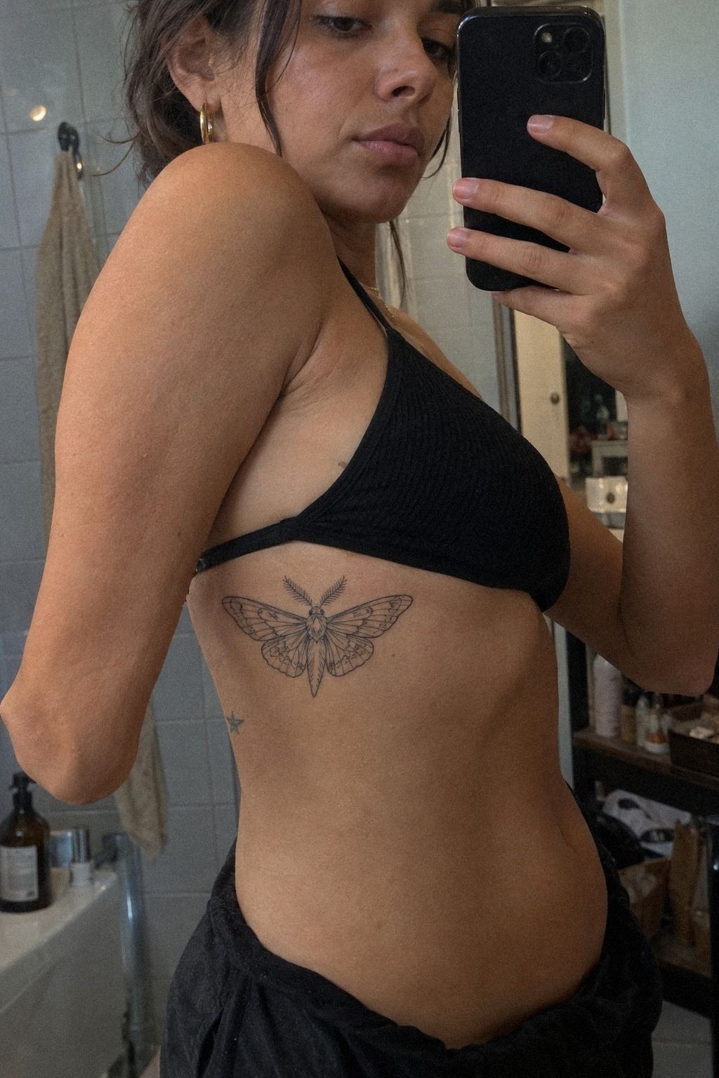
Keep the antennae crisp and graceful by treating them as part of the moth’s expression, not as leftover decoration. On the ribs, pale navy, white, or walnut-brown details can look expressive against the skin, but they need clean separation from the head and upper wing. Your artist should test the direction before selecting the final configuration.
A 3RL needle cartridge may suit delicate details, though the exact choice belongs to your licensed artist. You shouldn’t choose a needle from a social media caption. Skin, pressure, hand speed, and line weight all change the result.
I prefer antennae that curve outward gently rather than pointing straight up like rigid wires. That slight movement gives the moth an ethereal quality. If you’re drawn to sharper shapes, your artist can make the tips more angular without packing the entire design with heavy black.
The ribs can be more uncomfortable than the shoulder or forearm because the skin is thin and close to bone. Tell your artist if the sensation becomes too intense. A short pause won’t ruin the line, and pushing through unnecessary discomfort can make the sitting harder for you.
For a more symbolic direction, compare the flowing shapes in Luna moth tattoo meaning. You don’t have to copy a luna moth, but your reference can clarify whether you want rounded antennae, pointed wings, or a fiercer silhouette. Good linework is quiet until it isn’t.
5The Moonlit Moth Question: What Does It Mean?

Plan a symbolic moonlit moth design before your appointment by deciding what the moth represents to you. Emerald, gold, and cream accents can make the idea feel sacred and luminous, but the meaning should come before the color choice.
Write down the central symbolism in one sentence. Transformation, survival, attraction to light, and private remembrance can all work, but you don’t need to force every interpretation into one design.
A moon doesn’t have to sit above the moth. It can appear as a small phase mark, a negative-space crescent, or a quiet detail inside one wing. I prefer a single meaningful sign over a cluster of unrelated symbols.
If your idea feels too literal, remove one element and see what remains. A powerful silhouette can carry the story without a caption. That restraint often makes the final tattoo more personal.
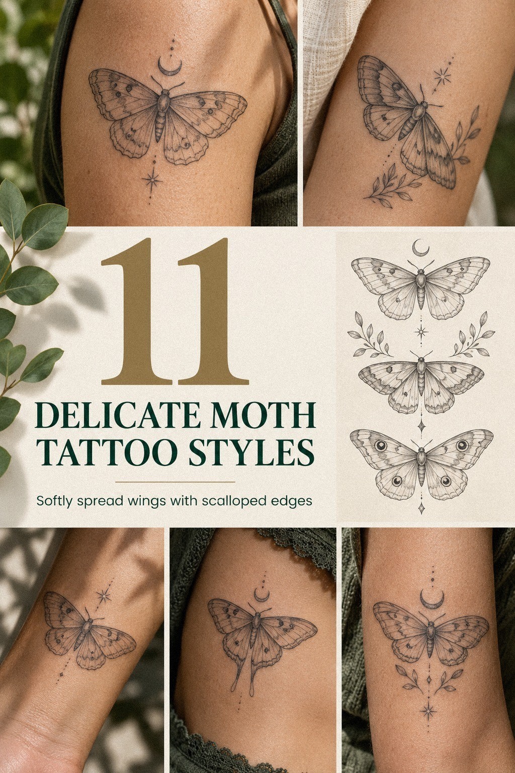
6Choose Botanical Details Around the Wings

Choose botanical details around the wings when you want the moth to feel organic without losing its delicate outline. On deep skin, forest-green, rust, or natural brown accents can create bold contrast, while leaves or stems give the spread wings a graceful rhythm. Ask your artist to keep the plants secondary.
A botanical stencil should show the full composition at actual placement, not only as a flat drawing. Your upper back curves, moves, and changes shape when you lift your arms. The branches need to follow that movement, or the design may look stiff when your posture changes.
I would choose one plant with a clear shape rather than a bundle of unrelated flowers. A fern can echo the moth’s flowing wings.
A thin stem can guide the eye along the spine of the composition. Your choice should support the moth instead of competing with it.
If you want a related but softer subject, compare delicate butterfly tattoo designs and notice how botanical details change the mood. A moth can remain edgy and symbolic with leaves, but too many petals can push it toward a generic piece.
Keep the line weight consistent between the moth and the plants. You don’t want heavy branches beside barely visible wings unless your artist has planned that contrast. The best version feels harmonious because your eye knows where to look first.
7Dotwork or Solid Fill for Intricate Wing Patterns?

Add dotwork for intricate wing patterns when you want texture without filling the entire moth with solid black. Small dots can create shadow, depth, and a vintage mood while protecting areas of skin. They also give your artist a way to make the wings feel ornate without making them heavy.
A dotwork pattern needs enough space to remain legible after healing. When dots are packed too tightly, they can merge visually. Ask how the artist spaces them and whether similar healed work is available to view.
Solid fill can create a fierce focal point, especially around the body or lower wing. Still, it may cost more because saturated areas often require additional time. Decide whether that stronger contrast is worth it for your design before the appointment.
I like combining one dark section with mostly open wings. That contrast feels daring and expressive without making the whole moth look dense. If you’re working with a tighter budget, reducing background fill may protect the design’s value without removing its personality.
8Match the Moth With Meaningful Coordinates
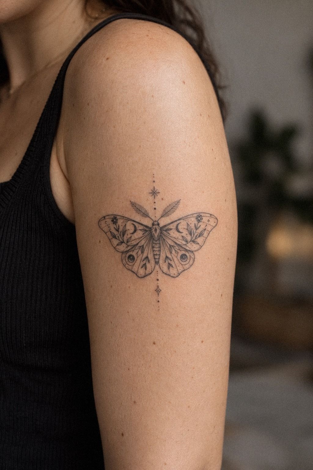
Match the moth with meaningful coordinates when you want the tattoo to record a place without turning the design into a crowded label. Along the spine, a fine-line moth with spread wings can sit above or below a short coordinate line. Warm ivory skin with camel or black accents can make the centered layout look polished and symbolic.
Use a single-line coordinate inscription only if you can read it at the proposed size. Your artist should show you the lettering beside the moth, because delicate numbers can blur when they’re too small. You don’t need a long phrase to make the piece personal.
I wouldn’t place coordinates directly through the wings. The moth should remain the visual anchor, while the numbers act as a quiet footnote. If you’re honoring a place, a journey, or a person, the separation gives both elements room to matter.
Coordinates can also carry emotional weight, so take your time checking them. Confirm the location format, spacing, and punctuation before the stencil touches your skin. A quick screenshot isn’t enough.
Write the final version down and review it with your artist.
For symbolic alternatives, moth tattoo symbolism and meaning can help you think about how animals carry memory and change. You may decide the moth needs no words at all. That can be the more powerful choice.
9A Custom Moth Redraw Beats a Generic Reference

Explore unique delicate moth tattoo ideas by changing one major feature at a time. Midnight-blue wings with copper or ivory details can feel iconic, but the redraw still needs to fit your body and the artist’s line style.
Start with the wing silhouette, then test the body shape, antennae, and any surrounding marks. Changing everything at once makes it difficult to understand which decision improved the design.
A custom redraw doesn’t need to be wildly unusual. A different lower-wing notch, an asymmetrical mark, or a smaller body can make the result feel personal while keeping the moth recognizable.
I wouldn’t copy a rare reference exactly. The person who designed it solved a different placement, scale, and skin problem. Borrow the mood, then let your artist create an original version.
10Bold Eyes Versus Dainty Linework

Balance bold eyes with dainty linework by choosing one focal feature for the moth. The eyes can become the visual anchor while the wings remain open and light. That contrast gives the design a sharp, memorable expression.
A solid black eye detail can give the moth a fierce focal point without making the whole tattoo heavy. Your artist should keep the body and wing veins lighter so the eyes don’t compete with every other mark. This is where a small area of bold black can work beautifully.
I wouldn’t make both eyes oversized just because the reference looks dramatic. On a delicate moth tattoo, one strong point can be enough. If you’re choosing between thick outlines and focused eyes, I’d keep the outline lighter and protect the negative space around the face.
Ask to see healed work from the same artist, especially if you’re considering fine lines near the eyes. The stencil can look crisp and elegant, but the healed version tells you how the marks settle. You deserve that information before committing.
For another animal-based comparison, look at wolf tattoo meaning and notice how a single facial detail can carry symbolism. Your moth doesn’t need a realistic face. It needs one clear feature that makes the design feel alive!
11Protect Your Moth Through Careful Healing

Protect your moth through careful healing, especially during the first surface stage. Your artist should give you written instructions suited to the products and method used during the appointment. Terracotta, olive, and charcoal accents may soften temporarily while the skin settles, so don’t judge the final color too early.
A written aftercare sheet is more useful than random advice from a comment thread. Follow the cleaning, moisturizing, and covering instructions your artist provides. If something looks unusual, contact the studio or a medical professional rather than guessing.
Avoid swimming, soaking, and direct sun while the skin settles. Don’t pick at flakes, even when the itch becomes distracting. A patient routine protects the crispness you paid for.
The final cost includes aftercare supplies, possible touch-up time, and the attention required during healing. That doesn’t mean you should expect problems. It means the full value of the tattoo includes what happens after you leave the studio.
A Quick Size Check Before You Book
The finished width should be large enough for the body, wing separation, and smallest meaningful details. A tiny moth can be dainty, but it can’t carry every ornate reference feature at once.
A finished stencil measurement gives you something practical to discuss with your artist. Check it while standing, sitting, and relaxing your shoulders. You’ll notice problems earlier than you would from a flat reference.
If the wing veins disappear at the proposed size, simplify them. If the body feels too dominant, give the wings more negative space. These small adjustments can protect a delicate design from becoming muddy.
Placement and Pain Are Connected
Pain varies by person, placement, session length, and expectation. The forearm, thigh, and shoulder are often more tolerable, while ribs, feet, hands, and sternum can feel more intense.
Your placement consultation should include questions about breaks, posture, and appointment length. You don’t have to prove anything by sitting through unnecessary discomfort. A calm session can support cleaner work.
A collarbone placement may feel elegant and feminine, while a sternum version can feel more powerful and symmetrical. Neither choice is automatically better. Your tolerance, wardrobe, and reason for getting the moth should guide the decision.
The Meaning You Keep
Your moth can represent change without explaining the entire story. A moon, coordinate, leaf, or empty wing may hold a private memory more effectively than a paragraph of lettering.
A personal symbol adds value when it belongs to you. If the meaning feels forced, remove it. The strongest design may be the one that leaves space for your interpretation to change.
Some people want an empowering reminder. Others prefer a haunting, sacred, or playful image with no public explanation. The right meaning is the one that still feels true after the novelty fades.
Your Artist Conversation
Bring references, but arrive ready to describe the feeling you want. Words such as graceful, raw, symbolic, or sharp can help your artist understand the direction without copying another person’s tattoo.
A healed portfolio matters more than a gallery of fresh work. Ask how the artist approaches fine lines, dark contrast, placement changes, and small details. You should feel comfortable discussing the plan before paying a deposit.
Tell your artist which elements are essential and which can disappear if the size demands it. That gives them room to protect the silhouette instead of squeezing every detail into the stencil.
Cost and Value
In the United States, a shop minimum may be around $50 to $100, while hourly rates often fall around $100 to $250. A small piece commonly lands around $100 to $300, depending on the artist, region, placement, and complexity.
A written price estimate helps you compare value rather than chasing the lowest number. Ask whether the quote includes design time, deposits, touch-ups, and aftercare advice. A thoughtful plan can be worth more than a bargain appointment.
Healed Results Matter More Than Fresh Contrast
Fresh tattoos often look darker and sharper than they will after the surface settles. That change is normal, but healed examples give you a more honest sense of the artist’s line quality.
A healed tattoo example can show whether fine marks stay readable and whether dotwork remains balanced. Look for consistency across different skin tones and placements. You’ll make a more confident choice with that evidence.
Pay attention to how color settles too. Navy, copper, emerald, rose-gold, or terracotta accents may change subtly as the skin heals. Ask the artist what is realistic for your skin and whether a touch-up is commonly needed.
Your Shortlist Test
Reduce your ideas to two or three versions and compare them at the actual size. If the moth disappears when the design is reduced, remove a detail before adding another one.
A shortlist of references keeps the consultation focused. You don’t need to show every image you’ve saved. Your artist will work more clearly when the direction is specific.
Choose the version with the clearest silhouette, not necessarily the one with the most decoration. A minimal idea can be more memorable than an ornate one when the spacing is intentional.
The Fine-Line Moth Decision I’d Make
I’ve changed my mind about what makes a delicate moth tattoo successful. I used to think the most intricate reference would create the most memorable result, but the pieces I keep noticing have fewer marks and better spacing. A crisp body, open wings, and one symbolic detail can say more than a crowded design that tries to explain everything at once.
Your first decision should be readability. If you can’t identify the moth from across the room, the artist may be working too small or adding too much decoration. That doesn’t mean every tattoo needs to be bold.
It means your design needs a clear visual order, with the silhouette first and the tiny details second.
I also think placement deserves more respect than people give it. The ribs and sternum can feel more intense, while the forearm, thigh, and shoulder are often more tolerable.
A collarbone can look elegant but may feel sharper over bone. Choose the spot you’ll care for properly, not the spot that looks most dramatic in someone else’s reference.
Your meaning matters, but it doesn’t have to be explained through text. A moon, coordinate, leaf, or empty wing can hold a private memory without turning the tattoo into a caption. I’d skip extra symbolism if the moth already represents change, resilience, or a personal season for you.
The practical part matters too. A small tattoo can be worth the cost when the design is readable, the artist is experienced, and the appointment fits your budget. Ask for a quote, check the healed portfolio, and leave room for aftercare supplies.
Before you book, ask for a healed portfolio, a clear price estimate, the expected appointment length, and written aftercare. You don’t need to rush because the idea feels exciting.
A thoughtful plan will give your artist room to create something personal, polished, and lasting. That preparation is worth it.
The Questions I Get Asked Most
How Much Does a Delicate Moth Tattoo Usually Cost?
A delicate moth tattoo usually costs about $100 to $300 in the United States, depending on size, placement, artist, region, and detail. Some studios charge a $50 to $100 minimum, while hourly rates may run about $100 to $250. Ask for a quote before booking.
Is a Delicate Moth Tattoo a Good Idea for a First Tattoo?
Yes, a delicate moth tattoo can be a meaningful first tattoo if you choose a tolerable placement and a readable size. The forearm, thigh, and shoulder are often easier than ribs or sternum. A clean silhouette gives you a manageable design without removing personality.
How Do I Choose a Tattoo Artist for a Delicate Moth Tattoo?
Choose an artist with clean linework, healed portfolio examples, and strong studio hygiene. Look for consistent healed results, not only fresh tattoos. Ask whether they regularly create fine-line moths, botanical details, or dotwork, then discuss your skin, placement, size, and aftercare expectations.
How Much Does a Delicate Moth Tattoo Hurt?
Pain varies by person and placement. Ribs, feet, hands, and sternum are often more sensitive, while the forearm, thigh, and shoulder may feel more tolerable.
Tell your artist when you need a pause. Comfort planning helps you stay still, which supports cleaner lines.
How Long Does a Delicate Moth Tattoo Take to Heal?
The surface usually heals in about 2 to 3 weeks, while complete healing can take about 2 to 3 months. Wash gently, moisturize as directed, avoid swimming during early healing, and protect the tattoo from direct sun while the skin settles.
What’s the Best Placement for a Delicate Moth Tattoo?
The forearm, shoulder, and thigh are strong choices when you want easier viewing and often more tolerable sessions. The collarbone and ribs create a more striking composition but may feel more sensitive. Your best placement balances visibility, skin movement, comfort, and long-term care.
Where I’d Start First
If I had to pick one step, I’d start with the stencil size. A readable silhouette protects every later choice, from dotwork to coordinates.
Ask your artist to place it while you stand naturally, then check the spacing in daylight. Save that version for your appointment and let the details follow.

