Watercolor phoenix tattoos can look delicate and still carry a fierce private meaning. I chose mine after months of saving sketches, testing color against my skin, and rejecting anything too obvious. The final watercolor phoenix tattoo is small, expressive, and personal. I still don’t explain the whole story!
- ✓ I Chose a Small Watercolor Phoenix Reference: The Small-Scale Rule
- ✓ I Sketched Feathers Around My Wrist: The Negative-Space Rule
- ✓ What My Skin Undertone Changed: The Color Test
Editor’s note: I wanted a design that felt symbolic without becoming a public announcement. If you’re choosing something similar, start with the feeling, then edit the shape until it can carry that feeling quietly.
Here’s What It Looked Like Before
Before the appointment, I had only a patch of skin and a folder of screenshots. Nothing was marked. Nothing was certain.
The blank space felt almost too personal to hand over, so I kept comparing phoenix tattoo references until one small watercolor design made me stop scrolling.
The first sketches were too ornate. They had long flames, dramatic wings, and sharp black outlines that would’ve taken over my ribs. I wanted something more understated, with enough movement to feel alive but enough open skin to keep the shape legible as it healed.
I also saved examples of small phoenix tattoos because the proportions helped me understand what would work on my body. You don’t need a huge design to make the symbol feel powerful, and I didn’t want size to explain something that belongs to me.
The colors mattered, too. A muted terracotta felt more personal than bright red, while a narrow olive wash kept the phoenix recognizable without making it look theatrical. That balance gave me the private symbolism I was after.
- I Chose a Small Watercolor Phoenix Reference: The Small-Scale Rule
- I Sketched Feathers Around My Wrist: The Negative-Space Rule
- What My Skin Undertone Changed: The Color Test
- I Simplified the Phoenix Linework: The Three-Stroke Rule
- Ribs or Wrist? My Private Placement Test
- I Added Unique Flame and Feather Details: The Split-Flow Method
- Before the Appointment: The Clean-Skin Plan
- What the Rib Pause Taught Me
- I Protected the Fresh Watercolor Phoenix: The First-Night Rule
- Aftercare’s Two-Stage Color Check
- The Phoenix I Kept: Longevity Test
1I Chose a Small Watercolor Phoenix Reference: The Small-Scale Rule
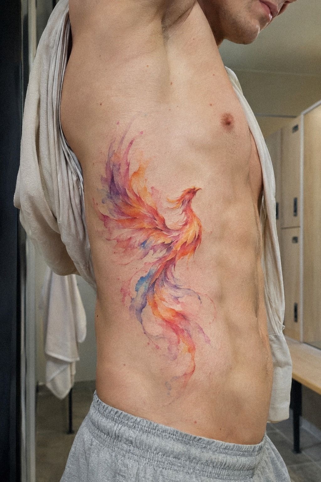
I started with a reference around 3 inches tall, not because small tattoos are easier, but because the small-scale silhouette felt more personal. The phoenix had a curved neck, one lifted wing, and a few loose feathers. It looked striking without shouting, which was exactly the tension I wanted.
My first artist suggested adding more flame detail, but I said no. Too many tiny marks would’ve blurred together over time, especially in a watercolor style with soft bleeding color. If you’re collecting ideas, compare the silhouette first, then the decorative details.
The silhouette has to survive.
I kept one watercolor reference from a watercolor bird tattoos collection because its open wing shape felt graceful and readable. You can borrow movement without copying a design, and that’s where your tattoo starts to become personal.
The final reference used a narrow body, a slightly oversized tail, and separated feather tips. It wasn’t the most elaborate option. It was the meaningful one, and I knew I’d regret choosing drama over clarity.
For me, the small scale was worth the cost of giving up extra detail. A larger tattoo might’ve looked more impressive, but this one could stay private. That mattered more than making the design bold from across the room.
2I Sketched Feathers Around My Wrist: The Negative-Space Rule
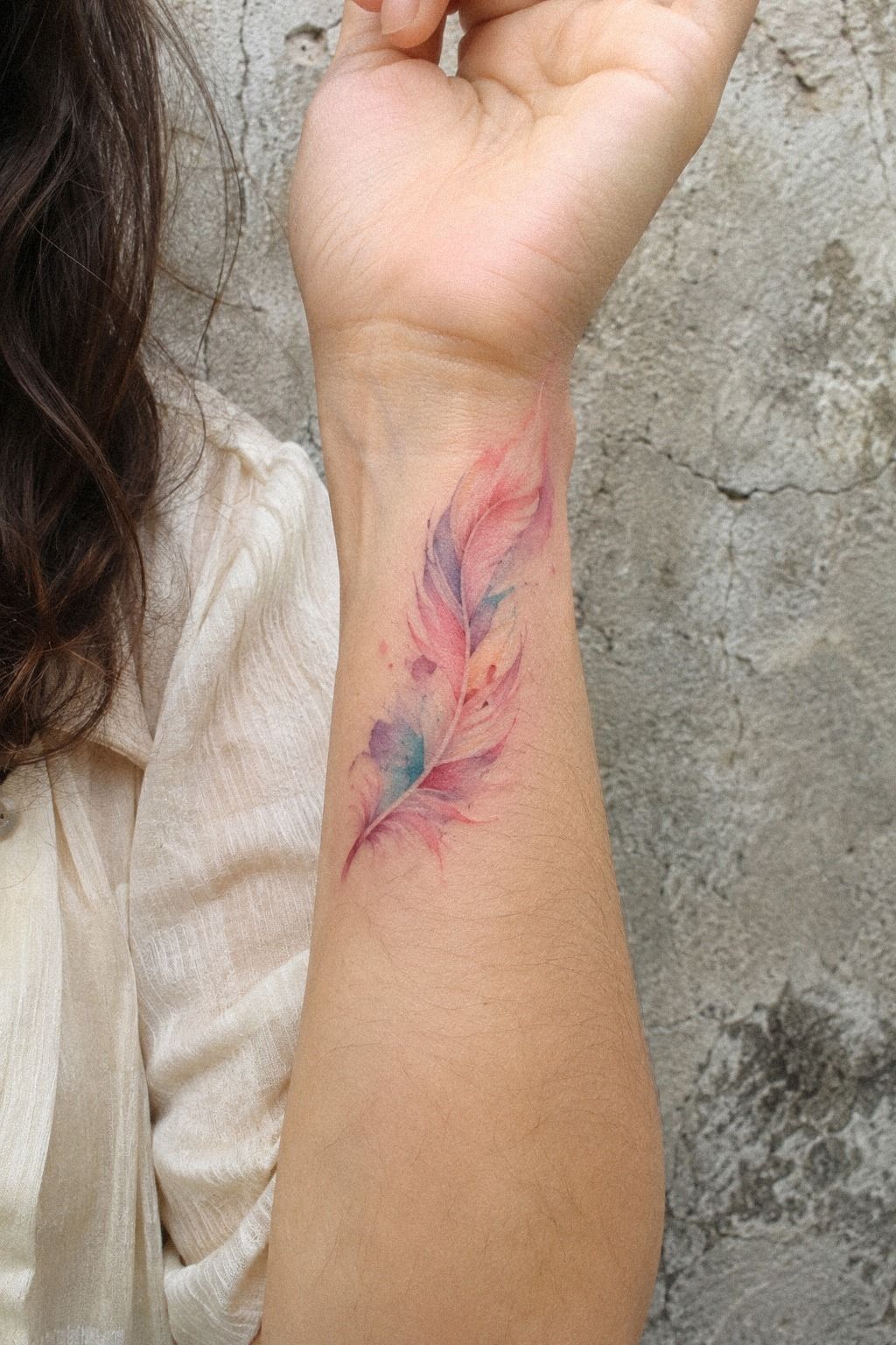
Before settling on my ribs, I tested the feather idea with a washable marker test around my wrist. The line followed the arm instead of sitting stiffly across it, and the separated barbs left little gaps of skin between each stroke. That negative space made the design feel delicate, not unfinished.
I liked the wrist version, but I didn’t choose it. The wrist placement is visible every day, and I wasn’t ready for the symbol to become a conversation starter with strangers. Your placement should match your comfort, not just the reference you saved at midnight.
A single feather can carry the same renewal theme as a full phoenix, especially when the barbs curve in one direction. I looked at unique watercolor butterfly tattoos for examples of separated color areas, then brought that idea back to the phoenix.
And the wrist test taught me something useful. If a design only works when it’s viewed straight on, it isn’t ready yet. I wanted mine to look like a flowing shape from several angles, even when I couldn’t see the whole tattoo myself.
3What My Skin Undertone Changed: The Color Test
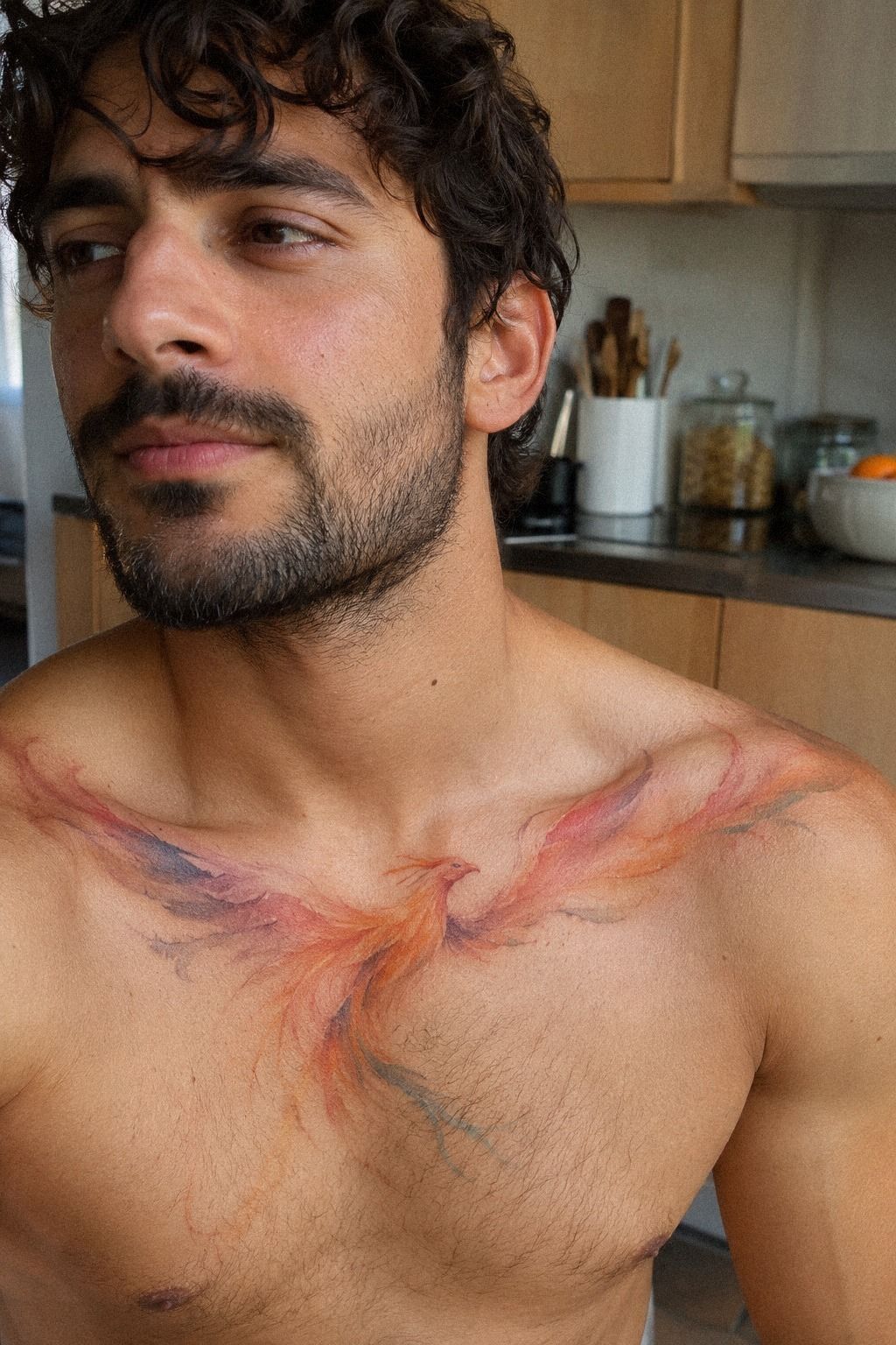
My olive undertone changed the entire color conversation. Plum and grey ink felt more balanced against my skin than bright red, while the restrained contrast kept the phoenix recognizable.
4I Simplified the Phoenix Linework: The Three-Stroke Rule
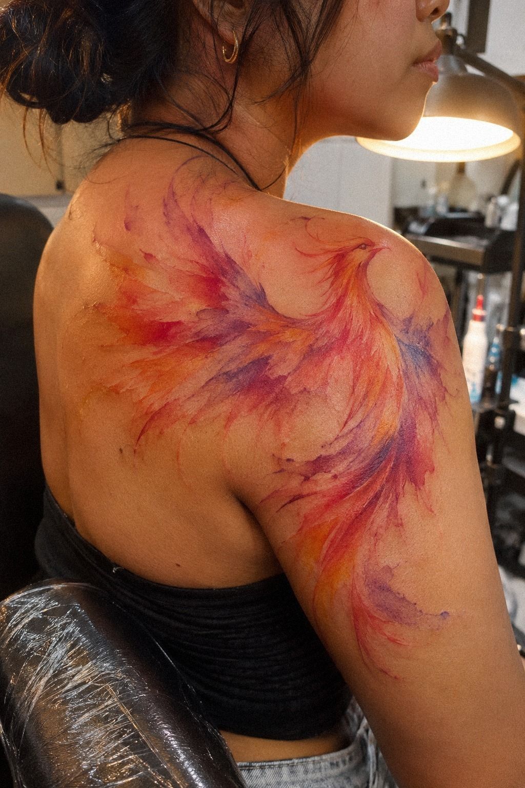
The original sketch had fourteen feather lines along the wing. We reduced that to three primary strokes and a few shorter barbs. The three-stroke rule made the phoenix look sleek, and it gave the watercolor wash space to move instead of trapping every color inside a tiny outline.
I used single-needle linework for the face and outer wing, but the artist kept the smallest details slightly open. Fine lines can spread as they age, so I didn’t want a miniature illustration packed with marks that would eventually crowd each other.
I compared the outline with watercolor owl tattoos because owl designs often rely on a simplified feather structure. You’re better off with three readable marks than ten pretty ones that lose their purpose.
The hardest edit was removing a tiny eye highlight. It looked charming on the drawing, but it would’ve been too small to trust on skin. I wanted a crisp expression, not a fragile detail that depended on perfect healing.
The final three-stroke wing looked less intricate on paper, but more expressive on the body. That trade made sense to me. A design doesn’t need every possible detail to feel complete.

5Ribs or Wrist? My Private Placement Test
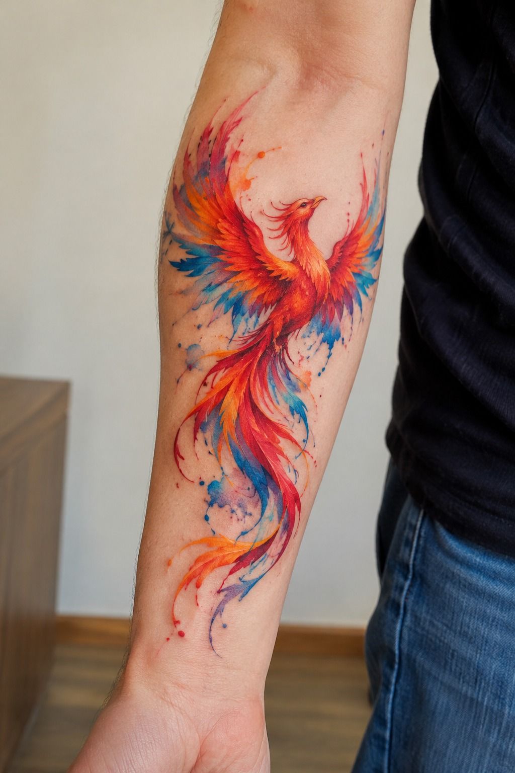
I placed the rib stencil first, then moved it slightly toward the side until the phoenix followed the natural curve of my body.
6I Added Unique Flame and Feather Details: The Split-Flow Method
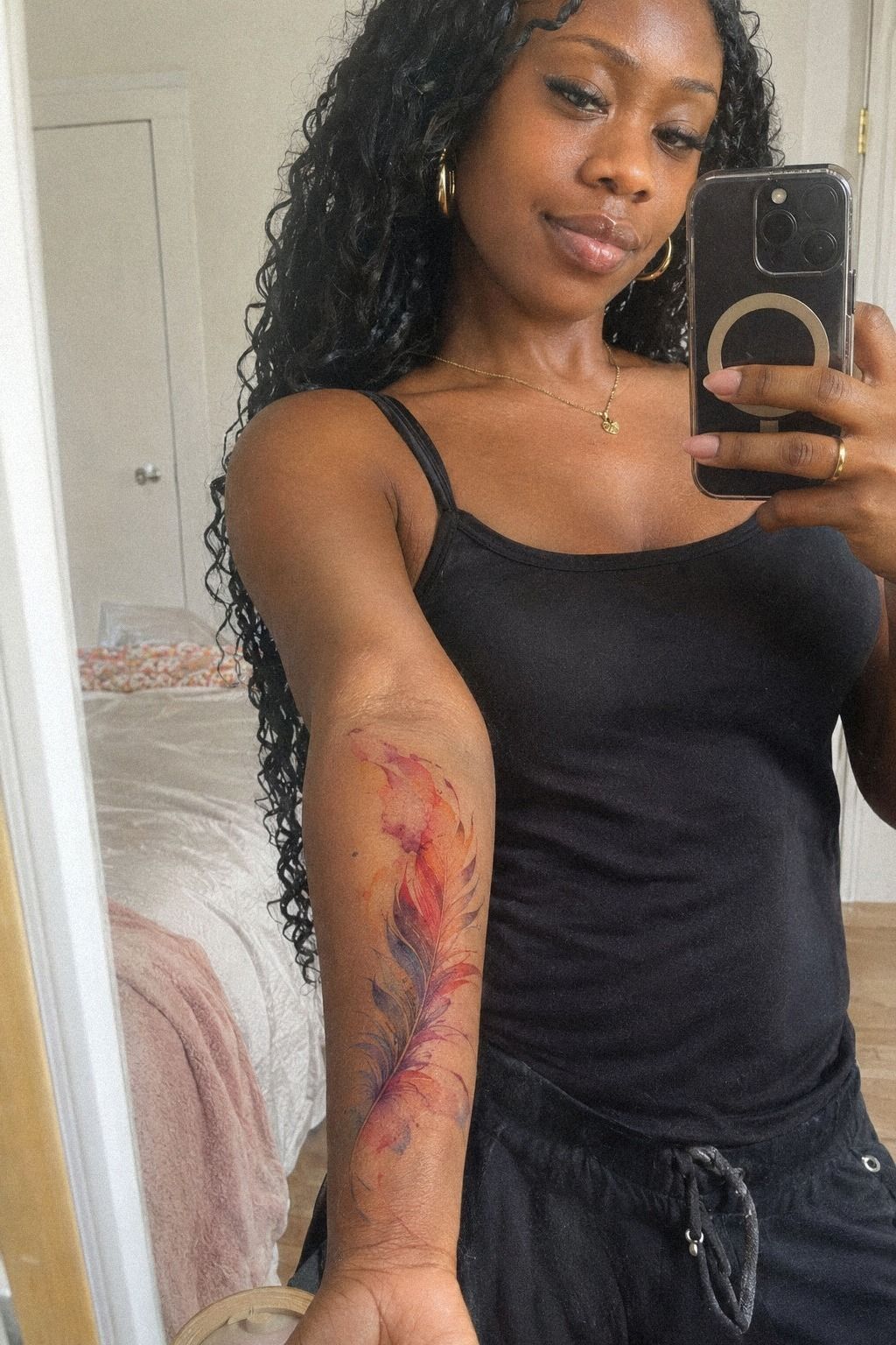
The final design needed one detail that belonged only to me, so I changed the flame tips into feather-shaped flames. They looked like they were breaking apart as they rose, which gave the phoenix an ethereal quality without making it look vague or ornamental.
I added one tiny dark feather beneath the wing and left a clean gap before the rust wash. That small interruption became my favorite part because it made the bird look like it was moving rather than posing. Your eye follows the gap before it notices the color.
For more shape ideas, I studied watercolor dragon tattoos and focused on their flame transitions. You can take a useful curve from another subject without turning your tattoo into a collage of borrowed symbols.
And I refused a large halo of forest green around the body. It would’ve made the phoenix louder, but not more expressive. The restrained version felt understated, and that choice gave the private meaning somewhere to sit.
The split flame detail was small, but it made the design feel personal instead of merely attractive. That distinction mattered. I wanted a symbol with history, not a decorative shape I might forget.
That was it! The phoenix finally looked bold without becoming loud. I could recognize the reference, but I couldn’t mistake it for somebody else’s tattoo.
7Before the Appointment: The Clean-Skin Plan
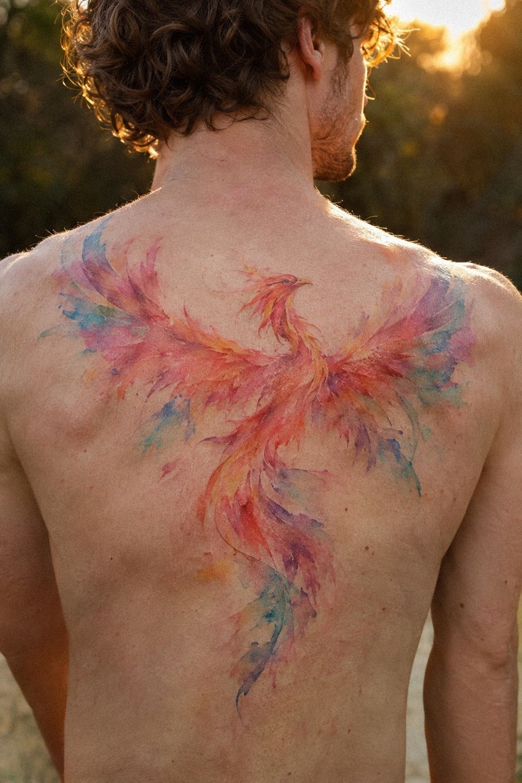
I booked the appointment for a day when I could keep the area covered and undisturbed afterward. I ate beforehand, brought water, and wore a loose shirt that wouldn’t press tightly against the ribs. It sounds simple, but preparation kept me from making rushed decisions.
The appointment checklist included placement, color order, line weight, and aftercare questions. I didn’t want to spend the session guessing. Good preparation gave me more confidence without pretending I wasn’t nervous.
The artist had a printed stencil, fresh charcoal ink, disposable supplies, and healed examples of similar watercolor work. I checked the stencil from standing and sitting positions before agreeing. You should never feel awkward asking to see the placement again from another angle.
I also made a short list of changes, including the smaller wing and dusty-rose edge. That list stopped me from improvising once the appointment started. Watercolor owl tattoos had shown me how much a small shape can change when its outer contour moves by only a few millimeters.
The appointment itself was quiet and focused. I was nervous, but I wasn’t confused. That difference matters, because a polished design usually comes from clear decisions before the machine starts.
Seeing healed examples helped me stay realistic. Fresh color can look vibrant and crisp, while healed watercolor may look softer, more delicate, and less intense.
8What the Rib Pause Taught Me
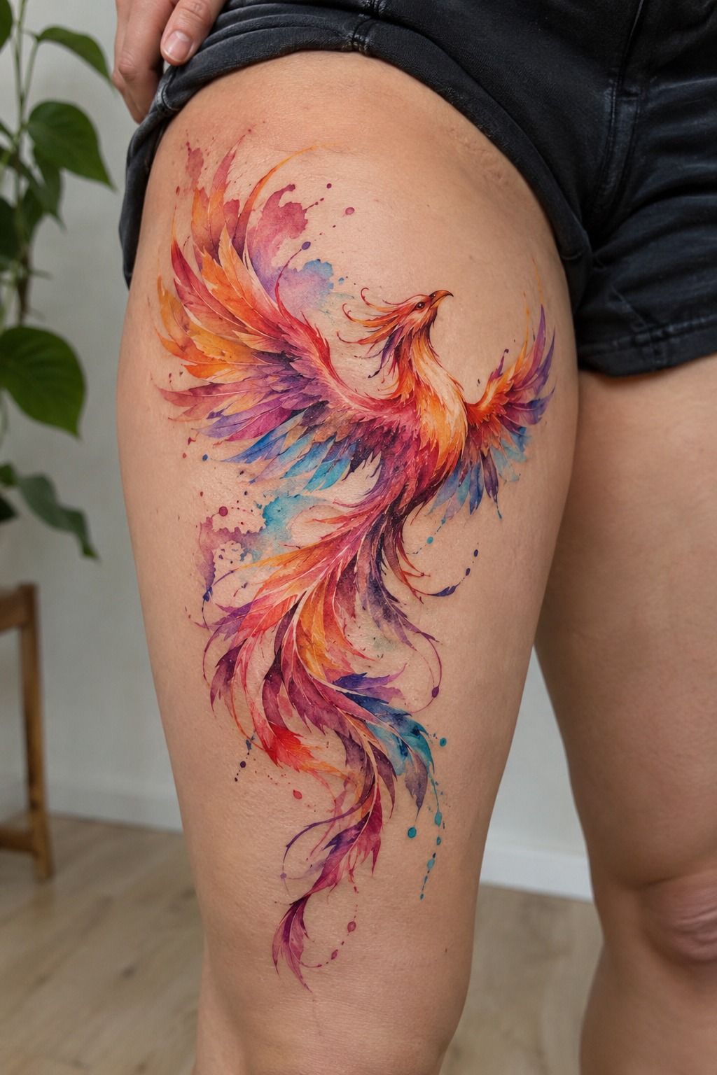
The first pass felt sharp and hot, especially along the lower ribs. That rib linework pause gave me time to breathe without rushing through the session.
9I Protected the Fresh Watercolor Phoenix: The First-Night Rule
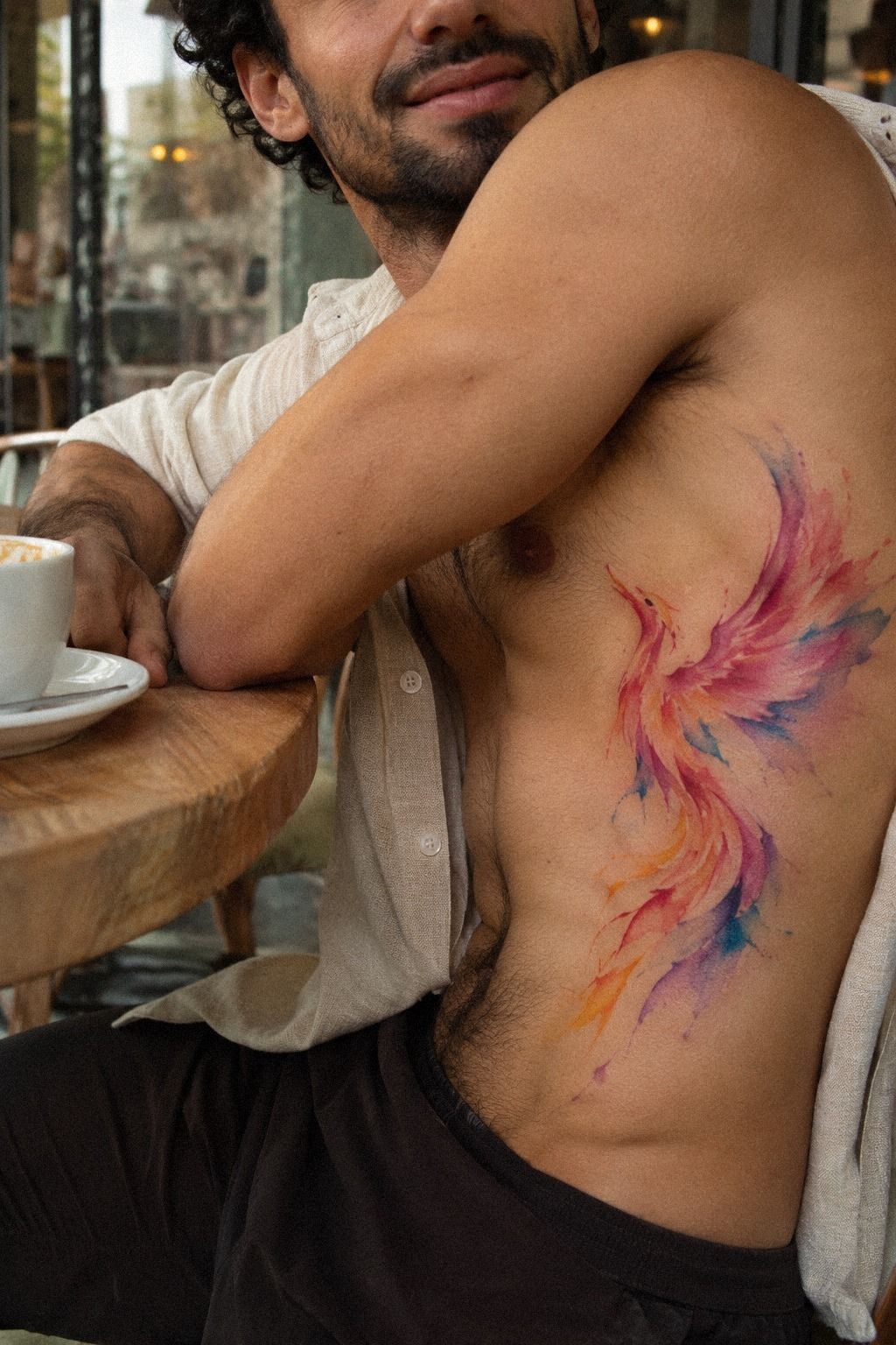
The fresh tattoo looked darker and sharper than the finished version would look. I followed the artist’s aftercare instructions, kept the covering on for the recommended time, and washed the area gently with clean hands. I didn’t scrub, pick, or add random products.
My shirt stayed loose, and I slept carefully so the ribs wouldn’t rub against rough fabric. The first night was awkward, but the delicate color wash looked clean the next morning. If you’re planning your own appointment, arrange your loose clothing and sleep position before you leave.
I saved watercolor unique butterfly tattoos for later inspiration, but I didn’t compare my healing tattoo with glossy healing photos. Fresh images can make normal healing look alarming, especially when the surface starts to flake.
The most important rule was avoiding direct sun and swimming while the skin healed. That wasn’t exciting advice, but it was practical. Your tattoo needs boring care before it gets to look timeless.
I wrote the aftercare instructions on my phone so I wouldn’t rely on memory when I was tired. That tiny step was worth the price of avoiding unnecessary irritation and second-guessing.
The first night wasn’t elegant. It was awkward, careful, and completely worth taking seriously.
10Aftercare’s Two-Stage Color Check
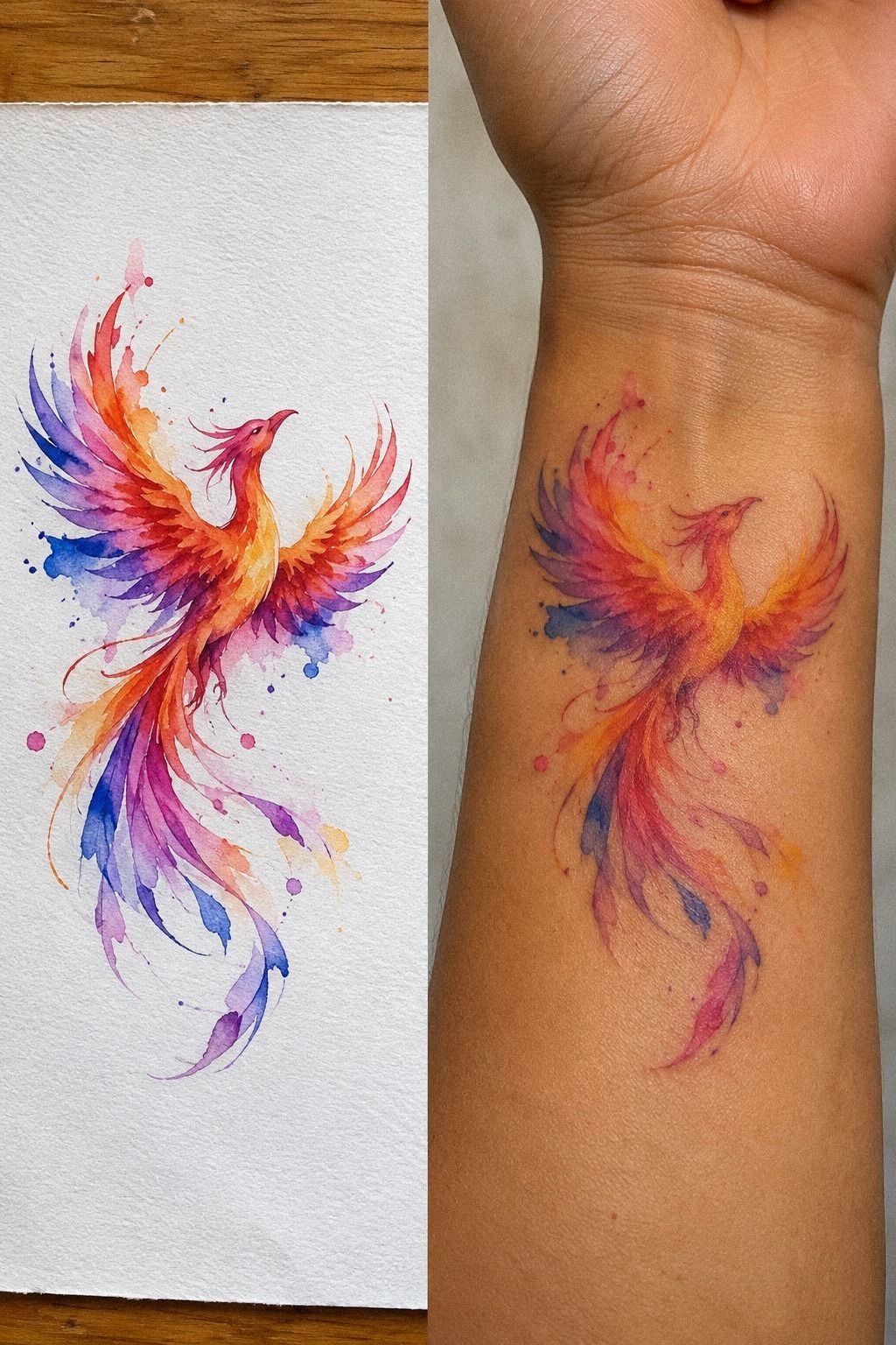
During the first week, the phoenix looked slightly cloudy beneath the peeling surface. I waited through that temporary stage before judging the final color.
11The Phoenix I Kept: Longevity Test
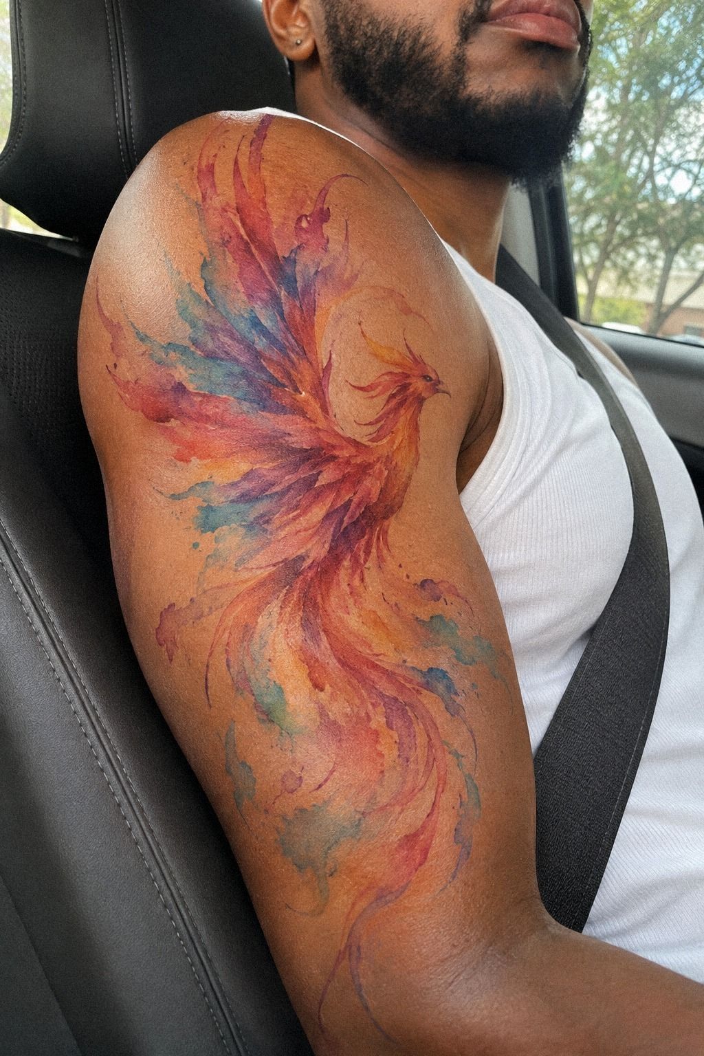
After several months, the phoenix looked less intense than it had on appointment day, but the shape stayed readable. The outer wing remained sharp enough to recognize, and the color settled into a classic wash rather than disappearing completely.
I know watercolor tattoos need realistic expectations. Very fine lines can widen, and lighter color may soften faster than solid black. Good placement, sensible line weight, and protection from ultraviolet light all matter more than a dramatic first-day look.
I still revisit small phoenix tattoos when I want to compare proportions, but I don’t wish mine were larger. The private scale lets the tattoo stay personal, and that privacy is part of why it still feels meaningful.
Would I change anything? I’d keep the same ribs placement and the same limited color range. I might make one feather slightly wider, but the restraint is what gives the phoenix its iconic shape.
For me, long-term readability matters more than chasing a flawless first-day look. The tattoo has softened, but it hasn’t lost its identity. That feels like the right kind of aging for a symbol about beginning again.
The real test was watercolor longevity, not whether strangers could see every tiny mark. The phoenix still feels personal, graceful, and quietly powerful.
What I Asked Before Booking
I asked how the artist approached watercolor tattoos after they healed, not just how bright they looked immediately afterward. I wanted to see healed portfolio work with fine lines, separated color, and small silhouettes. Those examples told me more than a polished social media post.
I also asked how much editing the artist recommended for a 3-inch design. A good answer wasn’t simply “more detail.” It was an explanation of the small-detail limits and what would likely blur. That conversation helped me judge the artist’s value.
I compared watercolor unique butterfly tattoos for examples of open color placement, then brought my own questions back to the phoenix. Good references should sharpen your decisions, not make you copy somebody else’s work.
The question I cared about most was whether the tattoo would still feel personal after the trend passed. I didn’t want a vintage effect or a fashionable shape to decide the meaning for me. I wanted something lasting symbolism could live inside.
I also asked what the artist would simplify if the design became too crowded. That answer mattered more than an ambitious promise. A daring idea is only useful when the artist knows where to stop.
What I Would Check Before Paying
Before paying a deposit, I’d check the artist’s hygiene practices, stencil process, and revision policy. I’d also ask what happens if the final design needs a small touch-up after complete healing. Clear answers make the cost easier to understand.
I wouldn’t choose an artist based only on the lowest quote. The real value is the combination of judgment, clean work, communication, and a design that still feels right months later. Cheap isn’t automatically wrong, but rushed work can become expensive to correct.
I also studied watercolor dragon tattoos to understand how other artists handled narrow curves and color separation. Then I returned to my own reference and removed anything that didn’t serve the phoenix.
The deposit conversation I needed covered the appointment length, the expected process, the aftercare basics, and the changes we had agreed on. That clarity made the decision feel less risky.
I wanted a clear touch-up plan, too. Watercolor work can settle unevenly, and asking about a future adjustment doesn’t mean you distrust the artist. It means you understand how skin behaves.
The Price I Was Given
My personal budget cap was $300, based on the typical US range I was given for a small watercolor phoenix. A shop minimum may sit around $50 to $100, while hourly rates often fall near $100 to $250, depending on the artist and region.
The quote I received depended on the size, ribs placement, and amount of color packing. I didn’t choose the cheapest option because clean linework and healed portfolio photos mattered more than saving a small amount upfront.
If you’re planning a similar piece, ask whether the shop charges a shop minimum, how long the appointment may take, and whether a touch-up policy exists. You can also compare watercolor snake tattoos for smaller compositions before you discuss your final idea.
My advice is simple: set a budget, but don’t pressure an artist to squeeze a complex design into a bargain appointment. The value is in the editing, communication, and work that still feels right after the initial excitement fades.
A small watercolor phoenix can be worth it when the artist understands restraint. My written quote covered the actual design rather than a fantasy version packed with details that wouldn’t survive on skin.
What the Phoenix Means To Me
I don’t explain the full meaning of the phoenix because it isn’t a slogan I want to repeat whenever someone notices my ribs. The symbol came from a year when I had to begin again without feeling ready.
I wasn’t looking for a dramatic declaration. I wanted a mark that could hold a private memory without displaying every detail.
The first sketch showed a bird rising through flame, but I removed most of the fire. That was deliberate.
The finished image isn’t about destruction followed by a triumphant reveal. It represents the slower part, the stretch where you keep moving while nobody can tell whether you’re recovering or simply surviving.
I’ve had people ask what it means, and I usually give them the short answer: renewal. That’s true, but it isn’t complete. The deeper meaning belongs to the version of me who made the choice, not to every person who sees the expressive phoenix on my skin.
And honestly, that boundary has made me like the tattoo more. It can be fierce without being public, elegant without being decorative, and raw without explaining itself.
I don’t need the design to perform its meaning for anyone else. It already did its job when I chose it.
The placement also changed how I understand visibility. I can show the tattoo when I want to, but clothing can cover it when I need privacy. That flexibility feels powerful, especially for a symbol connected to a difficult chapter.
If you’re choosing a tattoo with personal history behind it, give yourself permission to keep part of the story. You can make the linework visible and the explanation private.
That’s not evasive. It’s a respectful way to live with your own symbol.
I sometimes compare watercolor bird tattoos when I’m thinking about movement, but I don’t want to redesign mine. The phoenix shape is tied to its exact imperfections, its narrow wing, and the one feather I nearly removed.
That boundary matters! The private phoenix meaning is empowering because it belongs to me first. It can be romantic, haunting, or symbolic to somebody else, but I don’t have to hand over the complete story just because they can see the outline.
The renewal symbol doesn’t need to look triumphant. Its quietness is part of what makes it meaningful to me.
The Questions I Get Asked Most
How much should I expect to pay for a small watercolor phoenix?
A small watercolor phoenix often falls somewhere around $100 to $300 in the US, though shop minimums and artist rates vary. Ask for a written quote that accounts for size, placement, color, and expected session length. I wouldn’t compare prices without also checking healed portfolio work.
Are watercolor phoenix tattoos a good idea for a first tattoo?
Yes, they can work well as a first tattoo if you choose a readable silhouette and a placement you can tolerate. Clean structure matters more than complexity. I would avoid choosing a complicated design simply because it looks intricate in a reference image.
How do I choose an artist for a watercolor phoenix?
Look for healed examples, clean linework, thoughtful color transitions, and clear communication. Ask how the artist handles small details and fading. I trusted the artist more after seeing healed portfolio photos, not just fresh work from the appointment day.
How much do watercolor phoenix tattoos hurt?
Pain varies by placement, and ribs can feel sharp and hot during linework. Short pauses helped me stay still without pretending the session was easy. Your experience may be different, so choose an appointment length and placement you can approach calmly.
How long does a watercolor phoenix take to heal?
The surface often settles in about 2 to 3 weeks, while complete healing can take around 2 to 3 months. Follow your artist’s instructions, wash gently, avoid picking, and protect the area from direct sun while it heals.
What’s the best placement for a watercolor phoenix?
The best placement depends on privacy, pain tolerance, and the direction of the design. I chose the ribs because the curve gave the phoenix natural movement while letting me cover it when I wanted. The placement decision should serve your daily life, not just the reference image.
Will a small watercolor phoenix stay readable?
It can, if the artist protects the shape with sensible line weight, open details, and enough color separation. I prefer a smaller design with a strong outline to a crowded piece that looks intricate only when it’s brand new.
Where I’d Start First
If I had to pick one, I’d start with the small ribs placement. It keeps the meaning private, while the curved body gives the phoenix natural movement. You can show it when you choose, and nobody else gets to define the story.
I’d also begin with a small, graceful silhouette and a limited color palette. If the shape still feels meaningful without extra flames, heavy shading, or crowded feathers, you’ve probably found the right direction.
Start there! Let the symbol stay personal, even when the tattoo itself is visible.